Ask Reuben – March 25, 2020
Making Active Fields More Obvious
How can I make it more obvious that a field is active?
I don’t like appearance of Windows 10 ComboBox, how can I improve it?
In an earlier Ask-Reuben article we looked at what you could do to make the field with focus more obvious when you were not happy with the default look and feel of the native widget.
Todays Ask-Reuben deals with a similar topic, only with the appearance of the widget when active or inactive. I could talk about using the active and inactive pseudo selectors in a similar manner to the focus pseudo selector but I would just be repeating myself from the earlier article. Feel free to re-read and substitute the word “active” or “inactive” for “focus”, and double any emphasis where I say, don’t deviate too far from the native appearance.
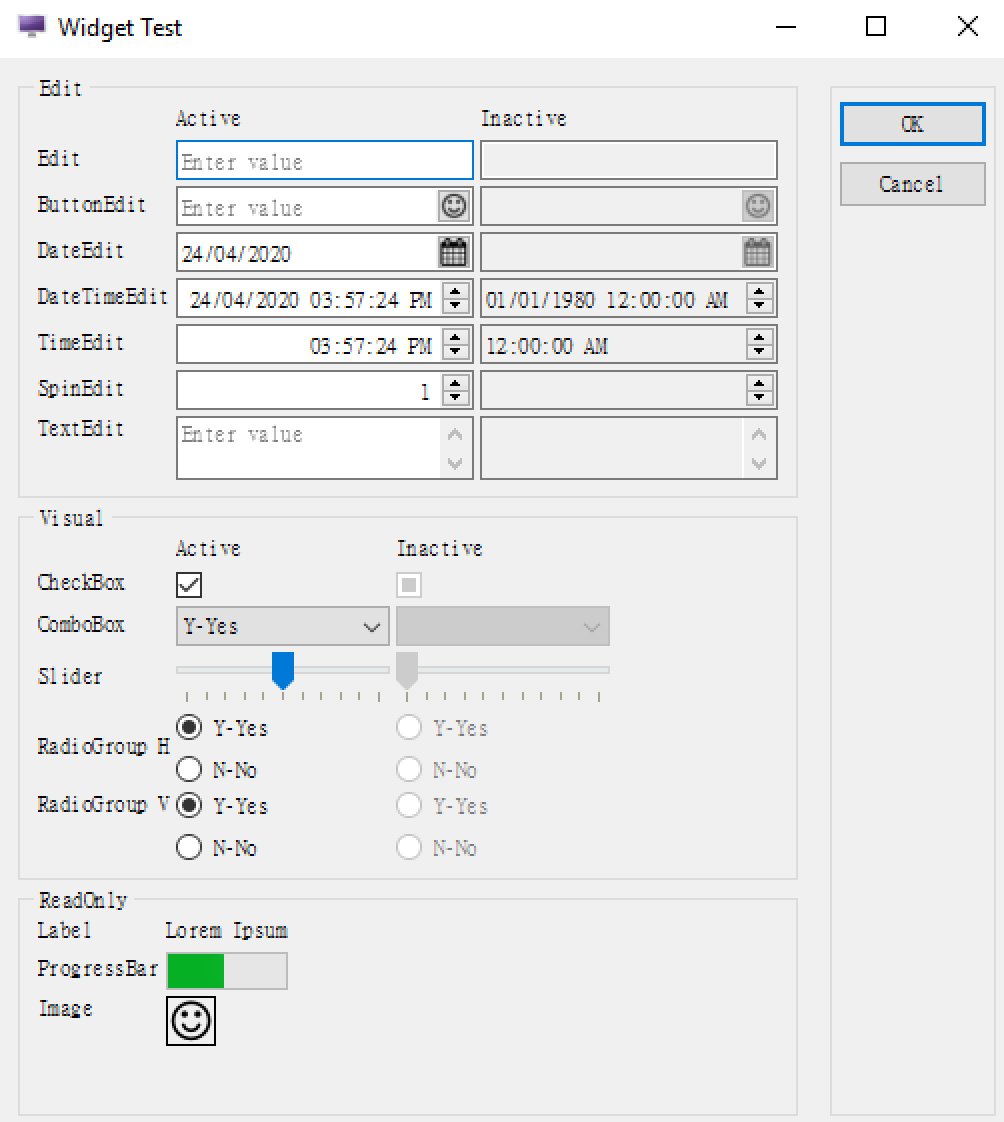
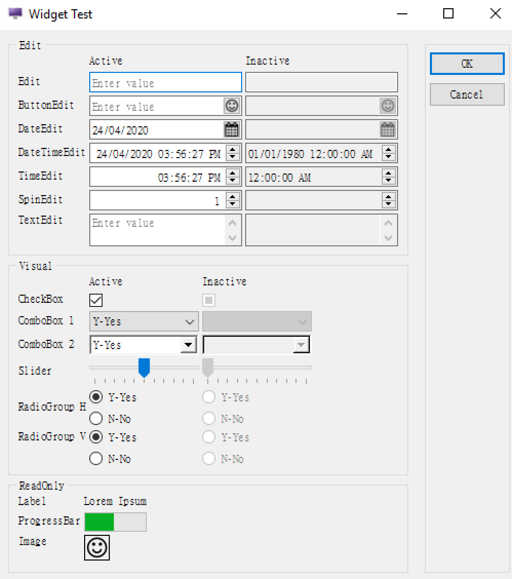
What I want to concentrate on in particular is the appearance of the native ComboBox on Windows 10. If you look at this screenshot, the widgets on the left are active and you can interact with them to change the underlying data value. The widgets on the right are in-active.
Now look closely at the ComboBox field. Its appearance looks different than the other widgets. The active ComboBox background is not white, and its background colour is very close to the inactive *EDIT fields, thus giving the appearance of not being active.
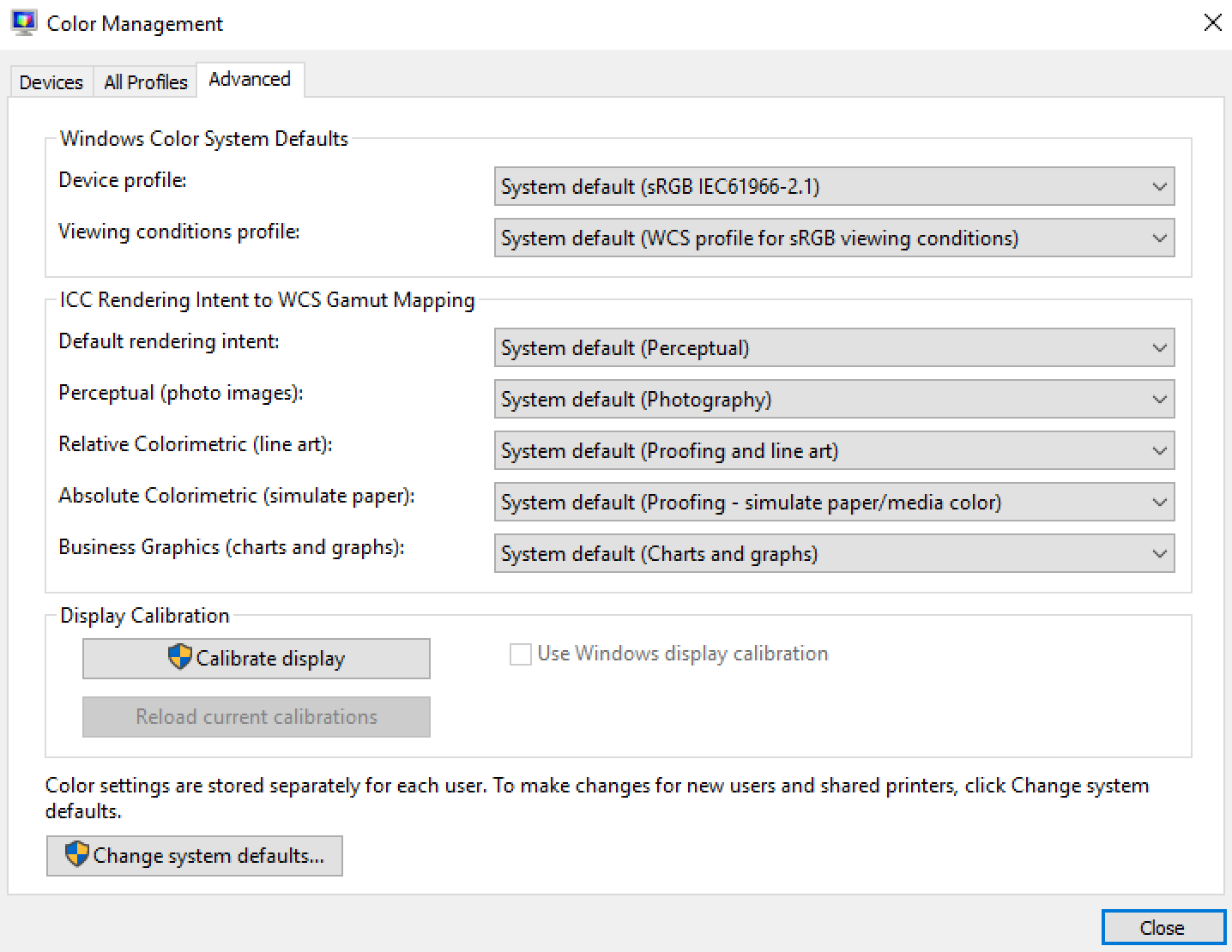
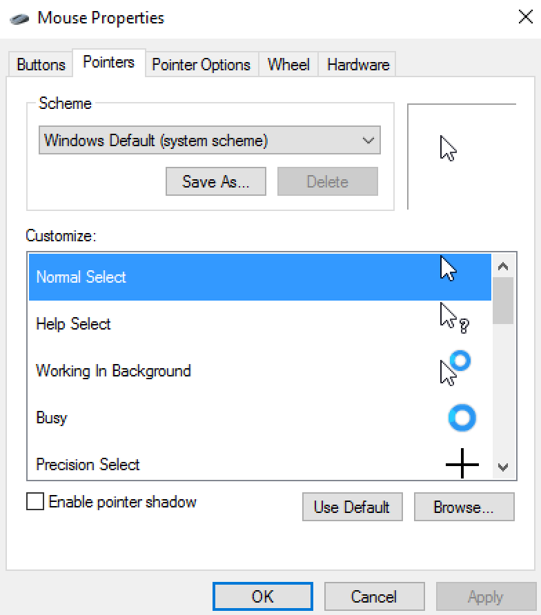
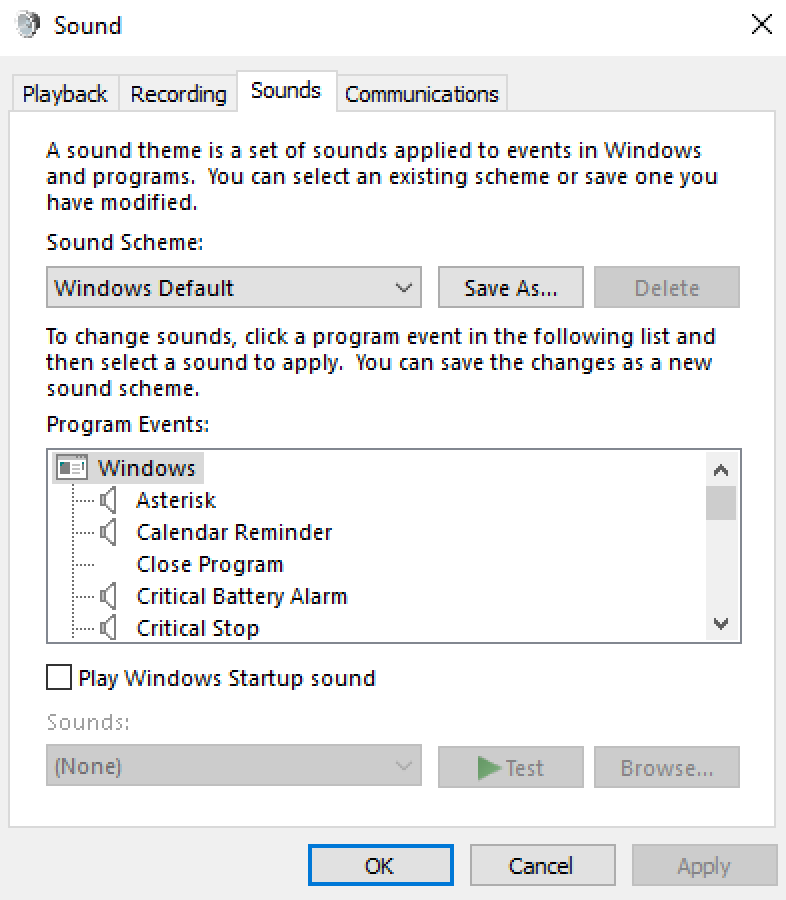
Believe it or not, that is the native look and feel for a ComboBox in Windows 10. If you don’t believe me look at the ComboBox’s in these system programs
To play devils advocate, the background colour for an active ComboBox is the same colour as an active Button. In the screenshot below note that the background colour of the “Sound Scheme” ComboBox and the adjacent “Save As…” button is the same …
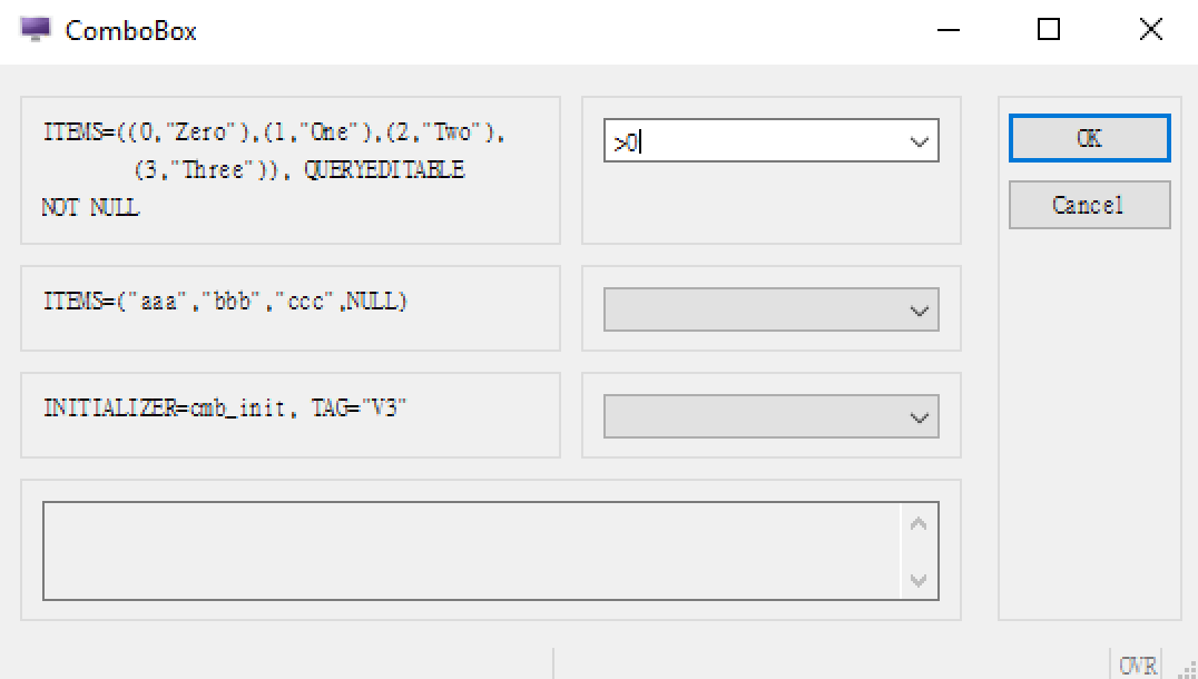
It maybe that their design metaphor is anywhere that is white you can type, anywhere that is light you can click, and anywhere that is dark you can’t click. If you use the QUERYEDITABLE attribute with a ComboBox, you will get a ComboBox rendered with a white background which helps support that metaphor. This screenshot from tweaking the FGLDIR/demo/UserInterface/Widgets/ComboBox demo to have the first field QUERYEDITABLE shows the white background given when QUERYEDITABLE is applied..
Compared to the Windows system programs I showed, I think you’ll find most Genero screens have more *EDIT type fields where the user can type a value. This maybe why a white background is interpreted as meaning this field is active and why the ComboBox not having a white background confuses some users.
Now 9 times out of 10, I would encourage you to use the native widget, and only apply styles or change its appearance away from the native appearance sparingly. As I might say, “What makes you think you know better than the design and user experience teams at < insert operating system vendor here>?” In this case I think we do know better 🙂 and the number of support cases we have on it suggests we aren’t in the minority. So what can be done to improve the look?
In this instance, what we have done is unlock a presentation style that allows you to choose a different rendering of a ComboBox. This is documented here, and requires you to add the following style to your .4st
<Style name="ComboBox">
    <StyleAttribute name="qtStyle" value="Windows" ></StyleAttribute>
</Style>
Behind the scenes what this is doing is rendering using an older version of a Windows ComboBox. The screenshot below now has two lines of ComboBox’s, the default native above, and the alternative using this presentation style below it.
Hopefully you can see that this second line of ComboBox fields is more in fitting with other GUI widgets. That is a white background to indicate that the field is active and that the user can click here to change value. As an aside this ComboBox also opens the door for a few other presentation styles to take effect on that particular widget that a native ComboBox does not allow.
Now I’d like to think that one day, the team at Microsoft will improve the ComboBox and so we would not need this .4st entry. So if you do decide to add the entry to your .4st, make a note to review this periodically (Windows and Genero upgrade), and remove the additional lines from your .4st to revert to using the native ComboBox when you can.


