Ask Reuben – October 21, 2019
How can I make the field with focus more obvious?
It is not very obvious that a particular field has the focus.
How can I make the field with focus more obvious?
UPDATE May 2025
With the release of Genero Browser Client 5.01.00, there was improvements in the way the field with focus is emphasised. You should no longer need to use any of the techniques listed here.
A question that is commonly asked is how can I make the field with focus more obvious. Typically it concerns a field such as a CHECKBOX, COMBOBOX, RADIOGROUP where in that particular native GUI, it is not obvious that a particular field has the GUI focus.
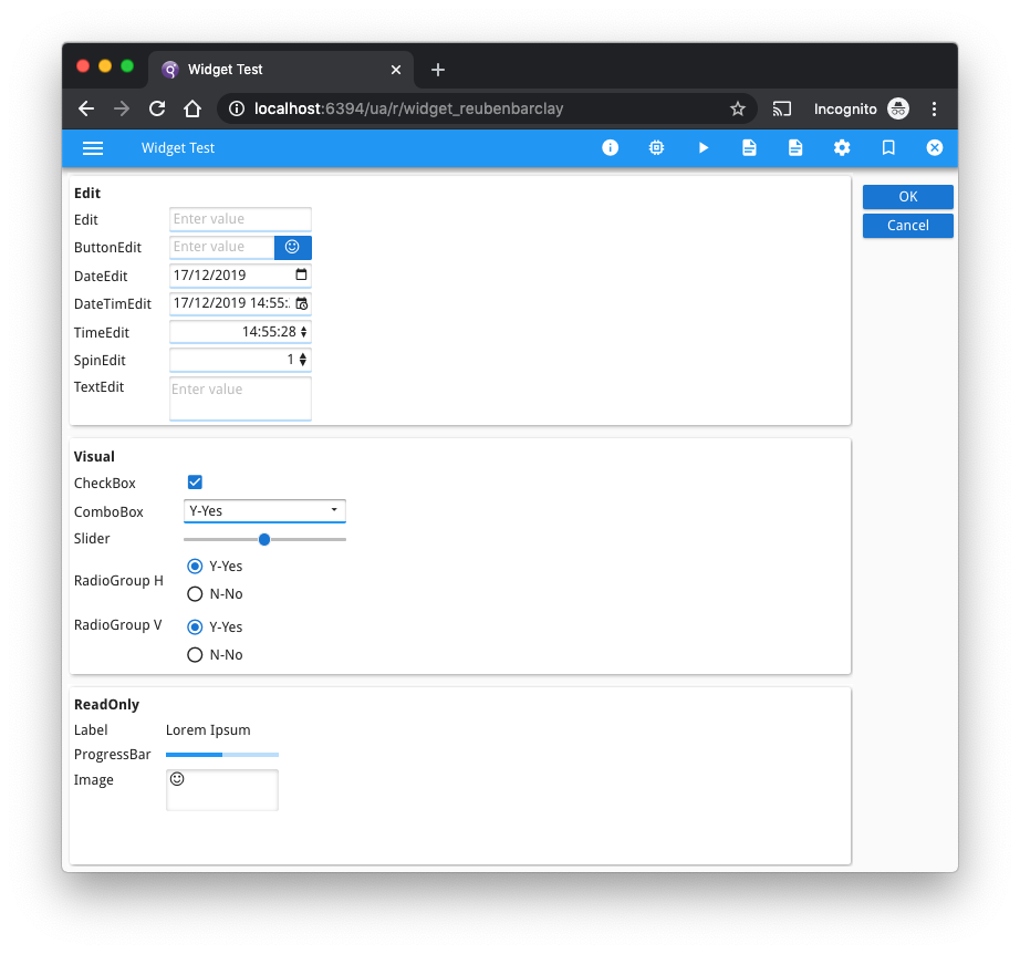
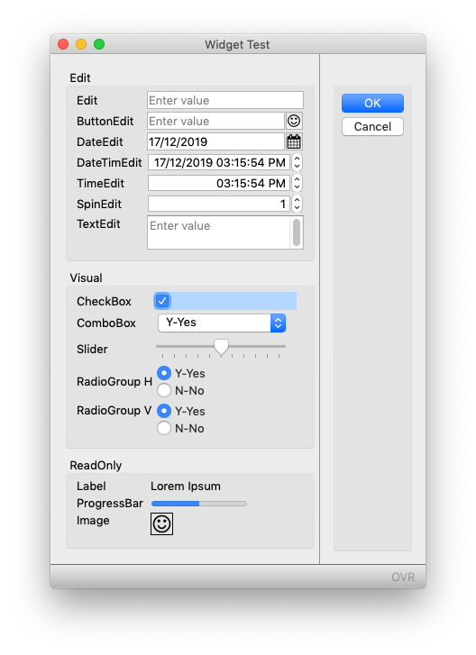
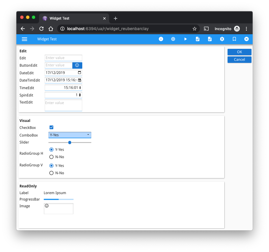
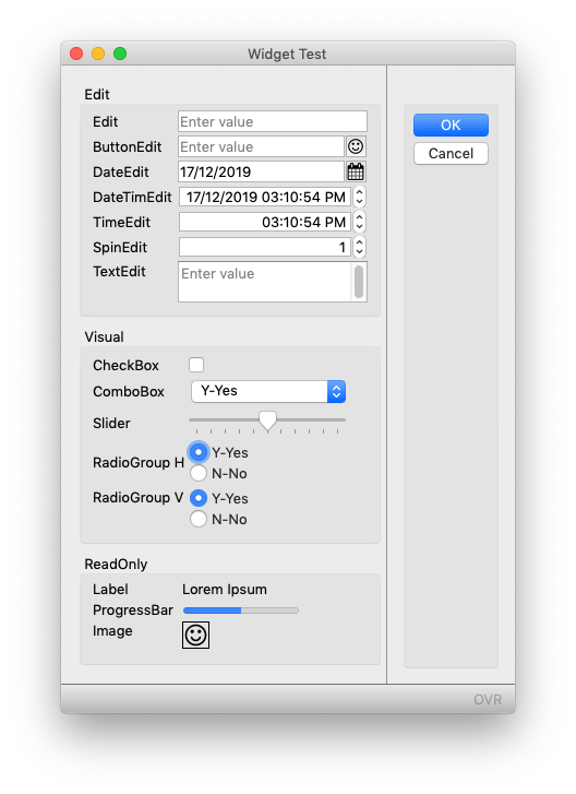
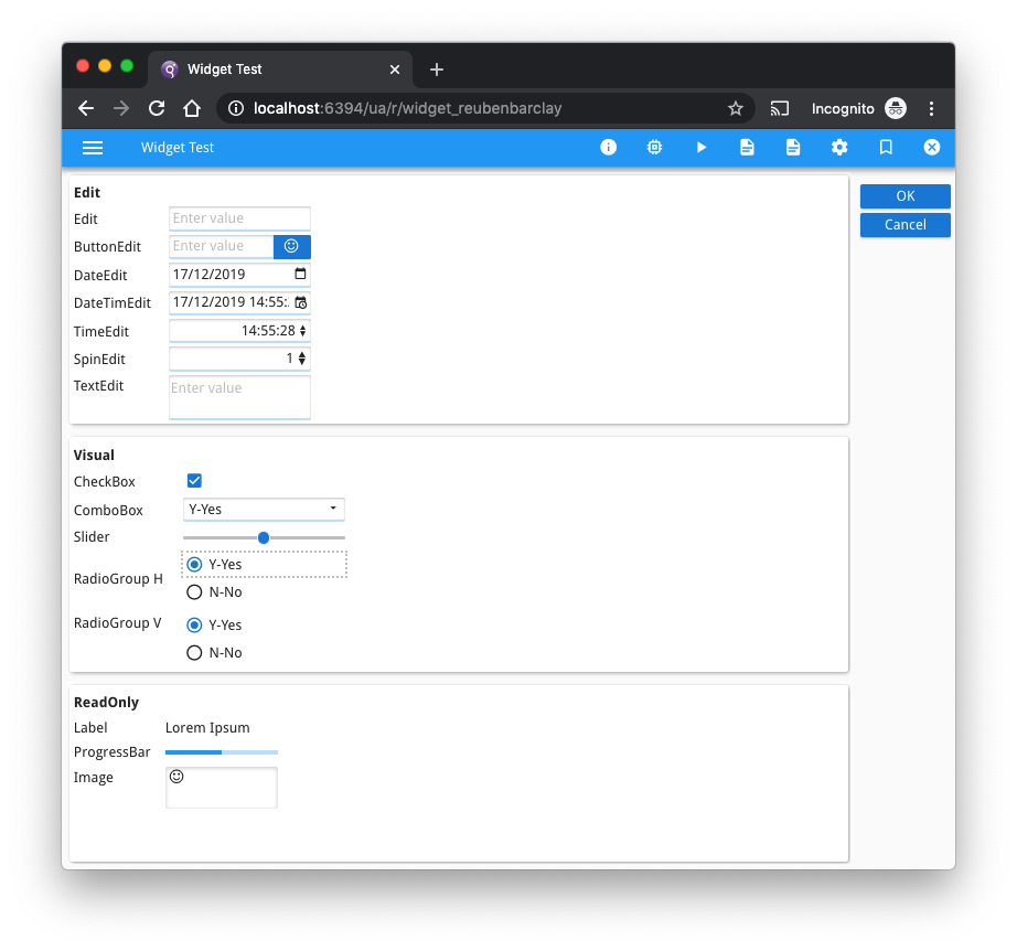
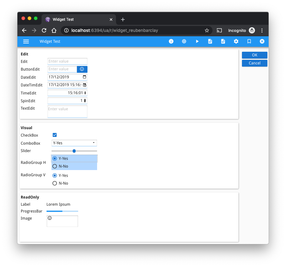
The screenshots below illustrate this. Which field in each screenshot has the focus?
The answer is that the screen on the left is GDC on Mac OSX and the field with focus is the Checkbox. The screen on the right is GBC and the field with focus is the ComboBox.
When answering the question on how to improve this, I hesitate to give an answer straight away. I hesitate because with the resources available to them, I’d like to think Microsoft, Apple etc can come up with a good user interface that can’t be improved by little old me or you. However there are some cases where I think it can be improved.
My answer involves presentation styles and involves two keys components
- the “:focus” pseudo-style selector.
- the “highlight” system colour.
When used in a .4st like so …
<Style name="CheckBox:focus">
    <StyleAttribute name="backgroundColor" value="highlight" ></StyleAttribute>
</Style>
<Style name="ComboBox:focus">
    <StyleAttribute name="backgroundColor" value="highlight" ></StyleAttribute>
</Style>
<Style name="RadioGroup:focus">
    <StyleAttribute name="backgroundColor" value="highlight" ></StyleAttribute>
</Style>
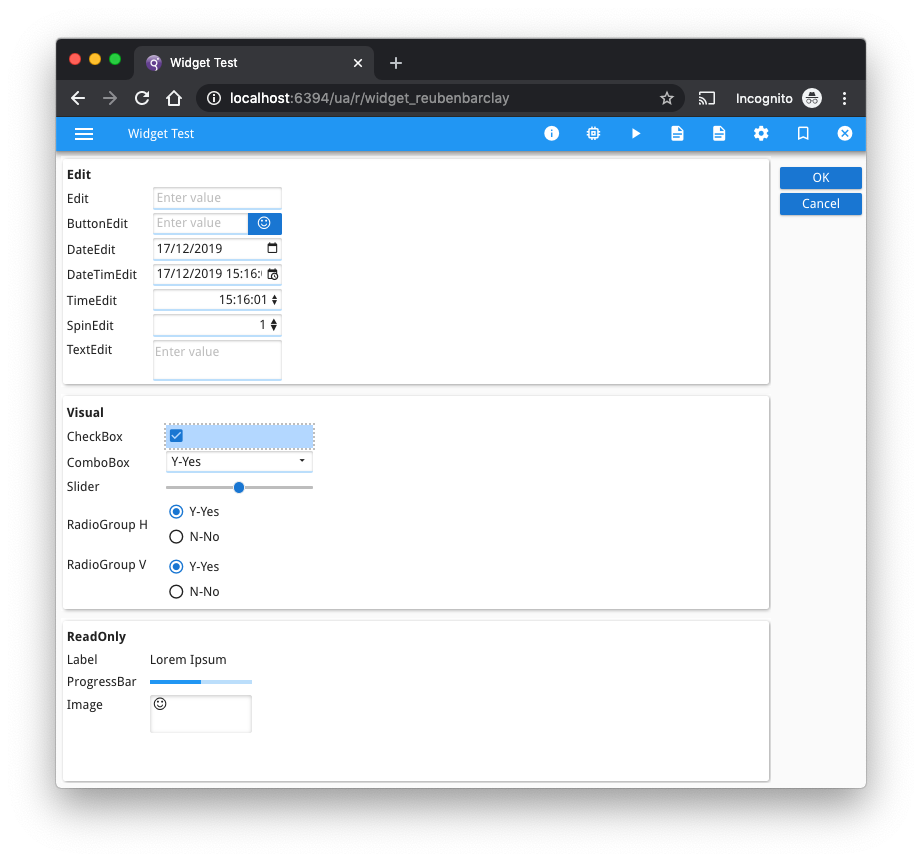
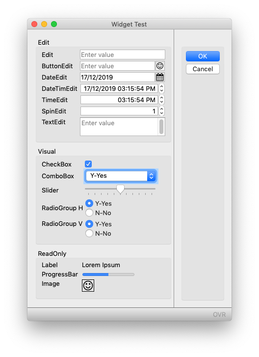
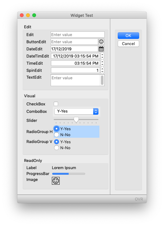
… then the field with focus is a little more visible as illustrated in the screenshots below.
I would recommend you keep such use of presentation styles to a minimum. You don’t want to diverge too much from the native format. What you create that looks good in one native format may not look good in another native format. This advice applies particularly to the choice of colour. If you hard-code a colour, that may look OK in a light theme, but how does it look in a dark theme? What looks OK with a blue theme might not look so good in a red theme etc. That is why I use try to use system colours like “highlight” as in this example.
I don’t tend to diverge too much from the above with the .4st. I have seen customers add a lot more presentation styles and move away from the native theme, but they then have to fiddle with them as they upgrade O/S e.g. Windows 7-> Windows 10, or as they allow end-users to use Linux or OSX instead of just Windows, or as they move from Desktop to Web and Mobile environments.
You are also limited to what the Native UI allows. For instance with Windows it has historically been difficult to change the background color of a COMBOBOX or BUTTON.
Also another little tip, with the CHECKBOX, I tend to add TEXT=” “, this makes the focus indicator a little bigger.
The screenshots below have the same field with focus on the left and right, the difference is that the screens on the left have the native UI, and the screens on the right have the .4st entry above added.
Hopefully it is a little more obvious what field has focus. Also you should note that the difference in the native GUI formats means that the improvement varies between platforms.


