Ask Reuben – June 14, 2023
Emulating More Mobile Features
How can I spread toolbar icons across the bottom of the screen?
How can I make a clickable image appear on the right edge of a table row?
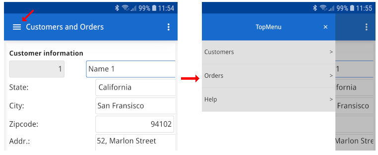
How can I render topmenu in a format more appropriate for mobile?
How can I avoid the rowbound 3-dots icon overlapping data or a widget?
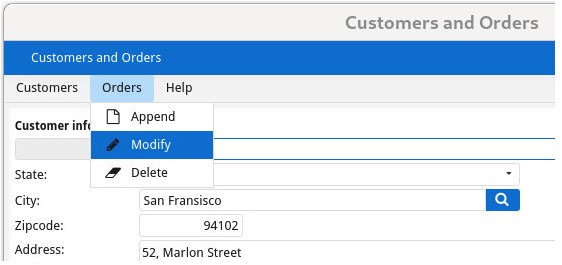
Around the time of the Genero 4.00 Early Access Program and Genero 4.00 Release, I published some articles Emulating ListView and Emulating Stack which showed how you could get the equivalent of some syntax that was deprecated in 4.00. Looking back at them I might also have mentioned using FLIPPED as an option for a ListView equivalent. That is rather than just using HIDDEN@SMALL to hide table columns as the device gets smaller, use FLIPPED to provide an alternate view of a TABLE better suited to a small device. You can think of the old ListView tableType Style Attribute as being the equivalent of FLIPPED@SMALL, plus HIDDEN@SMALL on every column except the first two. What we have given you now in 4.00 is more flexibility and control as to what columns are visible in that alternate FLIPPED rendering of a TABLE. You can have all the columns or you can choose the important ones, or you could perhaps have a summary column that is hidden when other columns are visible. You are not forced to the first two columns. There were some other areas of Mobile UI where we have also given you the smaller building blocks so you can construct the solution you want rather than being constrained by our implementation. These smaller building blocks are available outside of Mobile as well so can be used in any Genero application whether for Desktop, Web or Mobile thanks to Universal Rendering. Two new presentation styles, topMenuDesktopRendering and topMenuMobileRendering can be used to control the appearance of TopMenu’s. You can choose wether TopMenu are rendered in the “classic” view which is a row of options across top of screen that you then click on to see options available in that TopMenuGroup, or in the “sidebar” view which is better suited to small devices where you click on the Hamburger icon to expand out from the left the same TopMenu tree structure. The important thing is you got to choose, we were not forcing a particular view upon you other than the defaults.
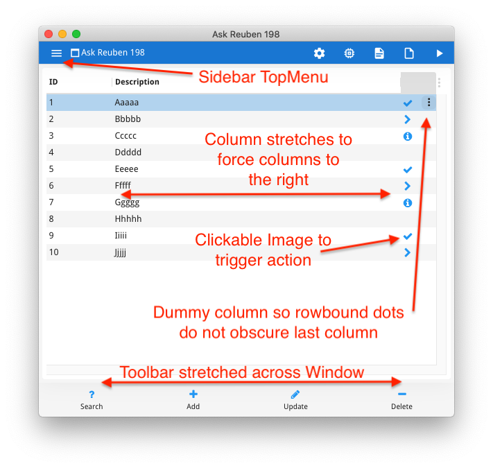
With Toolbars, there were more presentation styles and attribute values that were added that gave you more control over the rendering. The ones I want to mention from a mobile perspective was the ability to use itemsAlignment with a value of “justify”, and toolbarPosition with a value of “bottom”. This allows you to place across the bottom of the window, a row of buttons accessible by the users thumb. The size presentation style attribute could also be used to squeeze extra buttons or make them larger, depending how many buttons you have and the dexterity of your users.
For row configuration on iOS devices, prior to 4.00 there was some interesting syntax involving the ACCESSORYTYPE keyword that would render an icon on the right hand edge of the row. Depending on some other attributes this would trigger an action if the user clicked on that icon. This was deprecated in 4.00. With 4.00 what you can do using the responsive STRETCH=X and other attributes is add your own clickable IMAGE fixed to the right hand edge of a table row. That image can be what you want and this is not restricted to just iOS mobile front-ends.
Key elements in the design are …
- An IMAGE column of size 2 (I found 1 too small). This column is the last column (or in this case second last for reasons I’ll explain later). Set the ACTION attribute so that if the user clicks on this IMAGE, the action is triggered. Populate the image different for each row inside the 4gl.
- STRETCH=X on at least one column to the left of the image column, this means the last column will be on right hand edge.
- STRETCHMIN=2, STRETCHMAX=2, UNMOVABLE, UNSORTABLE, UNSIZABLE. Keep it the same small size, prevent users attempting to move or sort using that column. Also do not set TITLE attribute.
- In presentation styles, use rightFrozenColumns Style Attribute. This ensure that the right hand columns are always visible as you scroll horizontally.
In the example below, I have coded two columns on the right hand edge. This very last column I use to make sure the ROWBOUND 3-dots icon can render without overlapping other content. (With Actions and Action Defaults, the ROWBOUND attribute can be used to indicate that an action is bound to a row. For example update or delete that particular row. This results in a 3 dots icon occurring on the right hand edge of the row that the user can tap on to get a list of actions available for that row. ) If you don’t want the 3-dots icon to overlap with the contents of the last column, this is a trick you can do, handy if the last column is a GUI widget with a clickable element on the right e.g BUTTONEDIT, DATEEDIT, COMBOBOX etc, or the content in the last column is right-justified as these would otherwise be potentially obscured by the 3 dots icon.
The images I have selected from the FontAwesome library we ship with Genero for centralized images. One of the images I have used is fa-info-circle. You might wonder why I have not used fa-info-circle-o, we ship the free version of the Font Awesome library, if you want fa-info-circle-o you can find it in the Pro version of the Font Awesome library. (I should probably do an Ask-Reuben article showing how to use the Pro version)
If you run the code below you will get that screenshot.
I hope you like having the ability to have more control rather than only having options we make available for you. That is always an interesting design decision for us, do we give you something with one word of syntax or do we provide the smaller pieces that you can put together for the solution you want, and have those options available for all front-ends, not just one front end. As an interesting aside this is the same challenge we see with charts/graphs. If using a 3rd party Web Component you are limited to the options provided by the 3rd party (same with Business Graphs in Genero Report Writer). Using fglsvgcanvas you have the tools to create the charts/graphs you want.
#! askreuben198.4gl
MAIN
DEFINE arr DYNAMIC ARRAY OF RECORD
    field1 STRING,
    field2 STRING,
    clickable_image STRING, -- column to add right hand image that can be clicked on
    rowbound STRING         -- dummy column added to make sure rowbound dots don't obscure anything
END RECORD
DEFINE i INTEGER

    WHENEVER ANY ERROR STOP
    DEFER INTERRUPT
    DEFER QUIT
    OPTIONS FIELD ORDER FORM
    OPTIONS INPUT WRAP

    CALL ui.Interface.loadStyles("askreuben198.4st")

    FOR i = 1 TO 10
        LET arr[i].field1 = i
        LET arr[i].field2 = ASCII(64+i),ASCII(96+i),ASCII(96+i),ASCII(96+i),ASCII(96+i)
        CASE i MOD 4 # different image on each row
            WHEN 1 LET arr[i].clickable_image = "fa-check"          #CHECKMARK
            WHEN 2 LET arr[i].clickable_image = "fa-chevron-right"  #DETAILBUTTON
            WHEN 3 LET arr[i].clickable_image = "fa-info-circle"    #DISCLOSUREINDICATOR  fa-info-circle-o pro version
        END CASE
    END FOR

    OPEN WINDOW w WITH FORM "askreuben198" ATTRIBUTES(TEXT="Ask Reuben 198")
    CALL ui.Window.getCurrent().getForm().loadToolBar("askreuben198.4tb")
    CALL ui.Window.getCurrent().getForm().loadTopMenu("askreuben198.4tm")
    DISPLAY ARRAY arr TO scr.* ATTRIBUTES(ACCEPT=FALSE, CANCEL=FALSE)
        ON ACTION add
            MESSAGE "Add clicked"
        ON ACTION query
            MESSAGE "Query clicked"
        ON ACTION update
            MESSAGE "Update clicked"
        ON ACTION delete
            MESSAGE "Delete clicked"
        ON ACTION detail ATTRIBUTES(DEFAULTVIEW=NO)
            MESSAGE SFMT("Detail click in row %1",arr_curr())
        ON ACTION rowbound1 ATTRIBUTES(ROWBOUND, DEFAULTVIEW=NO)
            MESSAGE SFMT("Rowbound1 click in row %1",arr_curr())
        ON ACTION rowbound2 ATTRIBUTES(ROWBOUND, DEFAULTVIEW=NO)
            MESSAGE SFMT("Rowbound2 click in row %1",arr_curr())
    END DISPLAY
END MAIN
#! askreuben198.per
LAYOUT
TABLE ( STYLE="mobileem")
{
[f01 |f02 |x |y ]
}
END
END
ATTRIBUTES
EDIT f01 = formonly.field1, TITLE="ID";
EDIT f02 = formonly.field2, TITLE="Description", STRETCH=X;
IMAGE x = formonly.clickable_image, STRETCHMIN=2, STRETCHMAX=2, UNMOVABLE, UNSORTABLE, UNSIZABLE, ACTION=detail;
EDIT Y = formonly.rowbound, STRETCHMIN=2, STRETCHMAX=2, UNMOVABLE, UNSORTABLE, UNSIZABLE;
INSTRUCTIONS
SCREEN RECORD scr(field1, field2, clickable_image,rowbound)<?xml version="1.0" encoding="ANSI_X3.4-1968"?>
<!-- askreuben198.4st -->
<StyleList>
<Style name="Window">
<StyleAttribute name="windowType" value="normal"/>
<StyleAttribute name="toolBarPosition" value="bottom"/>
<StyleAttribute name="actionPanelPosition" value="chrome"/>
<StyleAttribute name="topmenuDesktopRendering" value="sidebar"/>
<StyleAttribute name="topmenuMobileRendering" value="sidebar"/>
</Style>
<Style name="Table.mobileem">
<StyleAttribute name="rightFrozenColumns" value="2"/>
</Style>
<Style name="ToolBar">
<StyleAttribute name="itemsAlignment" value="justify"/>
<StyleAttribute name="defaultTTFColor" value="#2196f3"/>
</Style>
<Style name="Image">
<StyleAttribute name="defaultTTFColor" value="#2196f3"/>
</Style>
</StyleList><?xml version="1.0" encoding="ANSI_X3.4-1968"?> <!-- askreuben198.4tb --> <ToolBar> <ToolBarItem name="query" image="fa-question" text="Search" /> <ToolBarItem name="add" image="fa-plus" text="Add" /> <ToolBarItem name="update" image="fa-pencil" text="Update" /> <ToolBarItem name="delete" image="fa-minus" text="Delete" /> </ToolBar>
<?xml version="1.0" encoding="ANSI_X3.4-1968"?>
<!-- askreuben198.4tm -->
<TopMenu>
  <TopMenuGroup text="Group 1">
    <TopMenuCommand name="action1" text="Action 1" />
  </TopMenuGroup>
  <TopMenuGroup text="Group 2">
    <TopMenuCommand name="action2" text="Action 2" />
  </TopMenuGroup>
</TopMenu>


