Ask Reuben – February 17, 2021
Dependency Diagram Filter
How can I visually see the relationship between .4gl files?
There is a lot in the Dependency Diagram, how can I make it easier to interpret?
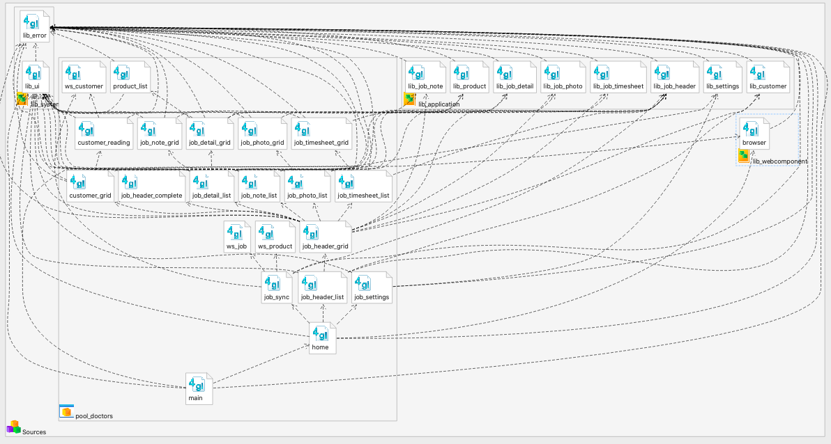
The Dependency Diagram in Genero Studio is a very useful tool. It allows you to visually see the relationship between the components of a project. From the Project Workspace view, if you right-click on a group, application, or library node there should be an option “Open Dependency Diagram”. This will open the Dependency Diagram for the selected node and its children. Most users first impression when they view the Dependency Diagram on their sources is not a positive one. One reason might be because you have right-clicked a high-level group node, I would experiment right-clicking on an application node and selecting “Open Dependency Diagram …” and noting what appears. Another reason is that you just see a an icon representing an application or library node(s), double-click on these to show the individual .4gl. The final reason it might not be a positive experience is because your applications are functionally rich and make lots of library calls. There are steps you can take to simplify the diagram. The one I want to highlight is the Filter View. The following screenshot is the Dependency Diagram of my Pool Doctors sample Genero Mobile application …
There are lots of lines indicating relationships between the various 4gl. Most of them are caused by library calls. If you look at lib_error.4gl it has a line drawn to it from every other .4gl because of the exception handling. Similarly lib_ui.4gl has calls from a number of .4gl files as I have standardised the user interface in lib_ui.4gl.
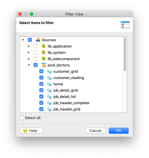
What you can do to remove an item from the diagram is to right-click on the item and select “Hide”. (to unhide is to right click and select Show All Items). There is a way you can do this for many nodes in one step and that is to make use of the Filter View. If you right-click on some blank space in your diagram and select “Filter Items …” the following dialog will appear …
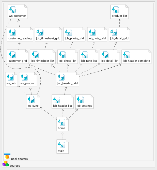
… you can then individual check or uncheck to indicate what items you wish to view in the diagram. Note how it is a tree and you can check/uncheck the parent node(s). The diagram below shows what happens if I uncheck the various libraries that I have in the Pool Doctors application …
… the resulting diagram is a lot simpler / clearer to interpret. I would rather it was top-down rather than bottom-up but I have yet to persuade our developers to change the orientation !!!
As I have adopted the model that each 4gl only opens at most one form, this also helps me to visualize the paths to the various form. So to follow the path from main to product_list I can see that the path is …
- main – no form, calls …
- home – the initial home screen, calls …
- job_header_list – the list of jobs, calls …
- job_header_grid – header information about a selected job, calls …
- job_detail_list – list of job details about a selected job, calls …
- job_detail_grid = header information about a selected job detail, calls …
- product_list = list of products that user selects from to populate a job detail entry
Using this view I can treat the Dependency Diagram as like a storyboard.
The other thing I have been diligent about is making sure I have no circular references. If you note every arrow is in an upwards direction, there are no arrows pointing down.
The Dependency Diagram is potentially a useful tool for you. You can utilise the Filter View to improve the appearance by filtering out nodes and their accompanying relationships to allow you to concentrate on a particular area. Some code discipline may also help in the appearance.


