Ask Reuben – October 21, 2019
Understanding the GUI Debug Grid
Why is this field the size it is? Part 2 How to Understand the GUI Debug Grid
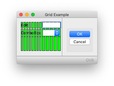
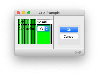
My previous answer showed you how to view the Debug Grid, in this answer I will show you how to interpret, and the effect of different code syntax on your rendered form from the information in the Debug Grid. The important things to relate are the source file (.per/.4fd), the compiled form (.42f), and the resultant screen. Using last weeks example …
#! grid.per
LAYOUT (TEXT="Grid Example")
GRID
{
Edit    [f01  ]
ComboBox[f02  ]
}
END
END
ATTRIBUTES

EDIT f01 = formonly.ed1;
COMBOBOX f02 = formonly.cb1, ITEMS=(("Y","Yes"),("N","No"));
#! grid.42f <Form name="grid" build="3.20.07" text="Grid Example" width="15" height="2"> <Grid width="15" height="2"> <Label text="Edit" posY="0" posX="0" gridWidth="4"></Label> <FormField name="formonly.ed1" colName="ed1" fieldId="0" sqlTabName="formonly" tabIndex="1"> <Edit width="5" posY="0" posX="9" gridWidth="5"></Edit> </FormField> <Label text="ComboBox" posY="1" posX="0" gridWidth="8"></Label> <FormField name="formonly.cb1" colName="cb1" fieldId="1" sqlTabName="formonly" tabIndex="2"> <ComboBox width="3" posY="1" posX="9" gridWidth="5"> <Item name="Y" text="Yes"></Item> <Item name="N" text="No"></Item> </ComboBox> </FormField> </Grid> <RecordView tabName="formonly"> <Link colName="ed1" fieldIdRef="0"/> <Link colName="cb1" fieldIdRef="1"/> </RecordView> </Form>
If you note in the compiled form (.42f) output, the Edit and ComboBox node both have posX = “9” and gridWidth = “5”. If you count the green rectangles in the screenshot you will see that the Edit and ComboBox both start on the 9th column in, and take up 5 columns. You will see posX and gridWidth attributes for all children of a Grid. The posX, gridWidth attribute define what green column the widget starts in, the number of green columns it stretches across, and as a result what green column it ends in.
With the example, I want you to see that the EDIT and COMBOBOX have both been defined to start at the same place, have the same width, thus both will also end at the same place.
You can look at the “[“, “]”, “|” in a .per inside a GRID and deduce the relative position of each widget within that GRID
These two fields start and end at the same position
[f01      ]
[f02      ]
These two fields start at the same position and f01 finishes to the left of f02
[f01      ]
[f02                ]
Field f01 starts to the left of f02, and both finish in the same position
[f01      ]
     [f02 ]
Field f01 starts to the left of the start of f02, and f02 finishes to the left of the finish position of f01
[f01            ]
    [f02    ]
Using the green (red/orange in the GBC) rectangles you can see that widgets have been defined to start or end in the same position because the widget will start or end in the same column. With the example, you can modify the start and end position of f01, f02, and note how the EDIT (f01) and COMBOBOX (f02) are drawn relative to each other.
Looking at a .per/.4fd , you can tell by looking at the relative positions of the “[“, “]”, “|” symbols within a GRID, what the relative position of the widgets are relative to each other. Note: The “within a GRID” is an important disclaimer, by default each GRID is rendered independently.
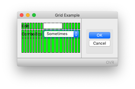
The next question is what are the actual sizes of the columns, that is what is the width of each green (red/orange in the GBC) rectangle. The answer is each column is the minimum width necessary to render the widgets that are rendered in that column. To see that, change the ITEMS value of the COMBOBOX to be ITEMS=((“Y”,”Yes”),(“N”,”No”),(“S”,”Sometimes”)). That is we now require enough space to render “Sometimes” when previously we only needed enough space to render “Yes”. Now when we render the form with the Debug Grid we see
… note that the green columns for the ComboBox are now twice as wide as the columns for the Labels. That is because the minimum size of the ComboBox has now increased in order to display the new value “Sometimes”. This has stretched the columns used by the ComboBox. These are the same columns as used by the Edit so the Edit is also stretched, remember the Edit was defined to start and end with the same X value as the ComboBox, and note that the Edit and ComboBox still start and end in the same position.
This columns of different width is normally what we see when we get a support call. As developers chances are you want each column to have approximately the same width to mirror the mental image in your head. There are two main things you can look at.
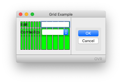
Have I sized the widget appropriately for the minimum content of that widget? With the example with “Sometimes” added, the ComboBox has been defined with a width of 5 yet the maximum value has 9 characters. Look at the result if I make the ComboBox wider, giving it a width of 11, that is 9 to display “Sometimes” and 2 for the drop-down icon. (As a rule of thumb allow two characters for drop-down, icon in COMBOBOX, DATEEDIT, BUTTONEDIT etc). So code is now
LAYOUT (TEXT="Grid Example")
GRID
{
Edit    [f01  ]
ComboBox[f02        ]
}
END
END
ATTRIBUTES

EDIT f01 = formonly.ed1;
COMBOBOX f02 = formonly.cb1, ITEMS=(("Y","Yes"),("N","No"),("S","Sometimes"));
You’ll note that each green column is closer in size and the difference is less pronounced. Also note that the EDIT and COMBOBOX no longer finish at the same position.
The other thing you can look at is to remove the requirement for a widget to be aligned with a widget above/below it in the same Grid. This can be done using the “:” HBox Layout tag. The key sentence in the documentation for the HBox Layout tag is “Hbox tags allow you to stack form items horizontally without the elements being influenced by elements above or below“. So with this code, the : is used to indicate the end of the widget is not aligned with anything above or below it …
LAYOUT (TEXT="Grid Example")
GRID
{
Edit    [f01  : ]
ComboBox[f02  : ]
}
END
END
ATTRIBUTES

EDIT f01 = formonly.ed1;
COMBOBOX f02 = formonly.cb1, ITEMS=(("Y","Yes"),("N","No"),("S","Sometimes"));
There is a question you might then ask, what is the minimum size to render a widget, I will answer that next week and what attributes can influence that.
When reviewing your form, ask yourself the questions, is the widget an appropriate size for the expected content?, and does the widget need to be aligned with widgets above and below?
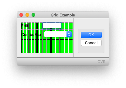
The common error we saw in the migration from a TUI to a GUI form was that a field would have width one e.g. “[x]” because it was a CHAR(1) field e.g. Y/N. It would be turned into a COMBOBOX but the width was not increased to allow for the value displayed in the ComboBox and/or the drop-down icon. Thus this COMBOBOX stretches the fields above and below it.
LAYOUT (TEXT="Grid Example")
GRID
{
Edit    [f01  ]
ComboBox[x]
}
END
END
ATTRIBUTES

EDIT f01 = formonly.ed1;
COMBOBOX x = formonly.cb1, ITEMS=(("Y","Yes"),("N","No"));
Note the 1 column that contains the COMBOBOX how it is extraordinarily wide, and has had a flow-on effect to the width of the EDIT, which has room for more than the expected 5 characters.
Typically a widget should be rendered left-aligned with widgets above and below it so that they align, but there is often no need for it to be right-aligned as well. Only with related fields e.g. 4 lines of an address field do you need alignment on the right hand edge. To minimise the influence above and below you can use the HBox Layout tag.
The key points from todays question, the posX, and gridWidth attributes tell what you what is the start and end green rectangle in the Debug Grid that a widget will be rendered between. A widgets relative position to the widgets above and below it will be maintained unless the widget is marked as independent by use of the HBox Layout tag. The width of each column is determined by all the widgets that are rendered in that column.
A more detailed explanation of what I am covering can be found in this section of the documentation.
Next week I will cover how this width for each column is calculated and what attributes can influence it.


