Ask Reuben – October 21, 2019
Viewing the GUI Debug Grid
Why is this widget the size it is? Part 1 – How to view the GUI Debug Grid
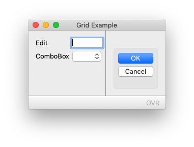
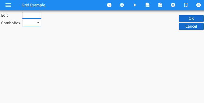
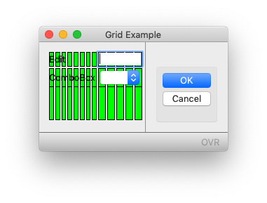
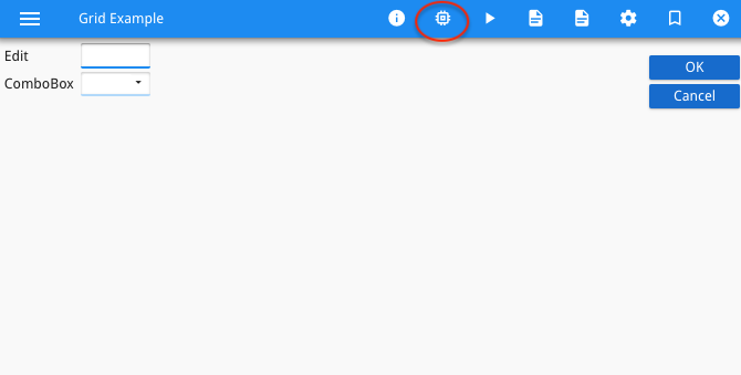
A common question to be asked is why is the Genero front-end rendering a widget the size that it is. The developer will try to make the field smaller or bigger, but their actions are not having the desired effect on the size. The answer to that question is a complex one so I will answer this across a number of ask-reuben’s. The first part today is to make sure you have the appropriate Debug tool at your disposal, that tool is the “Debug Grid”. The following week(s) I will show how to interpret this grid and manipulate the user interface as a result. The code example I will start with is this one Compile and run this program, you should end up with something like this (GDC and GBC respectively), a simple form with an EDIT widget and a COMBOBOX widget immediately below it.
#! grid.4gl
MAIN
    DEFINE rec RECORD
        ed1 STRING,
        cb1 STRING
    END RECORD

    CLOSE WINDOW SCREEN
    OPEN WINDOW w WITH FORM "grid"
    INPUT BY NAME rec.*
END MAIN
#! grid.per
LAYOUT (TEXT="Grid Example")
GRID
{
Edit    [f01  ]
ComboBox[f02  ]
}
END
END
ATTRIBUTES

EDIT f01 = formonly.ed1;
COMBOBOX f02 = formonly.cb1, ITEMS=(("Y","Yes"),("N","No"));
Before we move onto viewing the Debug Tree, open up the compiled form (the .42f file) in a text editor. Observe the various components of the form, and take note that the child elements of the Grid node have attributes posX, posY, gridWidth. We will come to those later
<?xml version='1.0' encoding='UTF-8'?>
<Form name="grid" build="3.20.07" text="Grid Example" width="15" height="2">
  <Grid width="15" height="2">
    <Label text="Edit" posY="0" posX="0" gridWidth="4"></Label>
    <FormField name="formonly.ed1" colName="ed1" fieldId="0" sqlTabName="formonly" tabIndex="1">
      <Edit width="5" posY="0" posX="9" gridWidth="5"></Edit>
    </FormField>
    <Label text="ComboBox" posY="1" posX="0" gridWidth="8"></Label>
    <FormField name="formonly.cb1" colName="cb1" fieldId="1" sqlTabName="formonly" tabIndex="2">
      <ComboBox width="3" posY="1" posX="9" gridWidth="5">
        <Item name="Y" text="Yes"></Item>
        <Item name="N" text="No"></Item>
      </ComboBox>
    </FormField>
  </Grid>
  <RecordView tabName="formonly">
    <Link colName="ed1" fieldIdRef="0"/>
    <Link colName="cb1" fieldIdRef="1"/>
  </RecordView>
</Form>
To view the “Debug Grid”, you need to ensure that the GDC/GBC is launched in a certain way.
If using GDC, then you need to launch the GDC using the -D command line argument
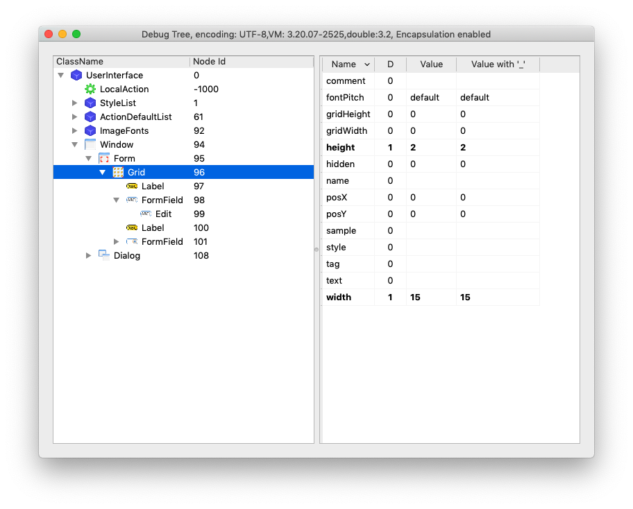
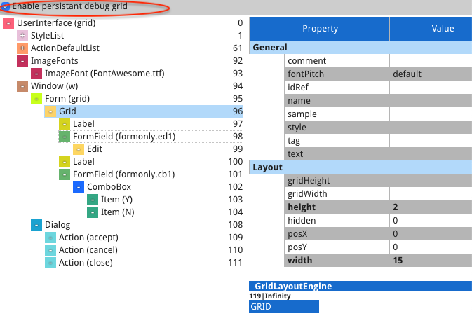
When the Genero program is running, hover the mouse over the affected area of the screen, hold the Control-key (Command-key on Mac), and click the right mouse button. You should see a window labelled “Debug Tree” appear. This contains the Abstract User Interface expressed in a Tree container. In the left hand panel, navigate up/down to find the Grid node, it will be either the parent or the grand-parent node of the widget you are interested in. ( a tip is to do the right-click over the widget you are interested in so it has the initial focus in the tree)
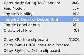
Right-click on that node, and you should in the Context Menu an option. “Toggle Z-Order of Debug Grid”
Select this, or you can simply press Control-Z (Command-Z on Mac)
If you look at your GDC screen now, you will see some green rectangles. For now you can note that these correspond to the rows and columns of the Grid, you will that there is 8 across for each letter in the “Combobox” label, and 5 across for the ComboBox widget. These numbers correspond to the space allocated to them in the .per, and the gridWidth attribute values in the .42f
If using GBC, then you need to ensure that the –development option is specified for either the ua.proxy.param resource or the command line argument for httpdispatch. Refer to the GAS documentation for details on this, note the warning about what happens if you close the Browser Tab whilst in Debug Mode. This side effect is desirable in a development environment, but undesirable in a production environment so take care that you don’t accidentally set this in a production environment.
Having made those changes, make sure you restart the GAS and launch your program. In the Chrome Bar these is now an extra option (as circled below)
If you click that a new tab will open. Select the parent Grid node, and then check the “Enable Persistent Grid” check-box
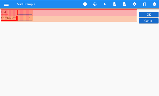
Now if you look back in the original tab with the Genero program running, you will some red / orange alternate background colour has been added. Each of these correspond to a row and column of the Grid.
Just like the GDC for now you can note that these correspond to the rows and columns of the Grid, you will that there is 8 across for each letter in the “Combobox” label, and 5 across for the ComboBox widget. These numbers correspond to the space allocated to them in the .per, and the gridWidth attribute value in the .42f.
If the above steps are not working for you, make sure that
- you are restarting the GDC/GBC after making the change so that Debug mode is in effect.
- in the Debug Tree, you are selecting a Grid node. note in the tree in the screenshots a Grid node has focus
- review this page in the documentation
In both the GDC and GBC, you will note that the columns are not the same size. The columns for the labels on the left are narrower than the columns for the widgets on the right. That is what I will explain in following Ask-Reuben’s. For now the important thing is you are able to open the Debug Tree, find the appropriate Grid node, and make the grid persistent so that you can see the green or red rectangles overlaid on your form.
Note: If you are interested in reading up on more of the AUI Tree, have a read of this section of the documentation and if you are also interested this section contains details on how the AUI Tree is transmitted to the front-end.


