Ask Reuben – June 28, 2022
Font Kerning
Why are these letters close together?
Where has the space between these letters gone?
Kerning is the act of adjusting the space between adjacent characters in a proportional font.
It was something I had not come across until investigating a support issue where the user was reporting that there was some data corruption as a space character between two characters was being removed. Upon closer investigation the space character was there, it was just that font kerning was taking place. This was occurring with the Arial font. The image below shows A space A with and without kerning applied (note the | character helps to illustrate that with kerning less horizontal space is used ) …
… the end-user in reading out the text was interpreting A space A as AA.
The principal of font kerning is best seen with adjacent letters such as AW, WA and AY. In the screenshot below, if you look closely you will see that adjacent letters AW, WA, AY overlap vertically making use of the empty space in the corners of the letters …
If kerning is possible with a font, it will have an internal table that says for these letter combinations, we can move these letters closer together and have some form of overlap.
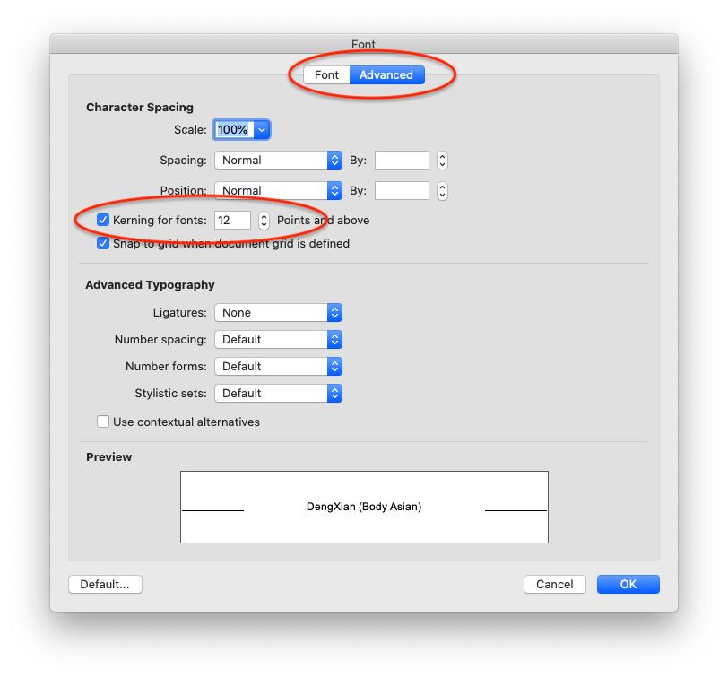
If you want to have a quick look at kerning in action, those screenshots were generated out of Word. Within the font dialog for a selection of text, there is an Advanced tab, and in that dialog there is a checkbox to enable font kerning and a size font to which it applies…
If you want to disable font kerning in your Genero application what are your options? You can always use a monospace font or you can use a font that does not have a kerning table. There is an argument that for small code fields, a monospace font should be used, so that the x’th character aligns, particularly when used in a TABLE. There is also an argument that codes should not contains spaces.
Whilst there is no kerning on/off syntax in Genero, what you can do is incorporate the disabling or enabling of Kerning in your GBC customisation. CSS has a property font-kerning which you can set to none to disable font kerning as per this w3schools try it yourself page. So your steps to customize via GBC customisation and using style sheets would include …
- add in .per, STYLE entries such as STYLE=”no_kerning”;
- add in your customization .scss, an entry like …
.gbc_style_no_kerning {
    font-kerning: none;
}
This will then apply the desired font kerning property to the text in the widgets that have that STYLE entry.


