Ask Reuben – September 28, 2022
“compact” theme
I have scrollbars with Universal Rendering screens that I did not with Native Rendering.
How can I fit more in a Universal Rendering screen ?
What is the compact theme ?
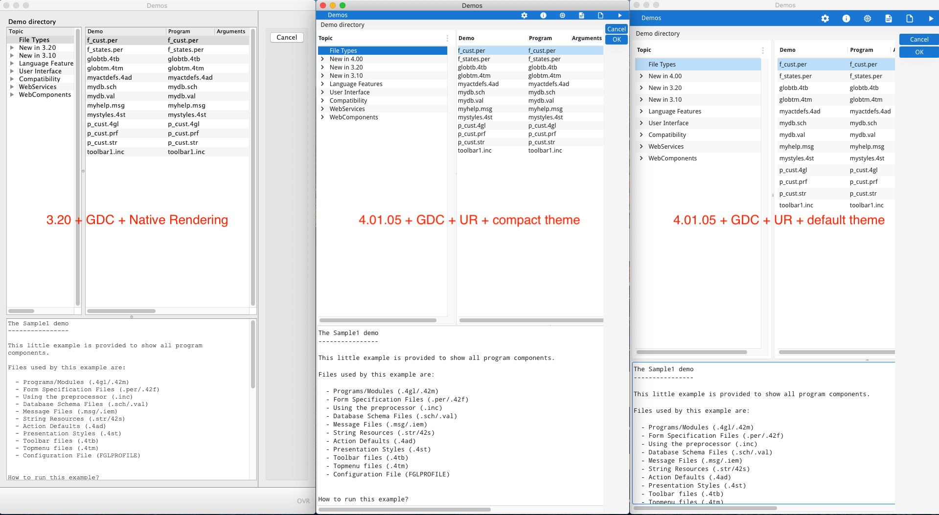
In the recent 4.01.05 GBC release, there is a new theme, the compact theme. Themes allow you to have different look and feels when viewing a Genero application. Previous releases of the GBC have included a highcontrast theme to illustrate what can be done with themes in terms of altering colors and sizes to aid accessibility. The new compact theme focuses on sizing and aims to have a 4.x Universal Rendering screen take a similar amount of space as a 3.x Native Genero Desktop Client application. The first image below shows screens from FGLDIR/demo rendered using :-
…I have arranged the 3 screens horizontally. Hopefully you can see that the two left hand screens (Native Rendering, and Universal Rendering with a compact theme) have similar row sizes and overall have similar heights whilst the screen on the right (Universal Rendering with the default theme) has larger row heights.
Before you say there is some differences, note that there is one extra row of data in the Topic table for 4.00 New Features in the 4.00 screens. You can also think of the addition of the Chrome Bar at the top in 4.X is balanced out by the omission of the StatusBar panel at the bottom in 4.X.
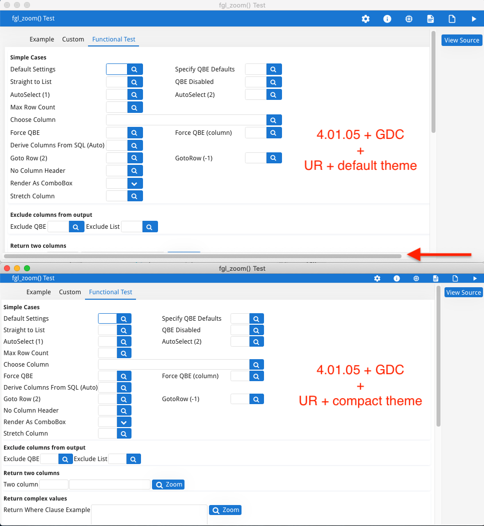
This next image constructed using one of my busy screens in fgl_zoom shows how differences in width can result in the appearance of a scroll bar (arrowed) …
… The content of the top screen using the default theme is wider and results in a horizontal scrollbar. Using the compact theme in the bottom screen, the content is narrower and the horizontal scrollbar disappears.
The compact theme means more data can be displayed in the space available and the concept is that this is similar to the amount of data that could be displayed in the native front-ends.
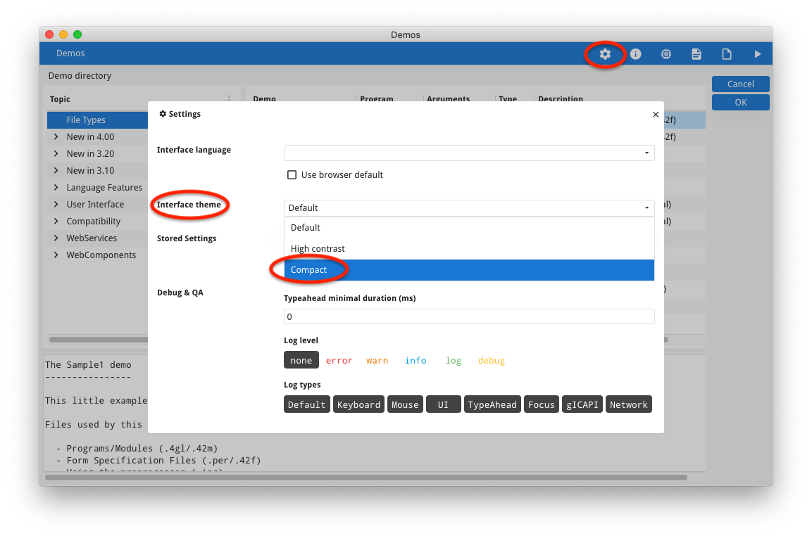
If you had not looked closely at GBC Themes before, there are many ways you can set the theme that is in use. When a Genero application is running, the user can click on the settings icon and select the theme from a drop-down, as in the screenshot below …
The last used Theme is stored along with Stored Settings, and will be used next time you start a Genero application.
You can append ?theme=compact to the URL to force a particular theme at start-up, very handy, along with the gbc= parameter, in the development environment to compare differences.
Programmatically there are also front-calls you can use to list the current and available themes, and to set the theme at runtime. This allows you to add functionality to store a theme with a user or some other record and allow the operator/system administrator to configure what theme they want to appear when a Genero application is started.
You might want to use elements of the compact theme in your GBC customisation. I would encourage you to dig in the GBC sources and determine how the compact theme is implemented.
With the GBC Project sources, look in custom.json, you will see …
    {
      "name": "compact",
      "title": "Compact",
      "uses": ["platform/browser", "colors/compact"]
    },
… this tells you that the compact theme is in the themes/platform/browser and themes/colors/compact directories. The important files unique for compact are in the directory themes/colors/compact (the directory name colors may change in a later version as the purpose has changed over time) and if you peek in there you see just over 20 theme variables that are set to have a lower value than the default value….
{
  "theme-margin-ratio":               0.2,
  "theme-field-height-ratio":         0.6,
  "theme-field-default-height":       "20px",
  "theme-input-padding-top":          "1px",
  ...
  "theme-table-minimal-row-height":   17,
  ...
  "gbc-ChromeBarWidget-height": "18px",
  ...
  "theme-sidebar-default-width": "40px"
}
So something like theme-field-height-ratio, instead of a default value of 0.7, will have a value of 0.6 in the compact theme.
In your own customisation, you can reference that file or you can pick and choose the values you want in your customisation.
If we add a dark theme, it will most likely be done in a similar fashion, only using theme variables that relate to color and not size.
A word of caution though, the default Universal Rendering values have evolved over the various incarnations of the Genero Web Client. Touch screens, using fingers rather than mouse pointers, need to allow for the size of fingers when selecting rows, fields etc. Whilst it may be tempting to use the compact theme so that you do not need to alter forms in moving to Universal Rendering on Desktop Clients, you may find the default Universal Rendering gives a better all round user experience. The better solution maybe to tweak the layout of your forms so that it works well with the Universal Rendering defaults theme sizes.


