Ask Reuben – March 25, 2020
Mandatory Fields
How can I indicate that a field is a mandatory?
How can I automatically add an asterix next to every mandatory field?
A de-facto GUI standard is to indicate that particular fields are mandatory, and a common question is to how to do something similar in Genero screens, as a developers first instinct is to look for a “mandatory” attribute.
There is some debate amongst GUI designers wether indicating mandatory fields is a good idea, some would argue that you should indicate optional fields, and some would argue that if every field on the screen is mandatory, do you need to indicate that it is mandatory? One method screen designers use is to mark a mandatory field with an asterix, but how does a first time user know that the asterix means that the field is mandatory?
From a Genero perspective, you need to first determine what attribute(s) indicate that a field is mandatory. I would argue that the NOT NULL attribute indicates that a field is mandatory. Some people fall into the trap of using the REQUIRED attribute without reading to see what it actually controls, it only requires that the user modifies the field value, it doesn’t require that a non-blank value be entered.
You may decide not to use the NOT NULL attribute to indicate that a field is mandatory and instead place all the validation in a function called from the AFTER FIELD and AFTER INPUT block. This is a valid technique if you are using the same function to validate non GUI input such as via a Web Service, and by using NOT NULL then you run into the possibility of forgetting to include the not null validation inside your function. Some coding standards to avoid this dictate only using NOT NULL to change the appearance or behaviour of a GUI widget such as a CHECKBOX, COMBOBOX, or RADIOGROUP, in which case you might use STYLE or TAG attributes to indicate if a field is mandatory and from that change the appearance.
A number of years ago I put together an example and uploaded to our Github repository that illustrated a number of techniques you can use to indicate that a field is mandatory. This is the ex_redasterix example.
It makes use of the ui.Form.setDefaultInitializer method to call a function every time a form is loaded and make some changes to the form. In the little test program there is a line
CALL ui.Form.setDefaultInitializer("form_init")
and this determines that this function
FUNCTION form_init(f ui.Form)
is executed every time a form is opened. It passes the DomNode of the form as an argument to the function, from which we can then call other ui.Form methods or interrogate or modify the AUI Tree.
The test I am using inside this function to determine if a field is mandatory is to look at the NOT NULL attribute
IF formfield_node.getAttribute("notNull") = 1 THEN
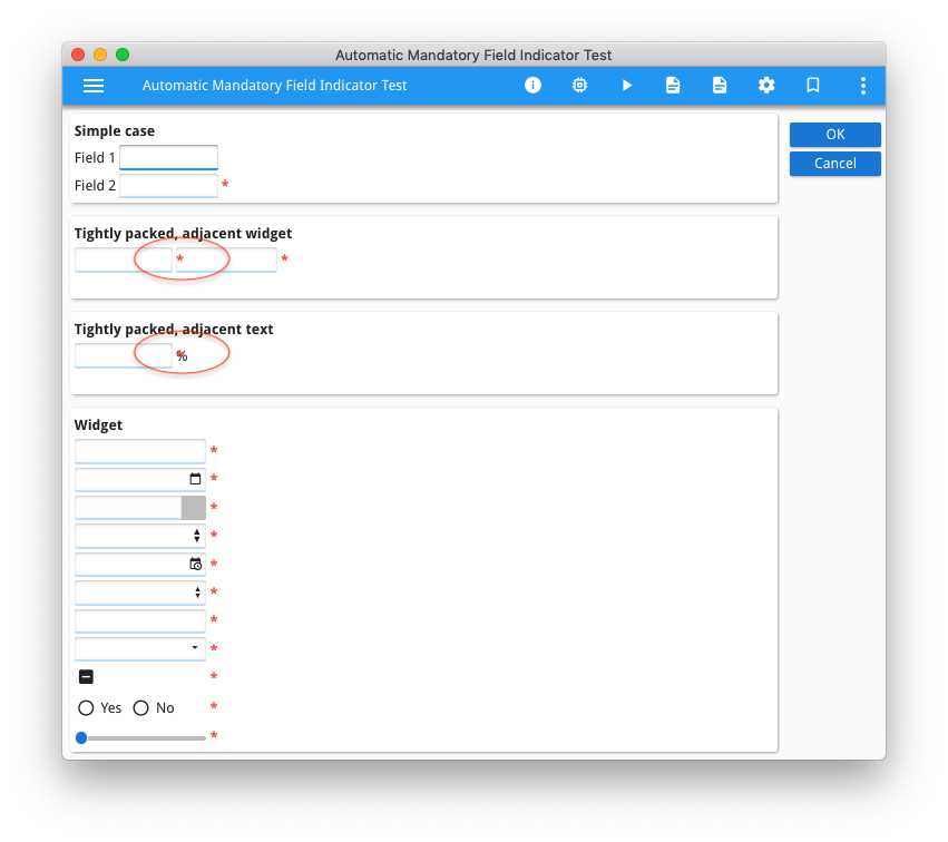
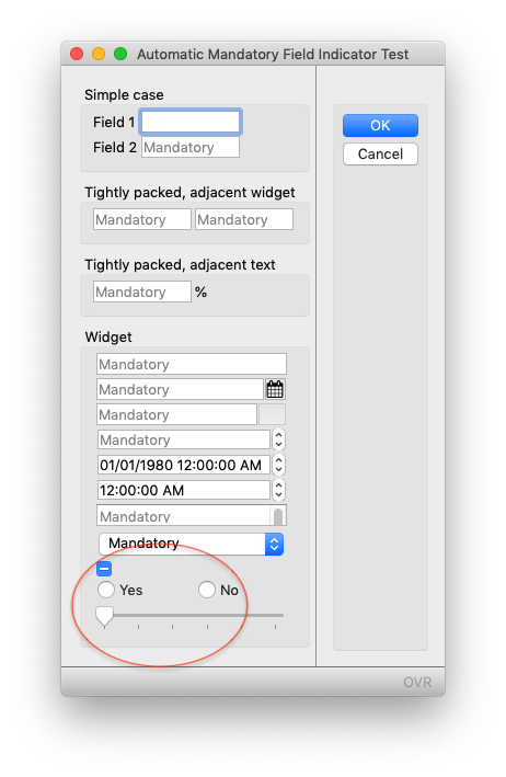
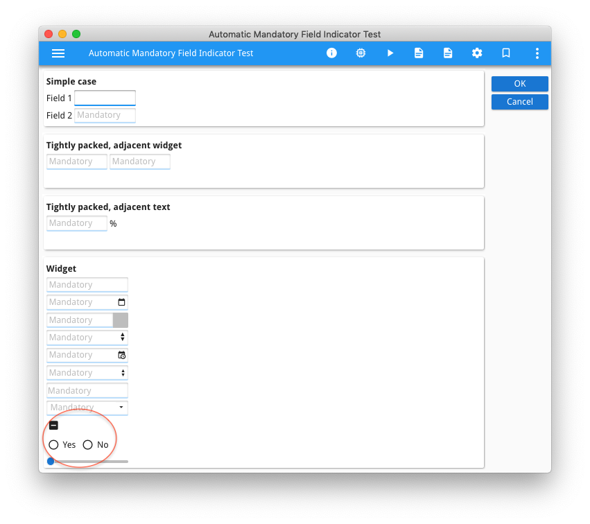
The example shows three different techniques you can use to indicate if a field is mandatory. There are two screenshots for each technique, one showing native GDC and the other Universal Rendering.
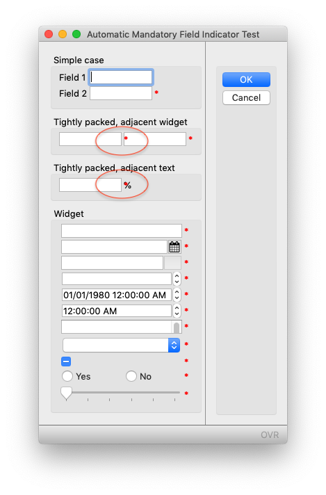
The first approach, for every field that is deemed mandatory, it adds a 1 character wide and tall Label to the right of each field that is mandatory, sets the text attribute to “*” and sets the style so that the asterix is red.
LET star_node = grid_node.createChild("Label")
LET star_y = widget_node.getAttribute("posY")
CALL star_node.setAttribute("posY", star_y)
LET star_x = widget_node.getAttribute("posX")+widget_node.getAttribute("gridWidth")+1
CALL star_node.setAttribute("posX", star_x)
CALL star_node.setAttribute("width", 1)
CALL star_node.setAttribute("height", 1)
CALL star_node.setAttribute("text", "*")
CALL star_node.setAttribute("style", "red_asterix")
The weakness of this approach is that you have to make sure that there is room to display this additional label to the right of the field. If not, it will overlap an adjacent field as highlighted below …
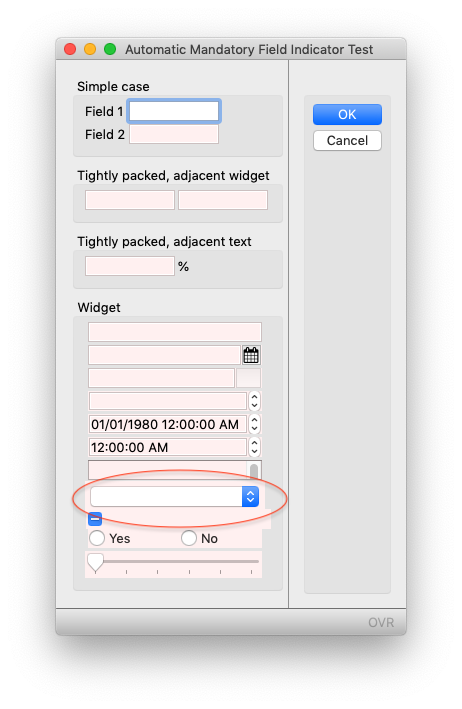
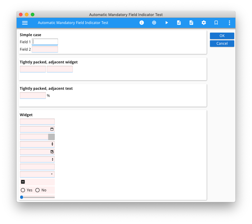
The second approach is that for every field that is deemed mandatory, add a presentation style.
CALL widget_node.setAttribute("style","mandatory")
In the .4st, define this style so that it makes the field stand out. In this case, a light red background.
<Style name=".mandatory">
     <StyleAttribute name="backgroundColor" value="#FFF0F0" ></StyleAttribute>
  </Style>
The weakness of this approach is that not all widgets allow you access to change the background colour. In this case, the native GDC COMBOBOX widget typically does not allow you to change its background colour. (see https://4js.com/ask-reuben/ig-27/ for a possible workaround)
The third approach adds a PLACEHOLDER attribute to display some text to indicate that the field is mandatory.
IF widget_node.getTagName() ! = "CheckBox"
AND widget_node.getTagName() ! = "RadioGroup"
AND widget_node.getTagName() ! = "Slider" THEN
    CALL widget_node.setAttribute("placeholder","Mandatory")
END IF
The weakness of this approach is that not all widgets are able to use the PLACEHOLDER attribute.
There are other possibilities to what I have listed above. One option with STACK is to append “(Mandatory)” or “(Optional)” to the TITLE attribute using a similar technique, or make the title value bold if field is mandatory. Using GBC Customisation you might choose to place an underline beneath a mandatory field, or perhaps place a triangle or asterix in the corner of the widget rather than alongside the widget.
The key thing to determine is how are you going to define what a mandatory or optional field is (NOT NULL, REQUIRED, or perhaps via STYLE or TAG), how are you going to indicate a mandatory field on the screen (asterix, text, colour etc) , and then use ui.Form.setDefaultInitializer to add this indicator when form is opened, thus ensuring that this is applied consistently throughout.


