Ask Reuben – October 21, 2019
Manipulating the GUI Debug Grid
Why is this field the size it is? Part 3 How to Manipulate the GUI Debug Grid
My two previous answers showed you how to bring up the Debug Grid, and then how to understand the Debug Grid and the relationship between widgets in the same grid column. What we saw was how the size of a widget was influenced by the widgets that shared the same column (and row). How a widget could be stretched by the widget(s) above or below it. The last pieces of the puzzle are figuring out the size of a widget before it is influenced or it influences the widgets above or below it. That corresponds to steps 6 and 7 here.
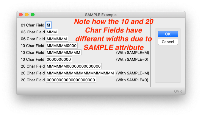
For each widget, an initial size of the widget is calculated. I’ll concentrate on EDIT as this forms the basis of a number of other edit types such as DATEEDIT, BUTTONEDIT. Starting with a CHAR(1), the size of a 1 character EDIT is that required to display the letter “M” using the applicable font and other font-properties. If the field has gridWidth=”6″, then the width required is that to display “MMMMMM”. Beyond 6 characters, the size increases by that necessary to display additional “0”. That is gridWidth=”10″ is big enough to display “MMMMMM0000”. Why is the letter “M” used and why do we increase based on “0” and not “M”. The reason for this is if you are using a proportional font, chances are you will be using some letters that don’t take up much space. Note the difference in width between “MMMMMMMMMM” and “iiiiiiiiii”. The letter “M” is used as this is typically the widest character with a given font. Somewhere along the line our developers came up with the acceptable compromise of 6 M’s followed by 0’s. That is, upto CHAR(6) chances are you are displaying an upshifted alpha-numeric code e.g. Y, TX, USA, BAR001. Beyond that chances are you are display a word, name, address e.g. Yes, Texas, United States of America, Barclay. So for these alpha-numeric codes we need to make sure we have enough space to display the worst-case of all M’s e.g. “MMMMMM”. Beyond that you don’t need all the space offered by an “M” as your text will be predominantly lower-case characters.
You can alter this calculation by use of the SAMPLE attribute . You would consider changing this SAMPLE attribute if you know that your field is typically populated with wider characters or narrower characters. For example, a 10 digit account code it might be best to have a SAMPLE=”MMMMMMMMMM” (or SAMPLE=”M” should have the same effect) to ensure that any 10 digit account code is always fully visible including the worst-case of “MMMMMMMMMM”. Note in the sample below, the rendered width of the various CHAR(10) and CHAR(20) fields is different based on the SAMPLE attribute.
#! grid_sample.4gl
MAIN
DEFINE rec RECORD
    a CHAR(1),
    abc CHAR(3),
    abcdef CHAR(6),
    abcdefghi1 CHAR(10),
    abcdefghi2 CHAR(10),
    abcdefghi3 CHAR(10),
    abcdefghijklmnopqrs1 CHAR(20),
    abcdefghijklmnopqrs2 CHAR(20),
    abcdefghijklmnopqrs3 CHAR(20)
END RECORD

    CLOSE WINDOW SCREEN

    LET rec.a = "M"
    LET rec.abc = "MMM"
    LET rec.abcdef = "MMMMMM"
    LET rec.abcdefghi1 = "MMMMMM0000"
    LET rec.abcdefghi2 = "MMMMMMMMMM"
    LET rec.abcdefghi3 = "0000000000"
    LET rec.abcdefghijklmnopqrs1 = "MMMMMM00000000000000"
    LET rec.abcdefghijklmnopqrs2 = "MMMMMMMMMMMMMMMMMMMM"
    LET rec.abcdefghijklmnopqrs3 = "00000000000000000000"

    OPEN WINDOW w WITH FORM "grid_sample"
    INPUT BY NAME rec.* ATTRIBUTES(WITHOUT DEFAULTS=TRUE)
END MAIN
#! grid_sample.per
LAYOUT (TEXT="SAMPLE Example")
GRID
{
01 Char Field [a: ]
03 Char Field [abc: ]
06 Char Field [abcdef: ]
10 Char Field [abcdefghi1: ]
10 Char Field [abcdefghi2: ] (With SAMPLE=M)
10 Char Field [abcdefghi3: ] (With SAMPLE=0)
20 Char Field [abcdefghijklmnopqrs1: ]
20 Char Field [abcdefghijklmnopqrs2: ] (With SAMPLE=M)
20 Char Field [abcdefghijklmnopqrs3: ] (With SAMPLE=0)
}
# 12345678901234567890 helps confirm alignment
END
END
ATTRIBUTES
EDIT a = formonly.a;
EDIT abc = formonly.abc;
EDIT abcdef = formonly.abcdef;
EDIT abcdefghi1 = formonly.abcdefghi1;
EDIT abcdefghi2 = formonly.abcdefghi2, SAMPLE="MMMMMMMMMM";
EDIT abcdefghi3 = formonly.abcdefghi3, SAMPLE="0000000000";
EDIT abcdefghijklmnopqrs1 = formonly.abcdefghijklmnopqrs1;
EDIT abcdefghijklmnopqrs2 = formonly.abcdefghijklmnopqrs2, SAMPLE="MMMMMMMMMMMMMMMMMMMM";
EDIT abcdefghijklmnopqrs3 = formonly.abcdefghijklmnopqrs3, SAMPLE="00000000000000000000";With an EDIT type widget you would typically make sure that the gridWidth equals the number of characters of the data-type e.g. CHAR(2) is [xx], CHAR(6) is [abcdef] etc, for numeric data-types wide enough for your FORMAT attribute e.g. FORMAT=”—,–&.&&” dictates a minimum gridWidth=”10″. For BUTTONEDIT, DATEEDIT, you add an allowance of 2 for the icon e.g. CHAR(6) BUTTONEDIT would be [abcdefgh] ie gridWidth=”8″. For DATEEDIT’s this means that gridWidth=”12″, that is enough to display “dd/mm/yyyy” and 2 characters for the icon.
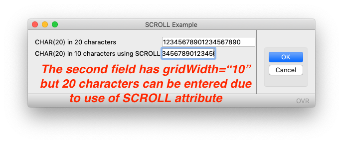
For larger data-types, you would typically use TEXTEDIT as this allows you to enter more than one line of text. If you are using a one line EDIT for a wide field e.g. a CHAR(40) name or address field, you might decide that this takes up too much space for the expected data-values. An attribute you can use here is the SCROLL attribute. You would typically use this for cases such as a CHAR(40) name and address fields where you only want it to take up the equivalent amount of space as say for a CHAR(30). On the rare occasion a user needs to enter more than 30 characters, he/she user can enter the additional characters and the widget will scroll the content as you enter it. Note how in the example below, the second widget is allowing you to enter more data that can fit in the field. The eagle-eyed amongst you may question why the spare space in the first field. This is because with no SAMPLE specified, the width is calculated as to display “MMMMMM00000000000000” and with most proportional fonts this is wider than “12345678901234567890”.
#! grid_scroll.4gl
MAIN
DEFINE rec RECORD
    normal CHAR(20),
    scroll CHAR(20)
END RECORD

    CLOSE WINDOW SCREEN
    LET rec.normal = "12345678901234567890"
    LET rec.scroll = rec.normal

    OPEN WINDOW w WITH FORM "grid_scroll"
    INPUT BY NAME rec.* ATTRIBUTES(WITHOUT DEFAULTS=TRUE)
END MAIN
#! grid_scroll.per
LAYOUT (TEXT="SCROLL Example")
GRID
{
CHAR(20) in 20 characters [abcdefghijklmnopqrst: ]
CHAR(20) in 10 characters using SCROLL [abcdefghij: ]
}
END
END
ATTRIBUTES
abcdefghijklmnopqrst = formonly.NORMAL;
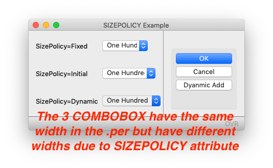
abcdefghij= formonly.SCROLL, SCROLL;Another attribute to investigate is the SIZEPOLICY attribute. This can be used to set the initial width and then what happens if the properties/attributes change, does the size of the widget change to match. A good widget to relate this to is the COMBOBOX. If the item-list is only populated by the ITEMS attribute then when the form is first rendered, we know the maximum width of the COMBOBOX. But if you have used the INITIALIZER attribute and/or the ui.ComboBox class to populate the item list then the size of the COMBOBOX can potentially change as required in order to display the widest value in the list. The SIZEPOLICY value determines what to base the initial size on and if it can be changed.
In the example below, the first widget has SIZEPOLICY=FIXED and its width is independent of the Items List and so is determined purely by the gridWidth as defined in the .per. The second widget has SIZEPOLICY=INITIAL and so has enough space to display the widest value in the Items List at first rendering, in this case “One Hundred”. The third widget has SIZEPOLICY=DYNAMIC and illustrates that the ComboBox has stretched to accomodate the new widest value in the list “Three Hundred”
#!grid_sizepolicy.4gl
MAIN
DEFINE rec RECORD
    fixed CHAR(1),
    initial CHAR(1),
    dynamic CHAR(1)
END RECORD
DEFINE cb RECORD

    fixed ui.ComboBox,
    initial ui.ComboBox,
    dynamic ui.ComboBox
END RECORD

    CLOSE WINDOW SCREEN
    LET rec.initial = 1
    LET rec.fixed = 1
    LET rec.dynamic = 1

    OPEN WINDOW w WITH FORM "grid_sizepolicy"
    INPUT BY NAME rec.* ATTRIBUTES(WITHOUT DEFAULTS=TRUE)
        BEFORE INPUT
            LET cb.initial = ui.ComboBox.forName("initial")
            LET cb.fixed = ui.ComboBox.forName("fixed")
            LET cb.dynamic = ui.ComboBox.forName("dynamic")

            CALL  cb.initial.addItem(1,"One Hundred")
            CALL  cb.fixed.addItem(1,"One Hundred")
            CALL  cb.dynamic.addItem(1,"One Hundred")
            CALL  cb.initial.addItem(2,"Two Hundred")
            CALL  cb.fixed.addItem(2,"Two Hundred")
            CALL  cb.dynamic.addItem(2,"Two Hundred")

        ON ACTION dynamic_add ATTRIBUTES(TEXT="Dyanmic Add")
            CALL  cb.initial.addItem(3,"Three Hundred")
            CALL  cb.fixed.addItem(3,"Three Hundred")
            CALL  cb.dynamic.addItem(3,"Three Hundred")
    END INPUT
END MAIN
#! grid_sizepolicy.per
LAYOUT (TEXT="SIZEPOLICY Example")
GRID
{
SizePolicy=Fixed [f01 : ]
[" "]
SizePolicy=Initial [f02 : ]
[" "]
SizePolicy=Dynamic [f03 : ]
}
END
END
ATTRIBUTES
COMBOBOX f01 = formonly.fixed, SIZEPOLICY=FIXED;
COMBOBOX f02 = formonly.INITIAL, SIZEPOLICY=INITIAL;
COMBOBOX f03 = formonly.dynamic, SIZEPOLICY=DYNAMIC;Each Widget has its own set of properties that may influence the size of a widget. For example ORIENTATION as used with a RADIOGROUP will drastically influence the width/height if set to VERTICAL or HORIZONTAL. We saw last week that the ITEMS attribute with a COMBOBOX is used to ensure the COMBOBOX is wide enough to display the widest value. The STRETCH attribute can be used for widgets such as TEXTEDIT, IMAGE to re-size if there is space available. That is as the user resizes the window and there is more space available, does the widget will resize. As a result these widgets don’t impact the size of other widgets but fit into the space available.
In the documentation, each WIDGET has its own list of attributes for that particular widget.
To wrap-up and get back to the rendering of a GRID, the way I like to think of this …
- the initial size for all widgets is calculated and is influenced by a number of attributes.
- the widget is placed in the GRID at the specified location in the grid as influenced by posX.
- in order for the widget to be placed across the correct number of columns (gridWidth), the underlying columns may be made widget so that the widget ends in the correct column.
- any widget above or below that shares these columns will also be made wider
The Debug Grid can help you identify where the columns have been made wider.
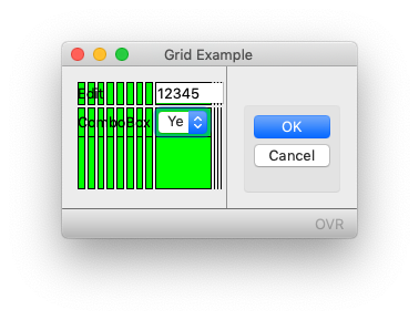
So if we go back to the typical error I showed last week, the COMBOBOX has gridWidth=”1″.
- The initial size for the COMBOBOX and EDIT were calculated
- Both widgets have the same posX so start at the same column
- The EDIT had a higher gridWidth than the COMBOBOX so it needed to end to the right of the COMBOBOX
- The COMBOBOX due to the values in its Items List needed to be wider than the one column it had been allocated to so that column needed to be made wider so that the COMBOBOX could be rendered
- This column was shared by the EDIT and so as a result the EDIT was made wider
We learned today that there are attributes that could have been used to influence the size of the widgets, we learned in previous weeks how the widgets were relative to one another, how to define, and if needed break that relationship, and before that how to bring up the Debug Grid and the helpful green rectangles.
To avoid typical errors
- Ensure that the number of columns and rows allocated to the widget are appropriate for the type of widget and expected data content
- Note how the position of the widgets in the Grid are related to each other. If the start and/or end position of the widgets are intended to be independent of one another, then ensure that independence is reflected in the form definition by use of HBOX Layout Tags.
Those are the two things I will look for in conjunction with the Debug Grid when someone asks why a widget is a particular size.
A final point I want to make. Note with the above how I had 3 small example programs that illustrated a particular attribute. I am assuming that as a Genero developer you have the ability to add these files to Genero Studio and build and execute them, or if you prefer the command line the ability to execute
fglform filename.per

fglcomp filename.4gl

fglrun filename
There are some sites I have been at that have a development environment that contain a number of scripts that hide what goes on behind the scenes when a Genero application is built at that development site. As a result some members of the development team do not know that the above commands are the steps required to compile and run a simple Genero program. If you are reading this and think you fall into this category, please speak to your senior developer and/or support contact so that you have the ability in your development environment to easily create and run simple programs such as those above, this will allow you to experiment and learn.


