Ask Reuben – March 25, 2020
Rounded Images
How do I render an image as a circle?
The solution of how to create a rounded image is a good one to demonstrate the benefits of the customisation feature of Universal Rendering. If you look to achieve this using our Native User Interface front-end, you won’t see an Image attribute or Presentation Style that achieves this. However Web Interfaces have a very simple CSS style that achieves this and Universal Rendering can use this same CSS style via customisation.
The CSS that achieves this is to use the CSS border-radius property. Normally this is set to a small value such as 10% to create the effect of a rectangle with rounded corners. However if you set this to 50% then the rounded corners meet in the middle to effectively make a circle. Using W3Schools you can use the try-it-yourself page to see the effects of this property. Note what happens with values of 0%, 10%, 25%, 50%.
So that shows how Web Developers achieve this, how do you do this with Universal Renderer via customization? You can add some CSS by inserting into your customization .scss file gbc-project-dir/customization/customization-project-dir/sass/customization.scss as noted here http://4js.com/online_documentation/fjs-gbc-manual-html/howdoi/customize-scss/index.html. Add this simple entry (don’t forget to run grunt to compile your customization) … … and use the STYLE attribute for any field in your .per / .4fd to reference this style … … and don’t forget to point your user interface at your customisation. The question you might then ask is how do you know that the CSS style selector is .gbc_ImageWidget.gbc_style_rounded. .gbc_ImageWidget is the style selector that is added for Image widgets, all other widgets and containers will have a similar selector .gbc_style_rounded is the style selector that is added when you have STYLE=”rounded” in the form definition. ie. .gbc_style_stylename is added. Using a browsers developer tools feature you can see these two style selectors in the generated .html and .css …
.gbc_ImageWidget.gbc_style_rounded {
    border-radius: 50%;
}
IMAGE f01 = formonly.field-name, STYLE=”rounded”;
You can use this same technique to add more CSS styles into your user interface. Look at the generated html to see the value for the style selectors for the widget/container and the value of the STYLE attribute, and then use those as selectors in customization.scss.
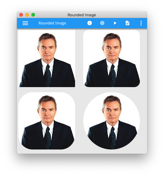
A quick program to demonstrate this and the resultant screenshot is below. This shows not only a rounded image but also different values for border-radius and how a rounded rectangle becomes a circle when this value is 50%. Replace the image name in the code with your own image, a square image will work best.
#! customization.scss

.gbc_ImageWidget.gbc_style_rounded10 {
    border-radius: 10%;
}
.gbc_ImageWidget.gbc_style_rounded25 {
    border-radius: 25%;
}
.gbc_ImageWidget.gbc_style_rounded50 {
    border-radius: 50%;
}
#! askreuben45.4gl
MAIN
CLOSE WINDOW SCREEN
CALL ui.Interface.loadStyles("askreuben45.4st")
OPEN WINDOW w WITH FORM "askreuben45"
DISPLAY "askreuben45" TO img1
DISPLAY "askreuben45" TO img2
DISPLAY "askreuben45" TO img3
DISPLAY "askreuben45" TO img4
MENU ""
ON ACTION close
EXIT MENU
END MENU
END MAIN<!-- #! askreube45.4st -->
<?xml version="1.0" encoding="ANSI_X3.4-1968"?>
<StyleList>
<Style name="Window">
<StyleAttribute name="windowType" value="normal" ></StyleAttribute>
</Style>
<Style name="Image">
<StyleAttribute name="border" value="none" ></StyleAttribute>
</Style>
<Style name="Window">
<StyleAttribute name="backgroundColor" value="#E7E7E7" ></StyleAttribute>
<StyleAttribute name="ringMenuPosition" value="chrome" ></StyleAttribute>
</Style>
</StyleList>#! askreuben45.per
LAYOUT (TEXT="Rounded Image")
VBOX
HBOX
GRID
{
[i01]
}
END
GRID
{
[i02]
}
END
END
HBOX
GRID
{
[i03]
}
END
GRID
{
[i04]
}
END
END
END
ATTRIBUTES
IMAGE i01 = formonly.img1, AUTOSCALE;
IMAGE i02 = formonly.img2, AUTOSCALE,STYLE="rounded10";
IMAGE i03 = formonly.img3, AUTOSCALE,STYLE="rounded25";
IMAGE i04 = formonly.img4, AUTOSCALE,STYLE="rounded50";


