Ask Reuben – November 11, 2024
Quick Responsive Demo
What is Responsiveness?
What can you quickly do with Responsiveness?
Genero 4.00 in 2021 introduced the concept of Responsiveness. Since then I have had a demo that I have used to illustrate in ten minutes or so, some of what you can do with the concept of Responsiveness in Genero. Over time that demo has been slowly added to. In this article I’d like to put in writing, some of those main points. The code for the demo can be found at the end of this article. I typically ran the demo using the GDC. It does not really matter if I run the demo using GDC, or GBC in a Browser, I typically chose the GDC as it opens in a dedicated window rather than a browser tab, so the default size is the default size as opposed to the size of the Browser window. I would then resize the window to a larger and smaller size to illustrate characteristics of the rendering. I would then make a small change in the .per or .4st, typically by uncommenting something to add an extra attribute that I had commented out in advance, I would then recompile, run the program and show the impact of adding or using this attribute. To illustrate why responsiveness is needed, I would run the program and point out the characteristics of the window. It is a typical header/detail, in the top half is the Header, broken into two Groups, the Top Left Group, and the Top Right Group. In the bottom half there is the Detail rendered in a Table. You most likely have a number of screens similar, a Grid at the top, a Table at the bottom.
Starting Position, Why is Responsive Needed ?
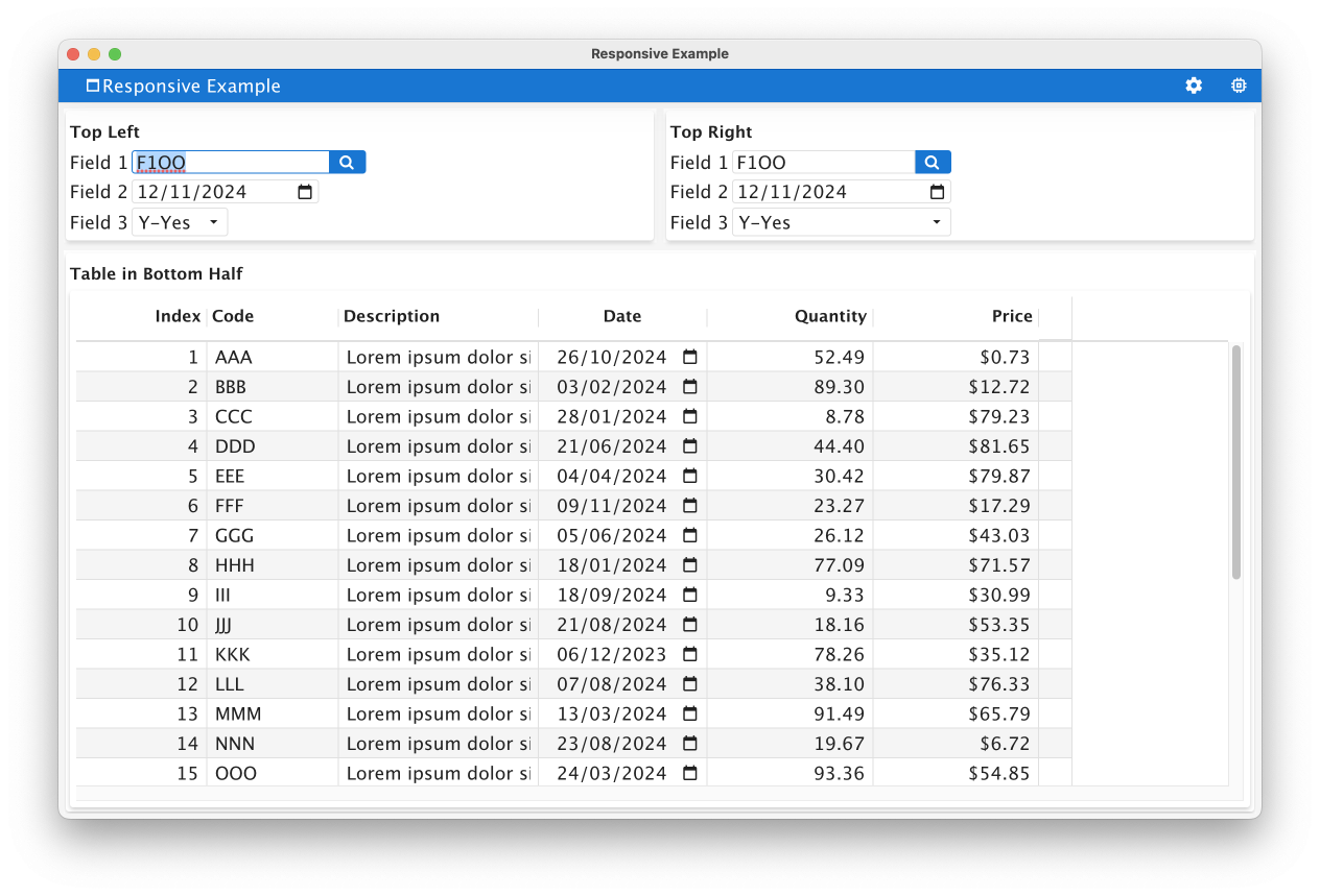
When resizing smaller, note how you cannot see the bulk of the information that is in the Top Right Group. Similarly you can only see the first few columns of the Table.
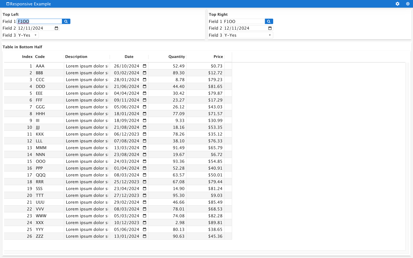
When resizing larger, note the large amounts of empty space that appear to the right of the table. Similarly in the two Groups at the top there is also some unused space.
Adding STRETCH=X to One Table Column
First change I make as part of the demo is to deal with large amount of space to the right of the Table.
I change line 45 of the .per from
EDIT c03 = formonly.col3, TITLE="Description", SCROLL;#, STRETCH=X;
to
EDIT c03 = formonly.col3, TITLE="Description", SCROLL, STRETCH=X;
That is I delete the semi-colon and comment so that there is now a STRETCH=X attribute.
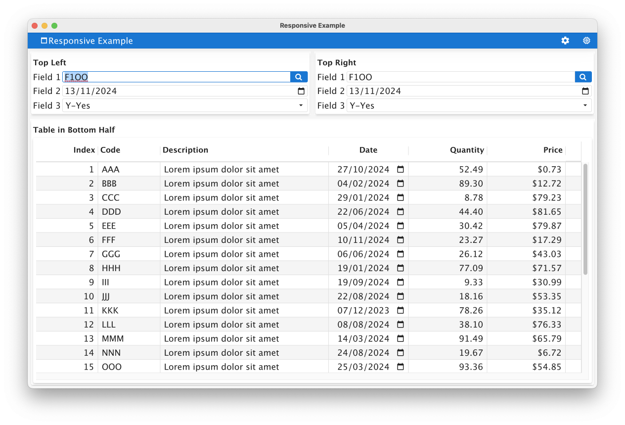
If I run the program again, we now see that with the default size, the amount of space to the right has now been allocated to the ‘Description’ column.
When resizing smaller, it does not make too much noticeable difference (and we will come to techniques for dealing with that later …
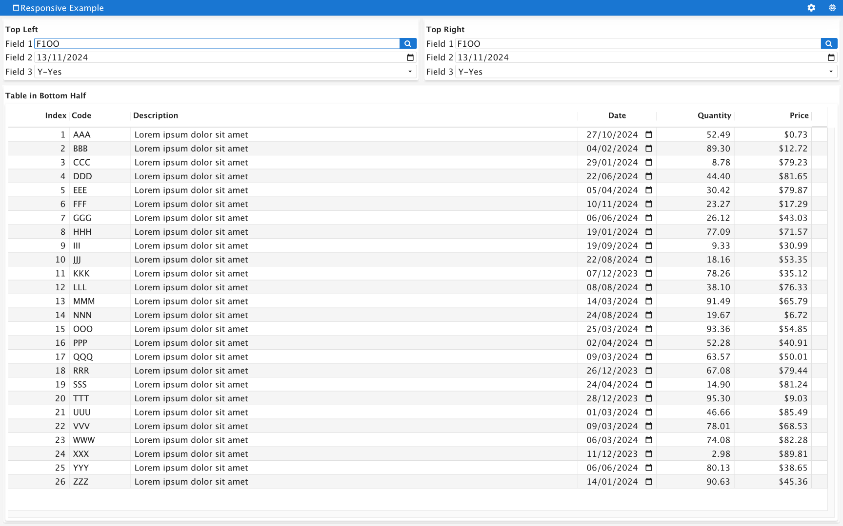
With the larger rendering, we now see that there is a large amount of space allocated to the “Description’ column. You might not think it looks too great but if you closely you will see that with my dummy data, the full amount of the dummy data “Lorem ipsum dolor sit amet” is now being displayed as opposed to the truncated “Lorem ipsum dolor s” previously. With normal data, chances are you would have the odd longer description that now has many more of its characters rendered.
You will typically find that in most tables, there is one column that is a CHAR(30), CHAR(40) etc that contains a name or a description. This column is the prime candidate to have STRETCH=’X’ added.
Adding STRETCH=X To Multiple Table Columns
If there is more than one column that is a good candidate to add STRETCH=X to, you can add STRETCH=X to other columns. Typically numeric, date, and what I call ‘code’ columns e.g. CHAR(10), CHAR(15) etc with alpha-numeric codes are not good candidates to use STRETCH=X to. If you add STRETCH=X to multiple columns, the additional space will be allocated to all columns with STRETCH=X in proportion. We can demonstrate this by repeating the change we made to line 45 of the .per to the previous column, the “Code” column. We should now see that this column stretches as the window is resized as well.
I will just show the large window here, note how the Column and Description column have both stretched. Given that all the data in the Code column is a CHAR(3) it was a poor candidate to be stretched.
Adding STRETCH=X in a GRID
There is still lots of white space in the two GRID’s. What we can do is use STRETCH=X to make fields stretch inside the GRID as well. As fields in a GRID are aligned with each other based on their definition in the form file, you do not have to apply STRETCH=X to every field. If you add STRETCH=X to one field, this will typically have the impact of widening the grid columns that individual field is rendered across in the GRID and all fields that are in this grid columns will get wider. Have a look at the Grid based layout of the documentation and the section on Form Item dependencies.
So in this example, do a similar change on line 35 and line 39, that is I delete the ; and #, so that the STRETCH=X property is used. So line 35 …
BUTTONEDIT l01 = formonly.left1, SCROLL, ACTION=zoom, IMAGE="fa-search";#, STRETCH=X;
… becomes …
BUTTONEDIT l01 = formonly.left1, SCROLL, ACTION=zoom, IMAGE="fa-search", STRETCH=X;
(and similar for line 39).
If we now run the program and again I’ll just show the larger window size, note how the fields in the top two grids are wider and take up more space …
Reviewing Field Alignment in a GRID
The first thing you might ask is why is the end of the fields in the Top Left group staggered? This is because they are staggered in the .per. Compare the position of the end ] in the two Grids. The Top Left grid has them staggered, whilst the Top Right grid has them aligned.
If I change the fields in the Top Left Group so that they too are aligned, that is go from
Field 1 [l01            ]
Field 2 [l02         ]
Field 3 [l03    ]
… to …
Field 1 [l01            ]
Field 2 [l02            ]
Field 3 [l03            ]
then these fields in this Grid was also align.
FLIPPED@
Upto now, I have focussed on what can be done when the user interface is bigger. What about smaller? First thing I do is in line 26, remove the # so that
TABLE #(FLIPPED@MEDIUM, FLIPPED@SMALL)
becomes
TABLE (FLIPPED@MEDIUM, FLIPPED@SMALL)
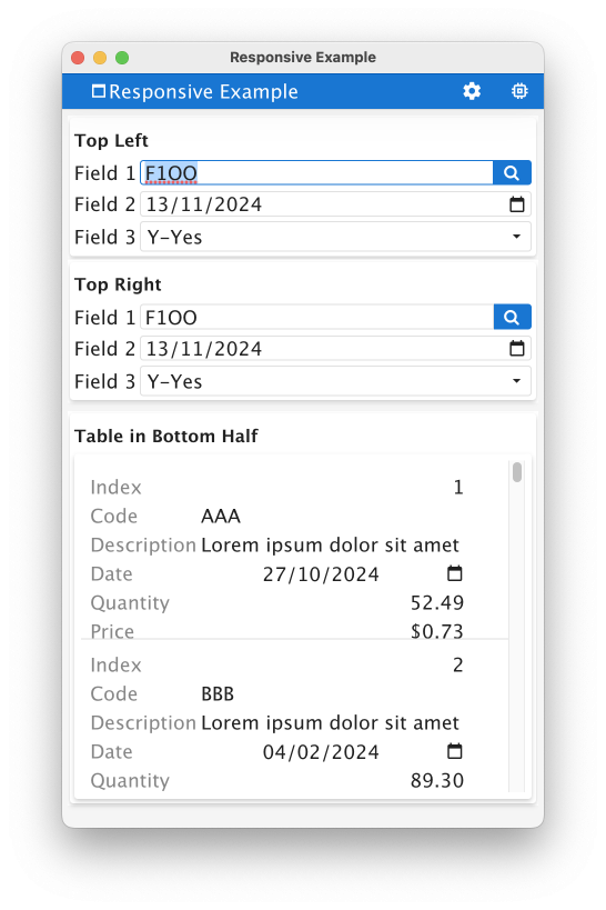
Now when we run the application, if we pay attention when the form is small, notice that the rendering of the table changes. Instead of columns going across, each column is its own line.
For phone sized devices, this is a better rendering to display information and we now only have to scroll vertically to look at more rows of data.
The @MEDIUM, @SMALL in the syntax says that this change to FLIPPED will only occur on small and medium sized devices.
ORIENTATION@
For the two groups at the top we can do something similar. What we can do is change the orientation of an HBOX to be VBOX on smaller devices. So on line 5 of the .per, if we remove the # so that. …
HBOX #(ORIENTATION@SMALL=VERTICAL,ORIENTATION@MEDIUM=VERTICAL)
… becomes …
HBOX (ORIENTATION@SMALL=VERTICAL,ORIENTATION@MEDIUM=VERTICAL)
… we are now making the HBOX orientate vertically on smaller devices.
We are now at a point where we have a user interface that displays well on the three sizes we are looking at. The default size …
The large size uses space more effectively …
The small size allows you to view any additional information by scrolling in the vertical direction only …
modalOnLargeScreen
There is one more change I had in the demo and it was something I added when it was made available in GBC 4.01.15.
In the two GROUP boxes you will notice the BUTTONEDIT. If you click on them they render a typical modal window allowing you to select a value to populate the BUTTONEDIT….
However on a small device, this modal window does not look as good. It typically takes up most if not all of the screen…
… what you do is make a change in the .4st. For your modal windows, change the value of the Style attributes for your modal window style from name=”windowType” value=”modal” to name=”windowType” value=”modalOnLargeScreen”. (For the demo to save typing modalOnLargeScreen, what I do is add an X and remove an X to the two windowType values so that one is used and one is not.)
This has the impact that the modal window will only be modal on a large device, otherwise it will treat the window as a normal window
Now on a small screen, the window that appears when you click on the ButtonEdit button appears as a normal window (i.e. full size) rather than a modal window…
Not Shown
Not all responsive features are covered by this demo. If someone asked a question then I might dive into one of these areas. I also like developers to go off and do some of their own research rather than being given everything on a plate. So take this program and review some of the responsive features below …
Hiding Form Elements – Just as FLIPPED and ORIENTATION can change based on device size, so too can you change the HIDDEN attribute to hide containers/fields as the device size changes. Personally I am not a fan of this technique, I figure if it is important enough to show on a large device, it is important enough to show on a small device.
if you want to see it add HIDDEN@SMALL to one of the fields, columns or containers and note what happens when you shrink the window.
One thing you can do with this technique is allow the same information to be presented in two different views, and you hide one of the views based on the device size. For instance on a larger device you might use a TEXTEDIT with HIDDEN@SMALL, whilst on a small device you might show the first characters in a BUTTONEDIT with HIDDEN@MEDIUM, HIDDEN@LARGE. That is display either the TEXTEDIT or BUTTONEDIT but not both. Then add code so that if the user clicks on the BUTTONEDIT, they see a modal window that displays the full value in a TEXTEDIT.
Similarly you might on a small device, display one summary field and hide multiple detail fields, and then on larger devices display the individual detail fields and hide the summary field.
Horizontal Box Splitting – instead of showing all children of a horizontally orientated HBOX or VBOX, use SPLIT to only render one of the children and allow the user to swipe between the children of the container. I don’t typically show it with this example as it looks best when there is only a single HBOX. If needed I will demonstrate by in the .per commenting out the VBOX (line 2), an END (line 22) and add (SPLIT) to the HBOX on line 3.
With a TABLE, you can add STRETCHCOLUMNS as a Table attribute to be the equivalent of adding STRETCH=X to all columns. To restrict a columns ability to stretch, you can use STRETCH=NONE, or add STRETCHMIN, STRETCHMAX. With this example you can experiment by adding STRETHCCOLUMNS to the TABLE attribute on line 26. You will most likely find that the numeric and date columns stretch or shrink too much, and you can then add STRETCHMIN=, STRETCHMAX= to lines 43-48.
You can add LAYOUT (STRETCH=X) to the top of the form, all form elements that allow STRETCH=X will then inherit this. I am not a fan of this technique as LABELs inside a GRID will also stretch. Certainly look at the strategy of using this and explicitly stating what elements you don’t want to stretch, or not using it and defining what elements you do want to stretch. Using HBox tags may also stop elements from unwanted stretching.
Also note that for mobile devices, the default is LAYOUT (STRETCH=X) whilst for desktop devices, the default is LAYOUT (STRETCH=NONE). If you don’t want mobile devices to have this default, add (STRETCH=NONE) to the LAYOUT node.
Adapting to ViewPort changes – the predefined action ON ACTION windowsized can be used in conjunction with the feinfo/windowSize front-call to have the 4gl respond to changes in the window size. At the moment, this is how you might have a GRID respond to changes in the window size, a technique I touched on here.
GBC Customisation can be used to control the definition of what medium and small devices are. See here for the two responsive theme variables. It should be noted that the default values for small and medium differ from other responsive definitions. and you may want to increase the sizes via customisation so that small relates to a typical phone device, medium relates to a typical tablet device.
Before / After Images
These images show the before and after of adding the responsive syntax

Summary
In making the jump from 3.00 to 4.00 and above, when you review your code, I would encourage you to add some minimal responsiveness as illustrated by this example. That would include …
- making at one column in every TABLE STRETCH=X. This is typically the column that contains a name or a description. Do not use resizeFillsEmptySpace presentation style, if you have remove it.
- review use of FLIPPED@SMALL, FLIPPED@MEDIUM for all Tables
- review use of ORIENTATION=VERTICAL@SMALL, ORIENTATION=VERTICAL@MEDIUM for all HBOX
- review use of modalOnLargeSceen presentation style for modal windows.
These are simple changes and can be incorporated easily into your next release.
At the moment, GRID require a little bit more work. You can consider adding …
- STRETCH=X to one or more fields in the GRID
- or STRETCH=X to LAYOUT node
- reviewing the alignment of fields in the GRID
You may also find reviewing container usage within a form. If you have a GRID with Layout tags to embed GROUP, SCROLLGRID, TABLE inside a GRID, you may find it beneficial to instead not use GRID but build up your form with a combination of HBOX and VBOX containers.
#! responsive.per
LAYOUT (TEXT="Responsive Example")
VBOX
HBOX #(ORIENTATION@SMALL=VERTICAL,ORIENTATION@MEDIUM=VERTICAL)
GROUP (TEXT="Top Left")
GRID
{
Field 1   [l01            ]
Field 2   [l02         ]
Field 3   [l03   ]
}
END
END
GROUP (TEXT="Top Right")
GRID
{
Field 1   [r01            ]
Field 2   [r02            ]
Field 3   [r03            ]
}
END
END
END
GROUP (TEXT="Table in Bottom Half")
TABLE #(FLIPPED@MEDIUM, FLIPPED@SMALL)
{
[c01     |c02     |c03           |c04         |c05        |c06        ]
}
END #TABLE
END #GROUP
END #VBOX
END #LAYOUT
ATTRIBUTES
BUTTONEDIT l01 = formonly.left1, SCROLL, ACTION=zoom, IMAGE="fa-search";#, STRETCH=X;
DATEEDIT l02 = formonly.left2;
COMBOBOX l03 = formonly.left3, ITEMS=(("Y","Y-Yes"),("N","N-No"));

BUTTONEDIT r01 = formonly.right1, SCROLL, ACTION=zoom, IMAGE="fa-search";#, STRETCH=X;
DATEEDIT r02 = formonly.right2;
COMBOBOX r03 = formonly.right3, ITEMS=(("Y","Y-Yes"),("N","N-No"));

EDIT c01 = formonly.col1, TITLE="Index";
EDIT c02 = formonly.col2, TITLE="Code";#, STRETCH=X;
EDIT c03 = formonly.col3, TITLE="Description", SCROLL;#, STRETCH=X;
DATEEDIT c04 = formonly.col4, TITLE="Date", JUSTIFY=CENTER;
EDIT c05 = formonly.col5, TITLE="Quantity", FORMAT="####,##&.&&";
EDIT c06 = formonly.col6, TITLE="Price", FORMAT="$$$$,$$&.&&";

INSTRUCTIONS
SCREEN RECORD scr(col1, col2, col3, col4, col5, col6)
#! responsive.per
LAYOUT (TEXT="Responsive Example")
VBOX
HBOX #(ORIENTATION@SMALL=VERTICAL,ORIENTATION@MEDIUM=VERTICAL)
GROUP (TEXT="Top Left")
GRID
{
Field 1 [l01 ]
Field 2 [l02 ]
Field 3 [l03 ]
}
END
END
GROUP (TEXT="Top Right")
GRID
{
Field 1 [r01 ]
Field 2 [r02 ]
Field 3 [r03 ]
}
END
END
END
GROUP (TEXT="Table in Bottom Half")
TABLE #(FLIPPED@MEDIUM, FLIPPED@SMALL)
{
[c01 |c02 |c03 |c04 |c05 |c06 ]
}
END #TABLE
END #GROUP
END #VBOX
END #LAYOUT
ATTRIBUTES
BUTTONEDIT l01 = formonly.left1, SCROLL, ACTION=zoom, IMAGE="fa-search";#, STRETCH=X;
DATEEDIT l02 = formonly.left2;
COMBOBOX l03 = formonly.left3, ITEMS=(("Y","Y-Yes"),("N","N-No"));
BUTTONEDIT r01 = formonly.right1, SCROLL, ACTION=zoom, IMAGE="fa-search";#, STRETCH=X;
DATEEDIT r02 = formonly.right2;
COMBOBOX r03 = formonly.right3, ITEMS=(("Y","Y-Yes"),("N","N-No"));
EDIT c01 = formonly.col1, TITLE="Index";
EDIT c02 = formonly.col2, TITLE="Code";#, STRETCH=X;
EDIT c03 = formonly.col3, TITLE="Description", SCROLL;#, STRETCH=X;
DATEEDIT c04 = formonly.col4, TITLE="Date", JUSTIFY=CENTER;
EDIT c05 = formonly.col5, TITLE="Quantity", FORMAT="####,##&.&&";
EDIT c06 = formonly.col6, TITLE="Price", FORMAT="$$$$,$$&.&&";
INSTRUCTIONS
SCREEN RECORD scr(col1, col2, col3, col4, col5, col6)<?xml version="1.0" encoding="ANSI_X3.4-1968"?>
<StyleList>
<Style name="Window">
<StyleAttribute name="windowType" value="normal"/>
<StyleAttribute name="actionPanelPosition" value="none"/>
</Style>
<Style name="Window.main">
<StyleAttribute name="windowType" value="normal"/>
<StyleAttribute name="startMenuPosition" value="menu"/>
</Style>
<Style name="Window.main2">
<StyleAttribute name="windowType" value="normal"/>
<StyleAttribute name="actionPanelPosition" value="none"/>
<StyleAttribute name="ringMenuPosition" value="none"/>
</Style>
<Style name="Window.dialog">
<StyleAttribute name="windowType" value="modal"/>
<StyleAttribute name="sizable" value="no"/>
<StyleAttribute name="position" value="center"/>
<StyleAttribute name="actionPanelPosition" value="bottom"/>
<StyleAttribute name="ringMenuPosition" value="bottom"/>
<StyleAttribute name="toolBarPosition" value="none"/>
</Style>
<Style name="Window.dialog2">
<StyleAttribute name="windowType" value="modal"/>
<StyleAttribute name="sizable" value="no"/>
<StyleAttribute name="position" value="center"/>
<StyleAttribute name="actionPanelPosition" value="none"/>
<StyleAttribute name="ringMenuPosition" value="none"/>
<StyleAttribute name="toolBarPosition" value="none"/>
</Style>
<Style name="Window.dialog3">
<StyleAttribute name="windowType" value="modal"/>
<StyleAttribute name="sizable" value="yes"/>
<StyleAttribute name="toolBarPosition" value="none"/>
<StyleAttribute name="actionPanelPosition" value="none"/>
<StyleAttribute name="ringMenuPosition" value="none"/>
</Style>
<Style name="Window.dialog4">
<StyleAttribute name="windowType" value="modal"/>
<StyleAttribute name="sizable" value="yes"/>
<StyleAttribute name="actionPanelPosition" value="bottom"/>
<StyleAttribute name="ringMenuPosition" value="none"/>
</Style>
<Style name="Window.naked">
<StyleAttribute name="windowType" value="modal"/>
<StyleAttribute name="actionPanelPosition" value="none"/>
<StyleAttribute name="ringMenuPosition" value="none"/>
<StyleAttribute name="toolBarPosition" value="none"/>
</Style>
<Style name="Window.viewer">
<StyleAttribute name="windowType" value="modal"/>
<StyleAttribute name="sizable" value="yes"/>
<StyleAttribute name="actionPanelPosition" value="none"/>
<StyleAttribute name="ringMenuPosition" value="none"/>
<StyleAttribute name="toolBarPosition" value="none"/>
</Style>
<Style name="Table">
<StyleAttribute name="alternateRows" value="yes"/>
<StyleAttribute name="headerAlignment" value="auto"/>
<StyleAttribute name="rowAspect" value="list"/>
</Style>
<Style name="Window.zoom">
<StyleAttribute name="windowTypeX" value="modalOnLargeScreen"/>
<StyleAttribute name="windowType" value="modal"/>
</Style>
</StyleList>


