Ask Reuben – October 13, 2021
Emulating ListView
Where is ListView in Genero Enterprise 4.00 ?
What is replacement for ListView in Genero Enterprise 4.00 ?
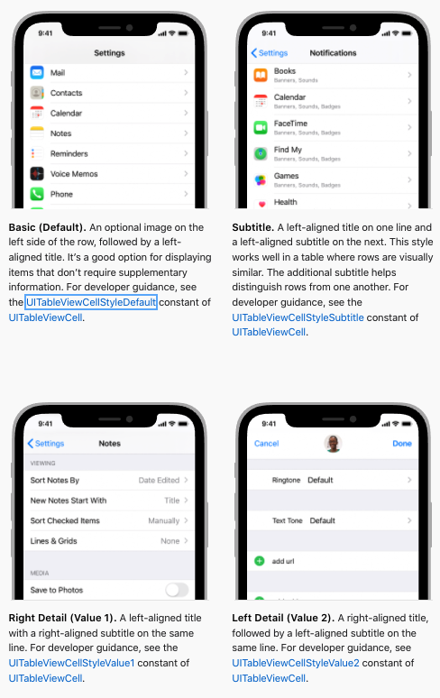
With the release of Genero Enterprise 4.00, one of the deprecated presentation styles was the “tableType” = “listView” presentation style. Sometimes with a release it is necessary to say that a design decision made in the past is not going to work in the future. It can be a case of having to take one step back in order to go forward two steps. The listView presentation style fell into that category. It generated a number of support calls, see this Ask Reuben article. It was limited in the rendering options it provided. Historically the listView was similar to the options provided by iOS as per this screenshot from Apple Developer documentation. If you scroll down to Table Rows you will see …
… you can hopefully recognise that Basic (Default), Subtitle, Right Detail (value1) correspond to what you can do with listView. We had no equivalent for Left Detail (value2) nor did we have an option for Customizing Cells..
With the introduction of STRETCH=X as part of the 4.00 responsive initiatives, it was possible for TABLE or SCROLLGRID to be used to provide these renderings without a need for the specialised listView style.
The listView presentation style had six different variations, the three I mentioned above, each with an optional image, giving six in total. It is possible using the new responsive syntax to render any one of these six variations using the existing code and the new responsive syntax.
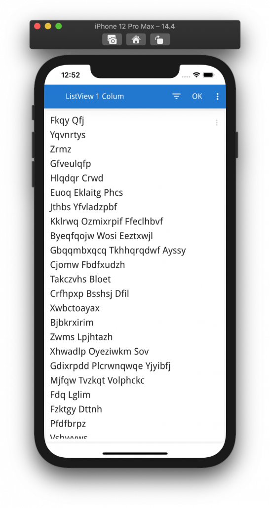
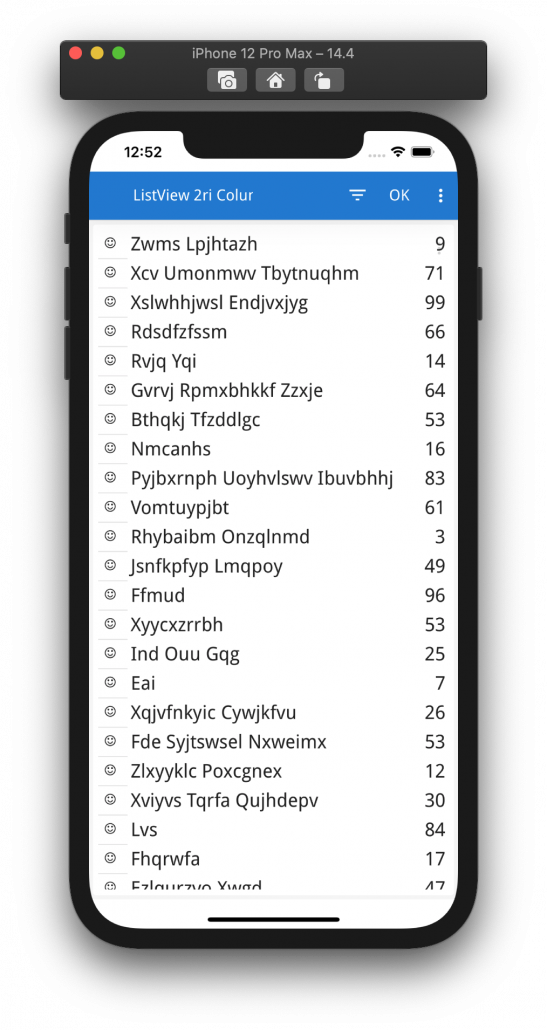
The Basic (Default) is simply a single column TABLE (or single field SCROLLGRID) that has STRETCH = X
TABLE
{
[f01      ]
}
END
ATTRIBUTES
LABEL f01 = formonly.field1, STRETCH=X, JUSTIFY=LEFT;
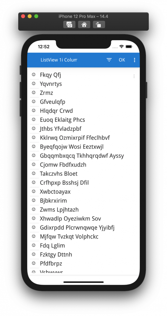
To add the optional image, as per these notes on column images. it is a case of using IMAGECOLUMN and a PHANTOM column
LABEL f01 = formonly.field1, STRETCH=X, JUSTIFY=LEFT, IMAGECOLUMN=img;
PHANTOM formonly.img;
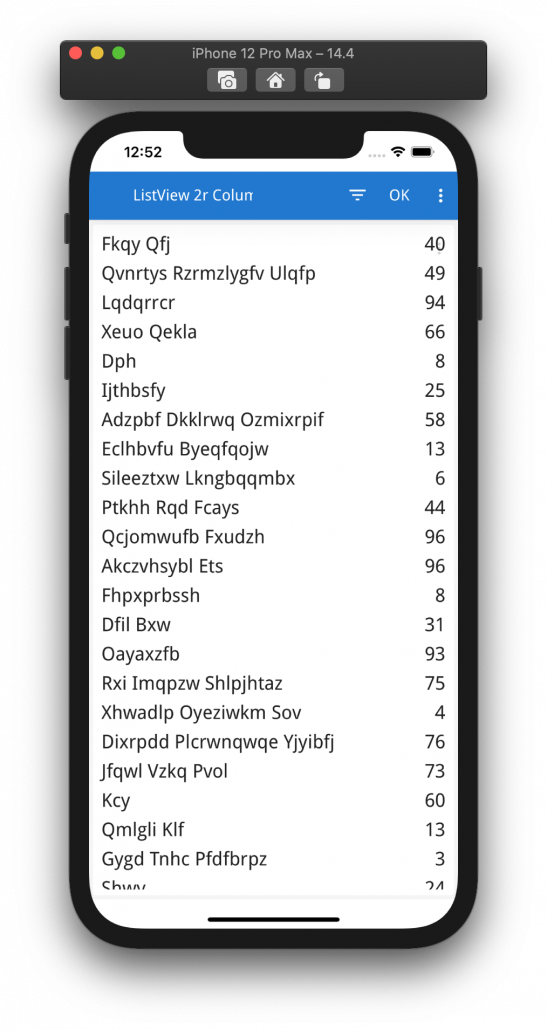
For the Right Detail (value1) case, there are two columns in the TABLE. The left column has STRETCH=X so it takes up most of the space, and the second column has JUSTIFY=RIGHT if it is not numeric. This will result in the left hand column stretching to take up most of the space and leaving only enough room for the second column on the right
TABLE
{
[f01       ][f02       ]
}
END
END
ATTRIBUTES
LABEL f01 = formonly.field1, STRETCH=X, JUSTIFY=LEFT;
LABEL f02 = formonly.field2, JUSTIFY=RIGHT;
Similarly to add the optional image, it is the same step as above
LABEL f01 = formonly.field1, STRETCH=X, JUSTIFY=LEFT, IMAGECOLUMN=img;
LABEL f02 = formonly.field2, JUSTIFY=RIGHT;
PHANTOM formonly.img;
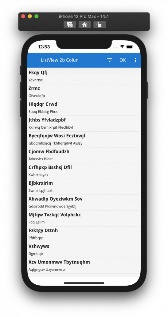
For the Subtitle case where you have two fields on top of one another rather than alongside, it is a case of using SCROLLGRID and again using STRETCH=X to make the two fields stretch across
SCROLLGRID (STYLE="list", WANTFIXEDPAGESIZE=NO)
{
[f01 ]
[f02 ]
---------------------
}
END
END
ATTRIBUTES
LABEL f01 = formonly.field1, STRETCH=X, STYLE="list1";
LABEL f02 = formonly.field2, STRETCH=X, STYLE="list2";
To have the two fields have different font sizes, it is necessary to use presentation styles and the fontSize StyleAttributes. Typically I would set list1 to have a fontSize of 1em and list2 to have a value of 0.8em. This means the top label will have the default font size and the second label will have a slightly smaller font size.
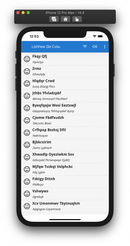
To add the optional image to this case, is a case of adding an explicit image field
SCROLLGRID (WANTFIXEDPAGESIZE=NO)
{
[i01][f01 ]
[   ][f02 ]
---------------------------------
}
END
END
ATTRIBUTES
LABEL f01 = formonly.field1, STRETCH=X, STYLE="list1";
LABEL f02 = formonly.field2, STRETCH=X, STYLE="list2";
IMAGE i01 = formonly.img, AUTOSCALE, STYLE="noborder";
Note how the image has AUTOSCALE, and does not STRETCH. I also use styles to hide the border for Image
StyleAttribute name="border" value="none"
To get close to listView rendering, I also consider using the following presentation styles for Table.
StyleAttribute name="alternateRows" value="no"
StyleAttribute name="showGrid" value="horizontal"
StyleAttribute name="headerHidden" value="yes"
StyleAttribute name="highlightCurrentRow" value="no"
These six screenshots are the six basic patterns available with ListView rendered using the above code patterns …
Hopefully you can see that using SCROLLGRID as well as TABLE combined with STRETCH I have more options. I am not restricted to the first two columns, I could have three, four, or more.
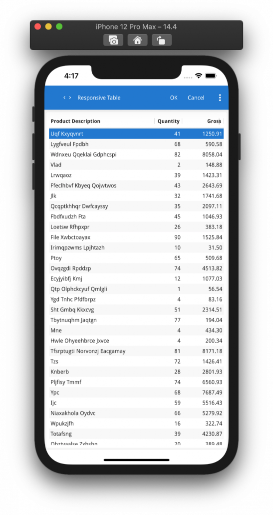
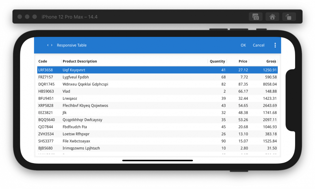
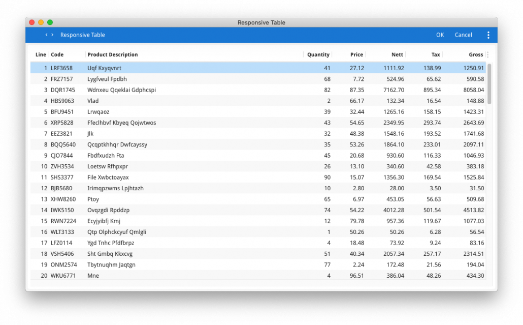
By also using HIDDEN@SMALL and HIDDEN@MEDIUM you also have options to configure what fields are hidden on smaller devices as opposed to the ListView usage of showing the first two columns and effectively hiding the rest. With this example …
EDIT f01 = formonly.line_number;
EDIT f02 = formonly.product_code;
EDIT f03 = formonly.product_description;
EDIT f04 = formonly.quantity;
EDIT f05 = formonly.price;
EDIT f06 = formonly.nett_value;
EDIT f07 = formonly.tax_value;
EDIT f08 = formonly.gross_value;
…. you can control what is rendered when there is less room to display with the addition of a few HIDDEN@size attributes.
EDIT f01 = formonly.line_number, HIDDEN@SMALL, HIDDEN@MEDIUM;
EDIT f02 = formonly.product_code, HIDDEN@SMALL;
EDIT f03 = formonly.product_description, STRETCH=X;
EDIT f04 = formonly.quantity;
EDIT f05 = formonly.price, HIDDEN@SMALL;
EDIT f06 = formonly.nett_value, HIDDEN@SMALL, HIDDEN@MEDIUM;
EDIT f07 = formonly.tax_value, HIDDEN@SMALL, HIDDEN@MEDIUM;
EDIT f08 = formonly.gross_value;
This example will give you 8 columns on large displays, 5 columns on medium displays, 3 columns on small displays, The use of STRETCH=X on the description column forces the description column to stretch and take up the space available for the row. This is what the three screenshots below show …
Hopefully you can see that you have more options available than what ListView gave previously, especially when you add in the option to use SCROLLGRID as well.


