Genero Enterprise three-year roadmap
Irving, Texas – May 24, 2017 – Four Js is pleased to announce its three-year roadmap describing its intent to greatly enhance the end-user experience for apps developed with its tools and close the gap between developing desktop and mobile business applications.
Your business logic, our infrastructure
This roadmap sets the course to further abstract Business Development Language’s presentation layer so that a single source code produces applications that always present the best possible user experience – irrespective of the device. Not only will your app run cross-platform, but it will adapt to different device screen sizes – automatically. This leaves you the time to focus on improving your business logic, while we take care of the technology infrastructure.
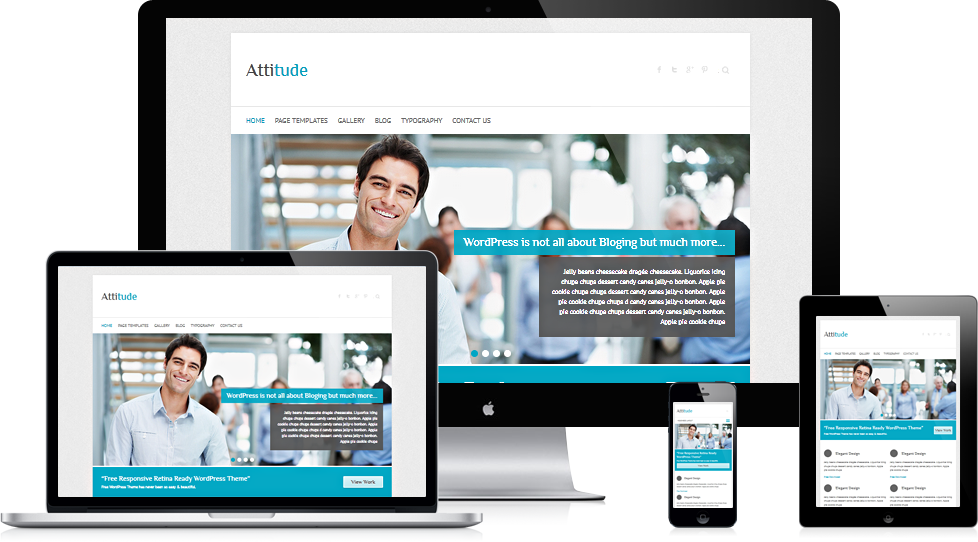
vNext 2018 - reconciling desktop and mobile
vNext focuses on reconciling BDL implementation differences between its desktop clients and Genero Mobile. In this release, all applications written for Genero Mobile will run on the desktop and vice versa.
Desktop clients comprise controllers such as INPUT ARRAY, TREE, TABLE and ‘multiple row selects’ that today, have no counterpart in Genero Mobile. Similarily, Genero Mobile introduced the notion of the PARALLEL DIALOG, which is yet to be supported on the desktop. The PARALLEL DIALOG is an extremely powerful controller, enabling two BDL modules to run simultaneously in a split screen and intercommunicate between each other. Split screens have become part and parcel of Smartphone and tablet ergonomics and its desktop equivalent will open up exciting new posibilities for application design.
vNext will also introduce Cloud versions of Genero Studio and Report Writer, which will also introduce ‘dashboard’ and ‘interactive chart’ features.
vNext+ 2019 - Responsive design
vNext+ is inspired by Responsive Web design (RWD) techniques found today on the world’s best websites. Today over half of the Internet’s traffic is created via mobile devices, which in turn are becoming the terminal of choice for certain enterprise application deployments. It makes sense then for the ergonomics of these two worlds – that of the Web site and the business application – to converge. vNext+ anticipates this trend.
An example of Responsive Web design
What is Responsive Web design?
Responsive Web design (RWD) is a method that Web designers use to allow websites to be satisfactorily viewed “in response” to a variety of devices and display sizes available to users. With this approach, content is considered as water, adapting to the vessel into which it is ‘poured’.
As content is ‘poured into the vessel’, it adapts to the layout of the viewing environment by using fluid, proportion-based grids, flexible images and media queries.
- The fluid grid concept calls for page element sizing to be in relative units like percentages, rather than absolute units like pixels or points.
- Flexible images are also sized in relative units, so as to prevent them from displaying outside their containing element.
- Media queries allow the page to use different CSS style rules based on characteristics of the device the site is being displayed on, most commonly the width of the browser.
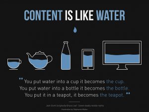
By Stéphanie Walter
The rise of RWD
The importance of Responsive Web design emerged when Google announced Mobilegeddon (April 21, 2015), boosting the ratings of sites that were mobile friendly or ‘responsive’ if the search was made from a mobile device.
Implementation
Implementation will be using an enhanced, fully-featured STACK layout, exploiting the same attributes as GRID layout. This approach makes STACK a viable, ‘responsive’ alternative to GRID. STACK will likely become the layout of choice providing a simple, elegant, abstract, predicatble, and cross-platform syntax for designing responsive user interfaces.
vNEXT++ 2020 - Table subgroups
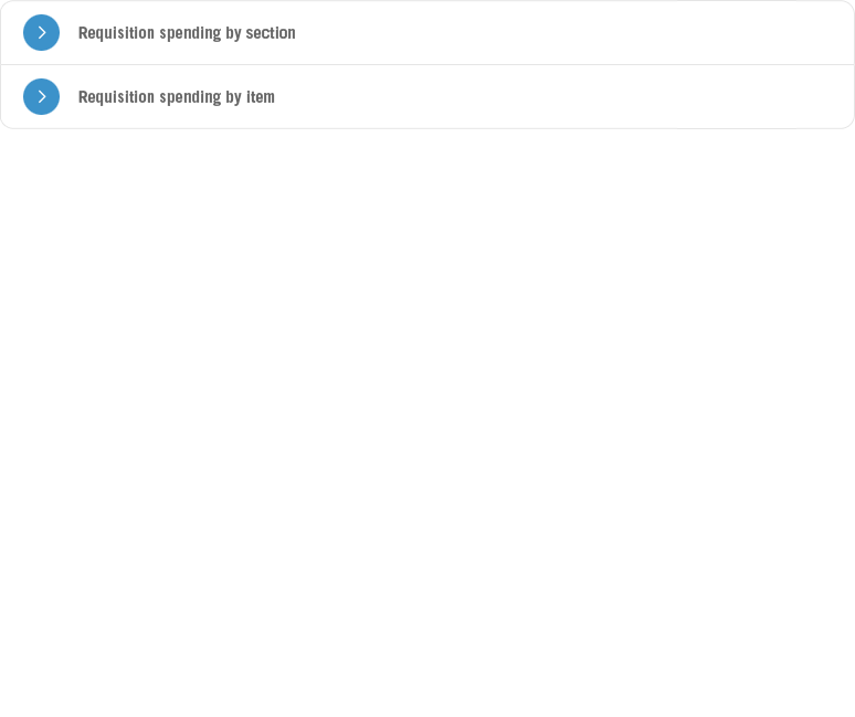
vNext++ introduces “table subgroups” – the ability to display hierarchical information of different types such as customer, order, and detail rows in a single view, bringing the same power and flexibility that is available today with “report subgroups”.
DISPLAY ARRAYs and TREE views fall short of this capability. DISPLAY ARRAYs present lists, but only with rows of the same data type. TREE views present heirarchical lists, but again, only if rows are of the same data type. TREE views fail to present hierarchical data if the types in each level are different.
Table subgroups will not only present heirarchical data of different types, but subgroups will nest within other subgroups and may be hidden or displayed with a simple mouse click.
Table subgroups include BEFORE GROUP and AFTER GROUP clauses. This enables the use of “headers” (information such as titles at the top of the group) and “footers” (information such as an “aggregate” at the bottom of the group).
Example Table Subgroup
Come and learn more at the WWDC 17 in Cancùn
Learn more about these exciting features at the World Wide Developer Conference 2017 in Cancùn, Mexico.

