Theme variables overview
GBC customization is based on variables. Theme variables are contained in the theme parts, and are set in the theme.scss.json file. They can be edited to change the look and feel of your applications.
Before starting your customization, take a moment to explore the following key files and directories in the gbc-project-dir:
-
Theme variable definitions
- Located in:
gbc-project-dir/src/theme/definitionsand its subdirectories. - These JSON files contain the theme variable definitions for the entire GBC. They control various aspects of the GBC's appearance, including layout, backgrounds, colors, borders, and sizes.
- Located in:
-
Widget information
- For detailed information about the widgets themselves, check out the JavaScript source files in:
gbc-project-dir/src/js/base/widget/widgetsand its subdirectories. - Here, you’ll find class documentation and comments for each widget implementation, providing valuable insights for your customization efforts.
- For detailed information about the widgets themselves, check out the JavaScript source files in:
By reviewing these resources, you'll gain a better understanding of how to tailor the GBC to your needs. It’s beneficial to think of the theme variables as organized in layers, which we will explore further in the next section.
Theme variable organization
Theme variables are organized in layers, forming a hierarchy. Each layer typically corresponds to
one namespace, which represents a group of variables identified by a unique prefix (for example,
ui-*, mt-*, gbc-*), but can include more than one
namespace. For more details about namespaces, go to Namespaces.
- Top UI designer layer (
ui-*):- Contains variables for colors, fonts, and density that map to existing
theme-*variables. - Use this layer to create a GBC theme that aligns
with your brand identity. This layer is organized into two sub groups: main variables and optional variables:
- Main variables: this group contains the first variables to define
when creating a GBC theme. This group contains
ui-*variables with literal default values. - Optional variables: this group contains
ui-*variables with literal default values or default values calculated from otherui-*variables.
- Main variables: this group contains the first variables to define
when creating a GBC theme. This group contains
- For details, go to General styling.
- Contains variables for colors, fonts, and density that map to existing
- UI Toolkit layer (
mt-*):- Establishes a foundational base for themes and styles inspired by Google's material design (external link) to apply to Genero application widgets.
- Most GBC widgets will inherit from here, so this is an intermediate set of variables helping to
customize things globally for consistency. This layer includes one sub-group per UI component (for
example, toolbars, tabs, fields, lists) and only contains
mt-*variables that have either literal default values or default values calculated from otherui-*ormt-*variables. - For more details, go to Advanced styling.
- Genero widgets layer (
gbc-*)- Customizes Genero and GBC widgets (for example, fields, containers, action views).
- This layer includes one sub-group per widget and only contains
gbc-*variables that have either literal default values or default values calculated from variables in any namespace. - For more details, go to Specific Genero widgets.
- GBC features layer
- Configures GBC features by using variables within the
gbc-*,mdi-*,html-*,responsive-*, andz-index-*namespaces. These variables control features like swipe navigation style and responsive layout. - This layer includes one sub-group per feature and only contains variables that have either literal default values or default values calculated from variables in any namespace.
- For more details, go to Specific Browser Client features.
- Configures GBC features by using variables within the
- Theme constants layer
- Contains variables from any namespace that should not be modified.
- For details, go to Theme constants.
Namespaces
| Namespace | Description |
|---|---|
ui-* |
This namespace includes variables such as colors, fonts, and density that allow for global customization of the UI settings, rather than adjustments for individual widgets. For instance, you can develop a GBC theme for the user interface that aligns with your brand identity. UI variables are used as the base value for other variables. For an example, go to Theme variable inheritance. The variables contained in the new ui-* namespace maps on to the existing
|
mt-* |
"mt" stands for Material Toolkit, which is based on material design concepts inspired by
Google's material
design and offers guidelines for colors, color combinations, spacing, and user interactions
as defined by Google. This namespace contains variables that help you customize variables used by
specific components, such as card, dialog, list, sidebar, and so on. For example, |
gbc-*Widget-* |
This namespace contains variables for specific GBC widgets, such as checkbox, message,
progress bar, scrollbar, splitter, table, and so on. See Specific Genero widgets. For examples of editing widget-specific variables, see Customize the chromebar. |
mdi-* |
"mdi" stands for Material Design Icons, based on Google's material
design (external link) guidelines for icons. This namespace contains variables that configure
GBC fonts. See Gbc Fonts and icons. For an example of editing Material Design Icons, see Change icons. |
html-* |
This namespace defines variables for setting default HTML elements. See HTML defaults variables. |
gbc-navigation-* |
This namespace defines variables for setting the swipe navigation style. See Swipe Navigation widget. |
responsive-*-width |
This namespace defines variables for setting the maximum width for small and medium devices. See Responsive defaults variables. |
$z-index-* |
This namespace defines variables for setting the CSS property $z-index that
controls the stacking order of overlapping elements in the GBC UI. See Z-indexes. |
Theme variable inheritance
GBC theme variables are interlinked and inherit default values from each other. Often, the
ui-* variables are used as the basis for other variables. Editing these
higher-level variables has a "ripple down" effect on those variables that inherit their values.
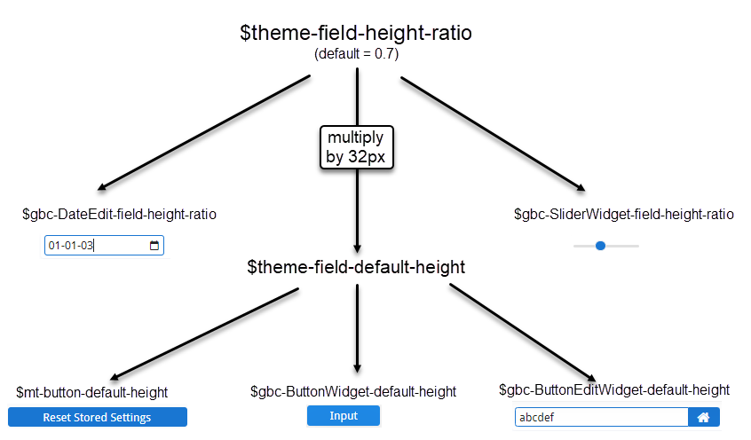
For example, see Figure 1:
$ui-field-height-ratiohas a default value of0.7. This is used as the default value for:$gbc-DateEdit-field-height-ratio: Used to calculate the size of the DateEdit widget.$gbc-SliderWidget-field-height-ratio: Used to calculate the size of the Slider widget.
- The default value of
$mt-field-default-heightis formed by multiplying$ui-field-height-ratioby32px. This is used as the default value for:$mt-button-default-height: The height of all buttons in the application.$gbc-ButtonWidget-default-height: The height of standard buttons on a GBC form.$gbc-ButtonEditWidget-default-height: The height of editable buttons on a GBC form.
If you edit $ui-field-height-ratio, this impacts the entire "tree" of variables.