Change icons
This procedure shows you how to change the checkbox icons. It involves setting theme variables.
About this task
GBC comes with default icons, which are a subset of those provided by Material Design (https://materialdesignicons.com/) . GBC does not include all possible Material Design icons (MDI), because this would make the client very large. However, you can add additional Material Design icons to GBC using the $gbc-cust-icons theme variable.
This works only with icons provided by Material Design. To use custom images or external resources, create a custom checkbox widget.
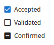
In this example, we will change the checkbox icons. These icons are specified by the gbc-CheckBoxWidget-unchecked-icon, gbc-CheckBoxWidget-indeterminate-icon, and gbc-CheckBoxWidget-checked-icon theme variables. The default checkbox icons look as in Figure 1.
To change the icons for other widgets, set the relevant theme variables:
Before you begin
This procedure assumes you are comfortable updating theme parts and themes. For the basic principles behind themes and theme parts, see How customization works. For instructions about adding and modifying themes and theme parts, see Working with themes. For information about the underlying GBC infrastructure and its components, see Theme reference.
-
Identify the icons you want to use:
-
Look up the text description for the icon you want to use, as in Figure 2.
You need the text description without the
mdi-prefix, that is,"triangle"not"mdi-triangle".Figure: Material Design icons 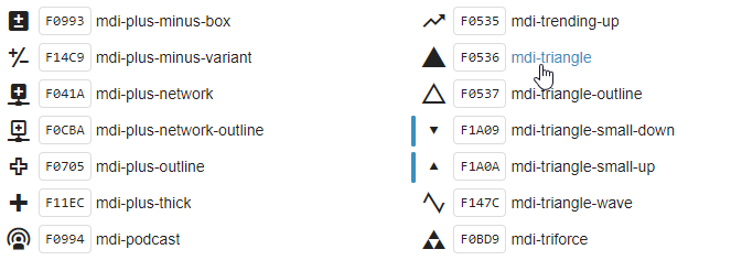
-
Look up the text description for the icon you want to use, as in Figure 2.
-
Test that your changes work as expected.
The checkbox icons should now look as in Figure 3.
Tip:You can check this using the demos application. For example, open the demos application by entering the URL for your GAS in a browser:- GAS 5.00 and greater
-
http://localhost:6394/ua/r/demo - GAS prior to 5.00
-
http://localhost:6394/ua/r/gwc-demo
Figure: New checkbox icons 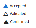
Tip:You may need to use CTRL + F5 to clear the browser cache before you see your changes.
If your tests do not behave as expected, ensure you are using your newly-built custom GBC. Depending on your development environment, you may need to package and deploy a custom GBC client. For information on which customization and theme you are using, go to Selecting customizations and themes.
For steps on changing a file loading icon, go to Change file loading icon.