Ask Reuben – April 30, 2025
gICAPI.UseGbcThemeVariables
My WebComponent does not have a dark mode.
My WebComponent does not respect my Theme.
My WebComponent does not have the same look and feel as the rest of my User Interface.
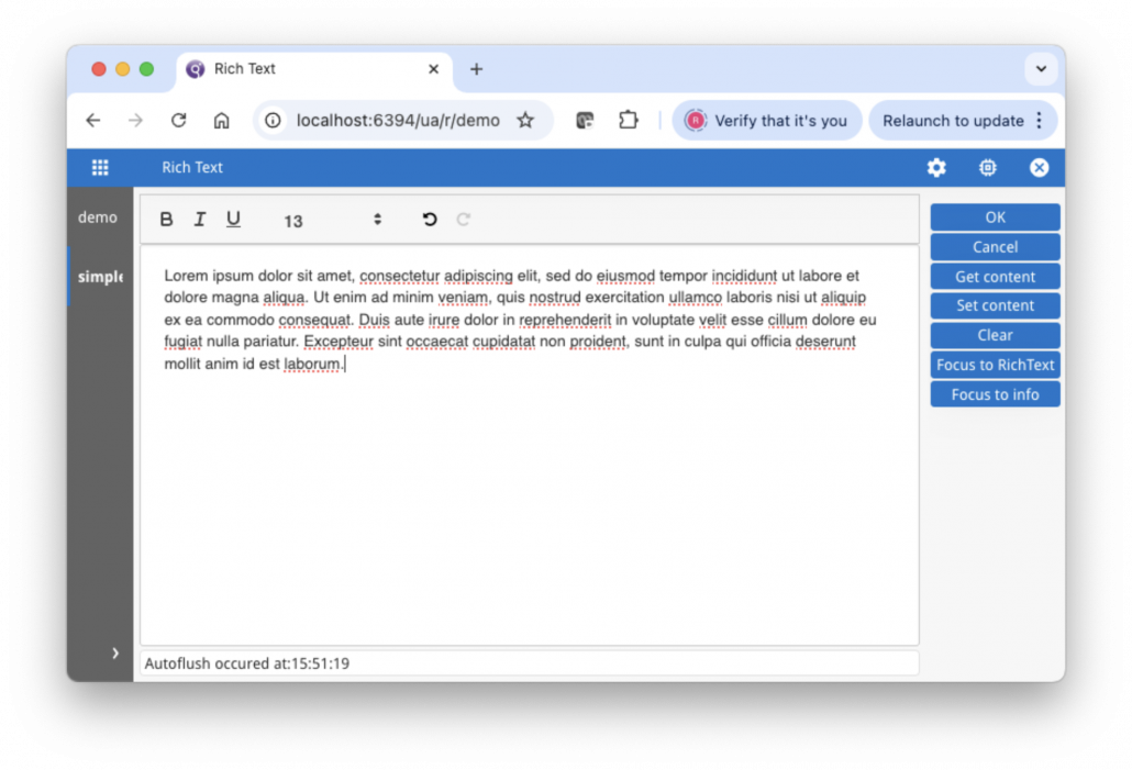
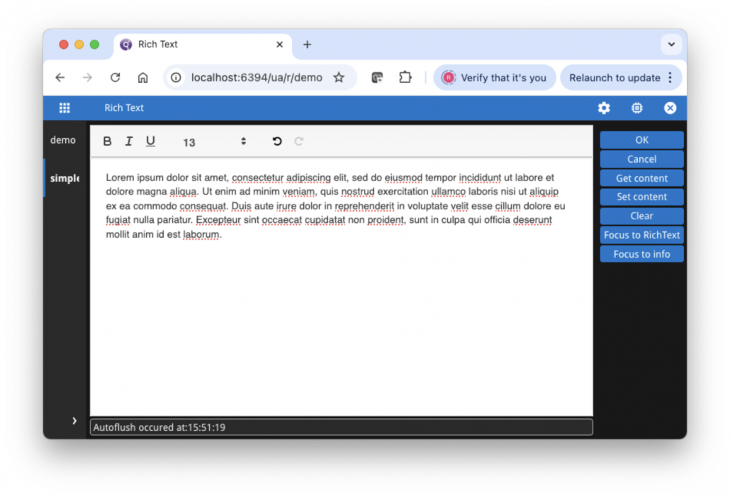
When we introduced the Dark Theme in GBC 4.01.20, a little while later we got questions of the form, my web components that have dark text on a light background, still have dark text on a light background when in Dark mode, how do I make them light text on dark background as well. We could even see this with our built-in Web Components. If you ran the simple built-in rich text webcomponent (fglrichtext) demo from FGLDIR/demo/webcomponents, it would still have dark text on a light background, even when using a dark theme. (Note: this built-in webcomponent has been deprecated in 5.00 but it is still there and can be used to illustrate this issue). The two screenshots below are with the default Desktop theme and the default Dark Desktop theme. Note how the field where you type in text has dark text on a light background in both the default (light) and dark theme …
What was needed was someway to propagate the Theme colors down to the Web Component. This was achieved with a new method useGbCThemeVariables in the gICAPI web component interface. Very simple to use, you simply need to declare what GBC theme variables you want to pass down to the web component as part of the gICAPI.onICHostReady function, and then reference these variables in the css by using the var function with an argument of the GBC theme variable name prefixed with two minus signs.
With the built-in fglrichtext web component in FGLDIR/webcomponents/fglrichtext, in js/gICAPI.js add the following lines inside the onICHostReady function …
  gICAPI.UseGbcThemeVariables([
     "theme-secondary-color",
     "theme-field-background-color"
]);
… this will pass the two Theme variables theme-secondary-color and theme-field-background-color down to the web component.
Now in the css for the web component, add usage of theme variables. So in css/styles.css add the two lines with the var function
.container{
    display: flex;
    flex-direction: column;
    height: 100%;
    margin: 0;
    overflow: hidden;
    background-color: var(--theme-field-background-color);
}
#editor {
    width: 100%;
    -webkit-border-radius: 4px;
    padding: 5px;
    color: var(--theme-secondary-color);
Now when you run the same demo in light and dark theme you will see that the background color and text color changes to match the Theme.
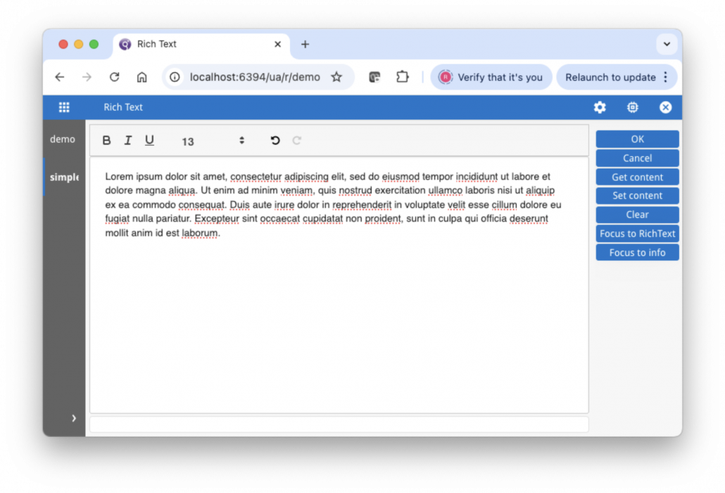
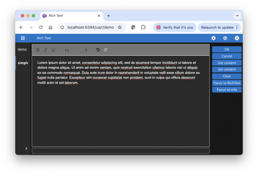
In practise there will probably me more Theme Variables you need to pass down. Note in the example, the dark toolbar text which should probably be lighter in dark theme. There might also be focused or disabled theme variables that also need to be propagated and used. Depending how well the web component was written, there maybe many places in the css you have to change as well.
For the problem of how to make your Web Component respect Dark Mode and/or look like the rest of your application, gICAPI.useGbcThemeVariables is the tool you use to pass Theme Variables down into your Web Component and make them available for use in your css.

