Ask Reuben – July 5, 2022
Starting GBC (part 3 of 3)
What is GBC Customisation?
What can you do with GBC Customisation?
What GBC Customisation technique should I use?
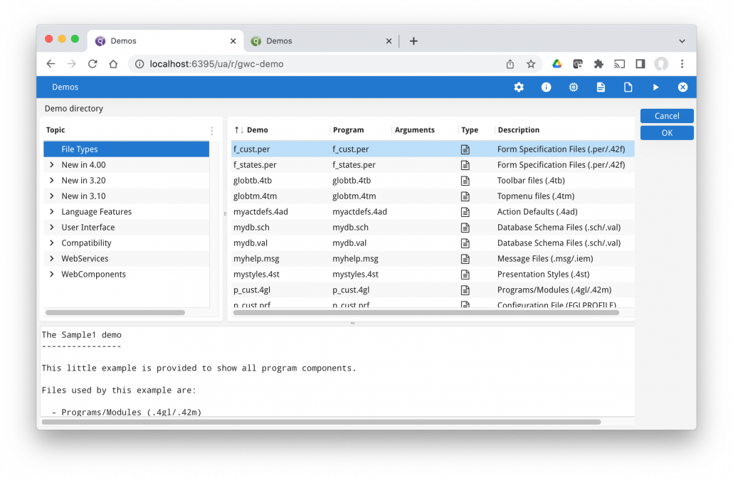
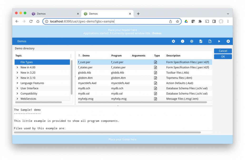
Imagine if in the past we had supplied you the GDC native rendering sources and you were free to modify these sources to get the User Interface just the way you wanted it! That is almost what you get with the concept of GBC customisation. I say “almost” because although we give you all the sources. we have created a number of openings of where we expect you to make your modifications. You should stick to those openings if you want to make ongoing maintenance for yourself easier in the future. GBC customisation is not the same as altering one line in a .4st and not having to recompile your application. GBC Customisation is also not something you might expect your entire 4gl development resource to be capable of doing as part of their 4gl programming tasks. It is a concept you should have some dedicated resources devoted to and have some proper change management in place. That resource should have some knowledge of web technologies, in particular HTML (.html), Javascript (.js), CSS (.css), and some knowledge of SASS (.scss). That resource needs to be familiar with how to teach themselves using tools like w3schools and other resources such as Stack Overflow. To learn about GBC Customisation, we have the GBC Customisation section in the documentation and there have been a number of presentations at prior WWDC. I did a presentation you can find here with examples sources in our Github repository. In a single article I am not going to be able to teach you everything but what I am able to point out is the salient points your development organisation needs to have a good understanding of. Note that in the Downloads area, there are two packages. The project package is what you want to download if you want to do some customisation as it contains the sources. The runtime package is the compiled package. Note that the version number is distinct from the FGL version number. As the product matures we are aiming to do a GBC release every month. You may wish to note that this and plan your release strategy accordingly. Within the same major release, you can upgrade the GBC separately from the FGL and other packages i.e you don’t have to recompile your FGL every time there is a new GBC release. I touched on it in the first Starting GBC article, There are many strategies you can adopt as to where the customised GBC will reside. As well as considering the final deployed product, you also need to consider how you want your development environment configured. You need to be aware that with Direct Connection, FGLGBCDIR is important, that with GAS, GBC_LOOKUP_PATH is important. That in a development environment it is important you can switch between GBC very quickly and ?gbc is very handy to do this. Also note the option of using the Deployment App, or using gasadmin at command line to deploy and select GBC to use, or that you can bundle GBC customisation in with your application in the gbc folder.. Many strategies and options and it is a case of noting them and choosing the right one for your purpose. To compile a customisation, the key command is gbc build, but in order to get to that point you need to set up your GBC build environment correctly. Note that steps 5 and on need to be repeated with each GBC project you download from our website. You will need to recompile all your customisations with each GBC release, note that the gbc arguments include some all arguments which will be handy if you have multiple customisations. Each GBC Project package contains a sample customisation. Your “Hello World” of GBC customisation is to download the GBC Project package and to compile and use the same customisation without having to make any changes to it. The two screenshots below show the standard GBC and the sample customisation. The key difference to note is the presence of the light blue header and footer in sample, and the different icon on the browser tab. Before doing any customisation, a step you need to make sure is that a) you can compile this sample customisation and b) you can configure your environment to reference it (in the screenshot I have configured my environment so ?gbc can reference it)
Downloads and Packages
GBC Location
GBC Development Environment
Hello World (sample)
Hello World (empty)
The next step I encourage is to do an empty customisation. This consists of a config.json file that consists solely of …
{
  "compile": {
    "mode": "cdev",
    "customization": "customization/empty"
  },
  "customizationSuffix" : "empty",
  "themes": [{
      "name": "default",
      "title": "Default"
    }
  ]
}
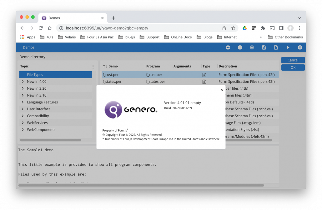
The only difference between the standard and this customisation is that if you click on the (i) icon in the ChromeBar you will see that the version is different. There are no themes (which I’ll mention later) or any customisation other than the version in the about box. When you want to start a customisation from scratch, this should be your starting point, not sample.
Theme Variables
Theme variables are the easiest way to customise your GBC. This is where we have thought developers may wist to change a setting, typically a colour or a size and we have placed a theme variable in the sources. Each theme variable has a default value but in a file you can place a theme variable and indicate what value you wish it to have.
There are many theme variables and the hardest thing is finding the right theme variable. The reference section of the documentation should contain an entry for each value.
For your simple hello world in this area, in theme.scss.json have the following entry
{
“palette-primary” : “#FF0000”
}
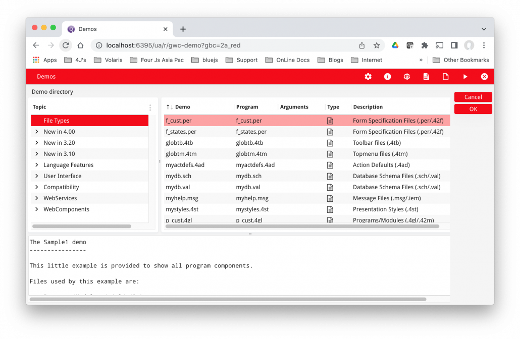
You should see that this changes the main color used from a shade of blue to red as per this screenshot
Customising Using Stylesheets
The Stylesheets in the title refers to Web CSS Cascading Style Sheets and not 4st stylesheets. This type of customization involves adding or editing a .scss file that the gbc build process compiles into a .css file.
It typically involves added in a STYLE entry in the form file that is used to indicate what widgets should have the customized style applied to. This can then be applied using a selector that has gbc_style_ prefixed to the style name used in the form file.
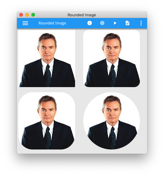
A good “hello world” example is to render images with a rounded border which I covered in earlier Ask Reuben
This requires in sass/customization.scss file the following
.gbc_ImageWidget.gbc_style_rounded50 {
    border-radius: 50%;
}
and then in your form file on any images add a style …
STYLE="rounded50";
… to indicate that this customization applies to this individual image. The documentation has a few more examples.
The neat thing about this technique is if you can do it in a web page with css then you can do it here. To give an example, there was a support question recently where the question was “can I change the cursor icon?” and it is a case of using web resources such as stack overflow / w3schools to see if is possible to change this in a web page which might lead you to a page such as this from w3schools which gives the syntax you might need to incorporate in your .scss. That is also how I found how to do the rounded image which led me to this page.
Customisation by extending a widget
The most complex customisation can be achieved by extending a widget. The previous example changed the generated .css, when extending a widget you are also changing the generated .html and .js as well as the .css.
The key to understand is that the term widget here can mean more than a widget (EDIT, COMBOBOX etc) that you add in a form. It can also include Containers (GROUP, TABLE etc) as well as parts of the GBC UI such as ChromeBar, Sidebar and non UI elements such as Front calls.
A good exercise for extending your first widget is to add a header and/or footer, and then to add a custom front-call to make changes to the header/footer. A common UI feature I see is adding some information to the header/footer such as the name of the currently logged in person or what database the user is connected to. The documentation has this as an example, see here.
The second image in the Hello World (sample) at the beginning of this article has the light blue banner for the header and footer.
Themes
Themes are a concept within customisation that allow you to have multiple look and feels within your customisation. They are not something you would look to learn on Day 1 of GBC customisation, if I was running a 2 day course they would be on day 2. Once you have mastered the various customisation techniques, then you can look at how to implement themes to give your application multiple look and feels. These themes can be selected by conditions such as the type of device e.g. Desktop vs Mobile. They can also be selected by the user so a user might select a high contrast theme if their eyesight is poor, or they could be controlled by the programmer so you might decide that different databases require use of a different theme.
A good first start for a theme is to repeat the simple Theme Variable “Hello World” above and created multiple themes differ in the primary color and note how these themes can be selected.
Understanding role of 4gl
Before getting too deep in a GBC Customisation project, it is important that you understand the role of 4gl and what customisation can change.
If you have DISPLAY ATTRIBUTES such as DISPLAY BY NAME fieldname ATTRIBUTES(RED) this is going to take priority. No amount of GBC Customisation is going to stop something being red after the developer has explicitly coded for it to be red. Hopefully as part of any Genero transformation in the past, most if not all these ATTRIBUTES have been removed from your code and 4st styles used instead.
Presentation Styles (4st) will also have priority. Hopefully for Colors you have used GBC System colors rather than explicit colors. Note how in the table in that documentation, these map to a GBC Theme variable. Change the theme variable value changes these style entries.
The other final point is that customisation does not change your dialogs. Your code will still be utilising INPUT, MENU, CONSTRUCT, DISPLAY ARRAY, INPUT ARRAY, PROMPT, DIALOG. It maybe that when someone says they want an improved User Experience, that means utilising Multiple Dialog.
Summary
It is very likely that with your Genero solution, there are going to be scenarios where you are going to do some GBC Customisation. It is important that you dedicate some resource to it and have members of your team understand the concepts, particularly if you are an ISV. Good customisation can add a lot of shine to your Genero application.
It is important that you understand that there are various customisation techniques …
- theme variables
- style sheets
- extend widgets
- themes
… and what they each can bring to your application.
When starting GBC make sure you have examples of each and understand what they can bring to your Genero application. Also to avoid disappointment, understand what you cannot do, where does the 4gl code have priority. Using GBC Customisation effectively may involve ripping out the use of attributes or modifying your use of presentation styles. Use the resources available and don’t be afraid to ask for help.
For the customers who have adopted GBC Customisation so far, it is amazing what they have made their applications look like. Some of the screens I have seen coming through on support cases, it is amazing to think that they are 4gl applications.
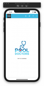
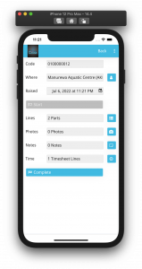
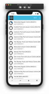
It also does not take much, these 3 screenshots are from my Pool Doctors mobile demo, I have used GBC Customisation to change primary color to match a color in the logo, increased the font size and increased the space between fields for fat fingers.


