Ask Reuben – October 28, 2020
Emulating Stretch
What is STRETCH?
How can I make an EDIT widget stretch?
UPDATE 29 September 2021
With the release of Genero Enterprise 4.00, the STRETCH attribute was added to most widgets. You should no longer need to add an empty IMAGE widget with STRETCH=X as described in this article, you can now apply STRETCH=X to the existing widgets in your form.
See the entry in New Features in Table 2.
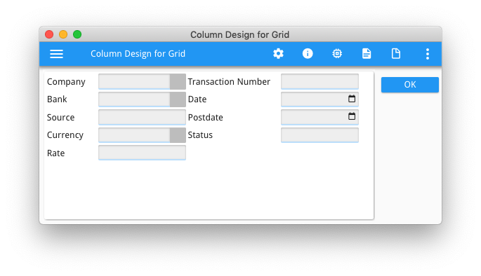
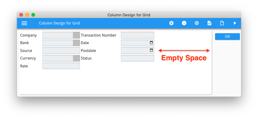
During Christophe’s plenary session at our recent Online WordWide Developer Conference, at around and in slides 19-25, he talked about a proposed extension to STRETCH and its use in making your UI responsive. What you might not have realised is that STRETCH is an existing attribute, only it is currently limited in the range of widgets it can be used with. As the documentation says … This attribute is typically used with form items that can be re-sized like IMAGE, TEXTEDIT, or WEBCOMPONENT fields. Part of what was proposed for the next release was extending the range of widgets that the STRETCH attribute can be used with, and Christophe’s demonstration showed it being used with an EDIT widget. With Grid based layouts, there is a clause in the rendering rules that I want to highlight. That reads … When resizing a window, the content will either grow with the window or be packed in the top left position. If elements in the window can grow, they will follow the window container and resize accordingly. Some elements can grow vertically, some can grow horizontally, and some can grow in both directions. The way resizable form items can grow is controlled by the STRETCH attribute. The window content is packed horizontally, vertically or in both directions, if none of the elements can grow in that direction. It is this rule that I make use of in an earlier Ask-Reuben article whereby adding a widget that can stretch (in that case an empty IMAGE), this can influence the appearance. The “If elements in the window can grow” condition is now fulfilled by the addition of the one IMAGE widget with STRETCH attribute. Although the STRETCH attribute for more widgets as proposed in Christophe’s presentation for 4.00 isn’t available yet, you can achieve the same result by using the same technique as in the earlier Ask-Reuben article, and that is to add an empty stretchable IMAGE widget to your GRID. When the form is resized, this image widget will stretch and stretch other widgets as a result. In his presentation Christophe made use of a form that was coded like the following, and currently it has the appearance as shown in the two screenshots when the window is its default size, and then when the window is stretched…
LAYOUT (TEXT="Column Design for Grid")
GROUP
GRID
{
Company      [f11         ]  Transaction Number [f21        ]
Bank         [f12         ]  Date               [f22        ]
Source       [f13         ]  Postdate           [f23        ]
Currency     [f14         ]  Status             [f24        ]
Rate         [f15         ]
}
END
END
END
ATTRIBUTES
BUTTONEDIT f11 = formonly.company;
BUTTONEDIT f12 = formonly.bank;
EDIT f13 = formonly.source;
BUTTONEDIT f14 = formonly.currency;
EDIT f15 = formonly.rate;
EDIT f21 = formonly.trn_number;
DATEEDIT f22 = formonly.date;
DATEEDIT f23 = formonly.postdate;
EDIT f24 = formonly.status;
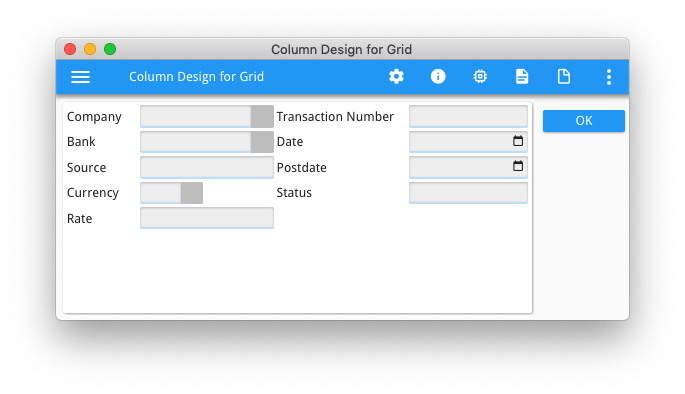
… note the empty space to the right as no widgets can grow and the grid has been packed accordingly. Also note that the width of the widgets is the same space no matter the width of the window container.
Now by adding a stretchable widget to the form, in my case an empty IMAGE that have STRETCH property = X and HEIGHT=0 PIXELS, I have a widget that can stretch that is not discernible to the viewer. (if the IMAGE border is visible, you can use Presentation Styles to remove the border)
LAYOUT (TEXT="Column Design for Grid")
GROUP
GRID
{
Company      [f11         ]  Transaction Number [f21        ]
Bank         [f12         ]  Date               [f22        ]
Source       [f13         ]  Postdate           [f23        ]
Currency     [f14         ]  Status             [f24        ]
Rate         [f15         ]
             [i11         ]                     [i21        ]
}
END
END
END
ATTRIBUTES
BUTTONEDIT f11 = formonly.company;
BUTTONEDIT f12 = formonly.bank;
EDIT f13 = formonly.source;
BUTTONEDIT f14 = formonly.currency;
EDIT f15 = formonly.rate;
EDIT f21 = formonly.trn_number;
DATEEDIT f22 = formonly.date;
DATEEDIT f23 = formonly.postdate;
EDIT f24 = formonly.status;

IMAGE i11 = formonly.dummy1, STRETCH=X, SIZEPOLICY=DYNAMIC, HEIGHT=0 PIXELS, STYLE="noborder";
IMAGE i21 = formonly.dummy2, STRETCH=X, SIZEPOLICY=DYNAMIC, HEIGHT=0 PIXELS, STYLE="noborder";
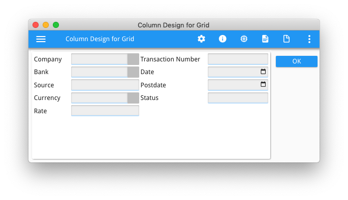
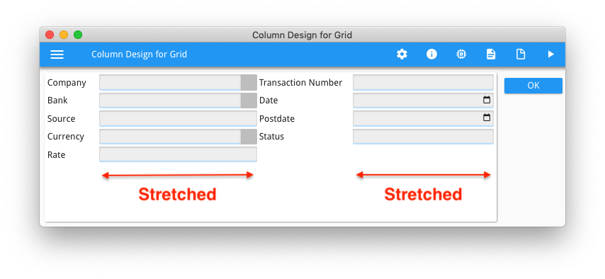
… note now that after increasing the size of the window, the width of the widgets has increased to use all of the space in the window. This is because the empty stretchable image widget has stretched and in doing so it has stretched other widgets that happen to share those columns in the grid.
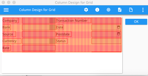
You can see this in the debug grid, note how only the columns used by the stretchable image are stretched, and in doing so have stretched the other widgets that share the columns used by the image widget.
Note also how I have placed the IMAGE widget so that it did not share any columns with the various field titles. Hence the field titles have not increased in size and they maintain the same proximity to the field they refer to. Again in the debug grid, note how the width of the columns used by the fields title have not increased in size.
Now your next question might be what if I don’t want the widget to grow. This is where you can use the HBox Tag and a Spacer Item. Any widget inside this HBox Tag will not grow if the other widgets in that column grow .
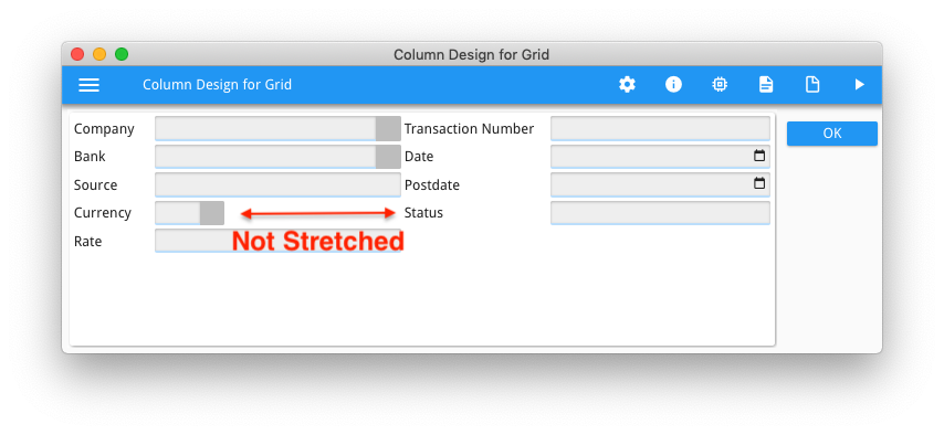
In the above example, that might be desirable with the currency field. It is typically a CHAR(3) field, and it might not make sense to have a lot of blank space inside the widget as the user may think they can enter more than 3 characters.
By adding an HBox Tag and a spacer using the : and – symbols …
Currency [f14-: ]
… this is saying that the widget should be sized with enough space to enter 3 characters and add empty space to the right if it is stretched. So now this code is …
LAYOUT (TEXT="Column Design for Grid")
GROUP
GRID
{
Company      [f11         ]  Transaction Number [f21        ]
Bank         [f12         ]  Date               [f22        ]
Source       [f13         ]  Postdate           [f23        ]
Currency     [f14-:       ]  Status             [f24        ]
Rate         [f15         ]
             [i11         ]                     [i21        ]
}
END
END
END
ATTRIBUTES
BUTTONEDIT f11 = formonly.company;
BUTTONEDIT f12 = formonly.bank;
EDIT f13 = formonly.source;
BUTTONEDIT f14 = formonly.currency;
EDIT f15 = formonly.rate;
EDIT f21 = formonly.trn_number;
DATEEDIT f22 = formonly.date;
DATEEDIT f23 = formonly.postdate;
EDIT f24 = formonly.status;

IMAGE i11 = formonly.dummy1, STRETCH=X, SIZEPOLICY=DYNAMIC, HEIGHT=0 PIXELS, STYLE="noborder";
IMAGE i21 = formonly.dummy2, STRETCH=X, SIZEPOLICY=DYNAMIC, HEIGHT=0 PIXELS, STYLE="noborder";
… note how the currency field has stayed the same width rather than stretching with the other elements that share the column of the stretching widget (the invisible image widget).
So if you liked what you saw in Christophe’s presentation and can’t wait for what he proposed, it is possible currently to achieve a similar by adding a stretchable element that is not visible (an empty widget) , and the result can also be influenced by the use of HBox Tags.
(Note: if you do need to hide the border of the empty widget, this is achieved with following presentation style)
<Style name="Image.noborder">
     <StyleAttribute name="border" value="none" ></StyleAttribute>
</Style>
