Ask Reuben – October 25, 2023
Charts, Graphs, and Infographics
How can I incorporate a Chart, Graph, Infographic in my Genero application?
For some Genero developers there is a misconception that you cannot include Charts, Graphs, Infographics within your Genero application. Other Genero developer have long since figured out how to include Charts, Graphs, and Infographics within their application.
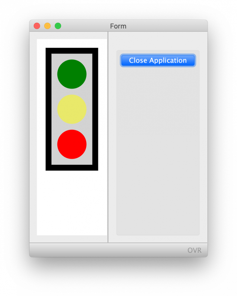
First of all, the word Infographics. This as per the Wiki definition is a graphic visual representation of information, data, or knowledge intended to present information quickly and clearly. I like to include it when speaking about Charts and Graphs because these terms imply a series of data or multiple data points. An Infographic can also include representing a single data point. For instance the image used to represent the battery life on you phone, or the petrol in your car, is representing a single number. The designer could simply have displayed a percentage e.g. 50%, but instead chose to represent the number with an image.
In this article I will explain four different techniques you can use to incorporate Charts, Graphs and Infographics within your Genero application. The order I will use in my opinion is from less powerful to most powerful.
Using Image Widget for InfoGraphics
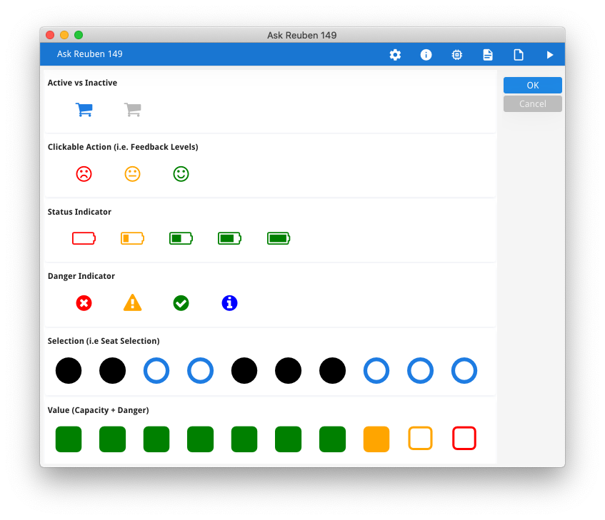
First of all, you can use the Image field or a combination of adjacent Image fields to represent a value. Have a peek through the font awesome cheat sheet and you can see …
- fa-battery*, fa-thermometer* – can be used in a single image to represent 0, 1/4, 1/2, 3/4, 1
- fa-thumbs-up, fa-thumbs-down – can be used to represent positive and negative
- fa-star*, fa-circle, fa-square – can be placed adjacent to one another to represent value
- note entries such as fa-circle-o, fa-circle. The image with -o in the name can be used to represent off/false/0 etc whilst the solid image without -o in the name can be used to represent on/true/1 etc
The use of color can also be used to represent values. As per this article, use presentation styles or amend image2font.txt to incorporate color into your use of font awesome images.
You aren’t restricted to Font Awesome images, you can source image files from elsewhere.
Using Genero Report Writer to create Charts and Graphs
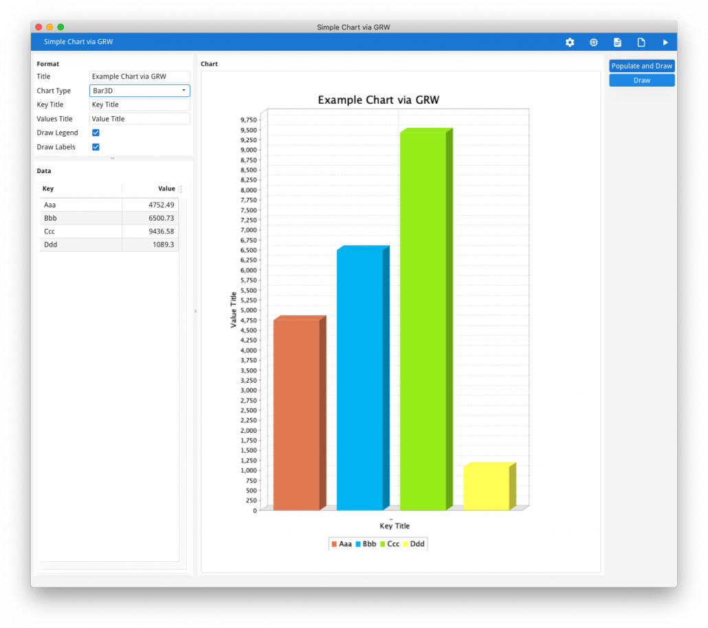
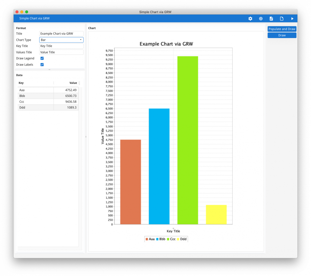
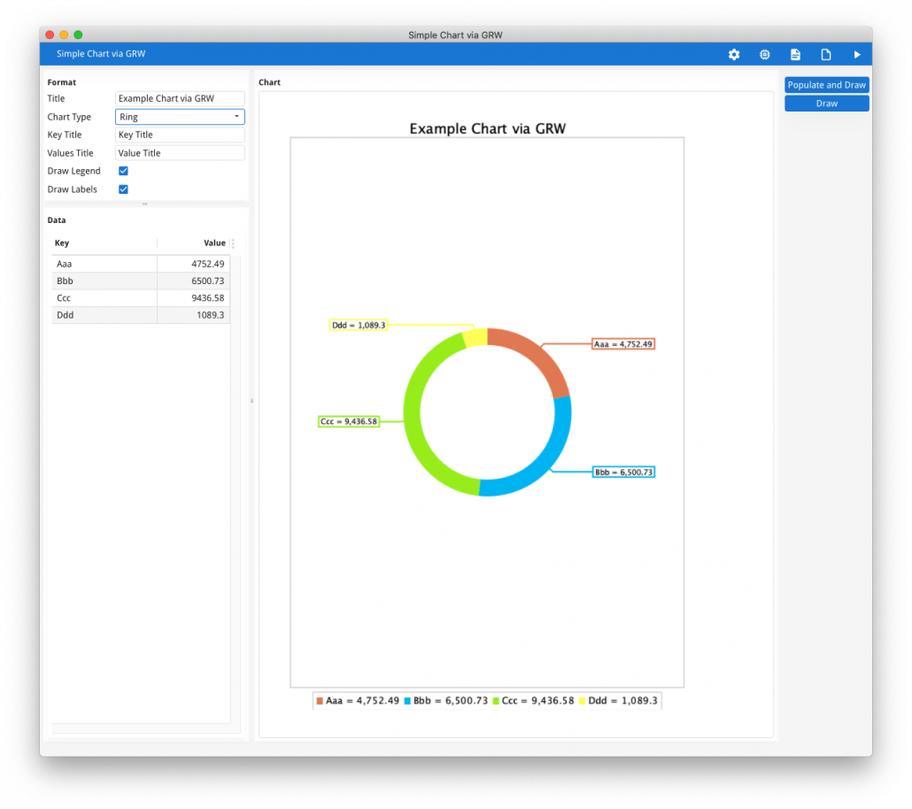
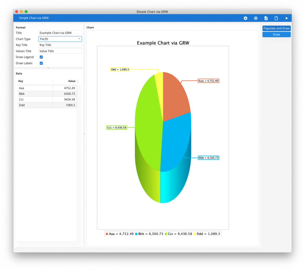
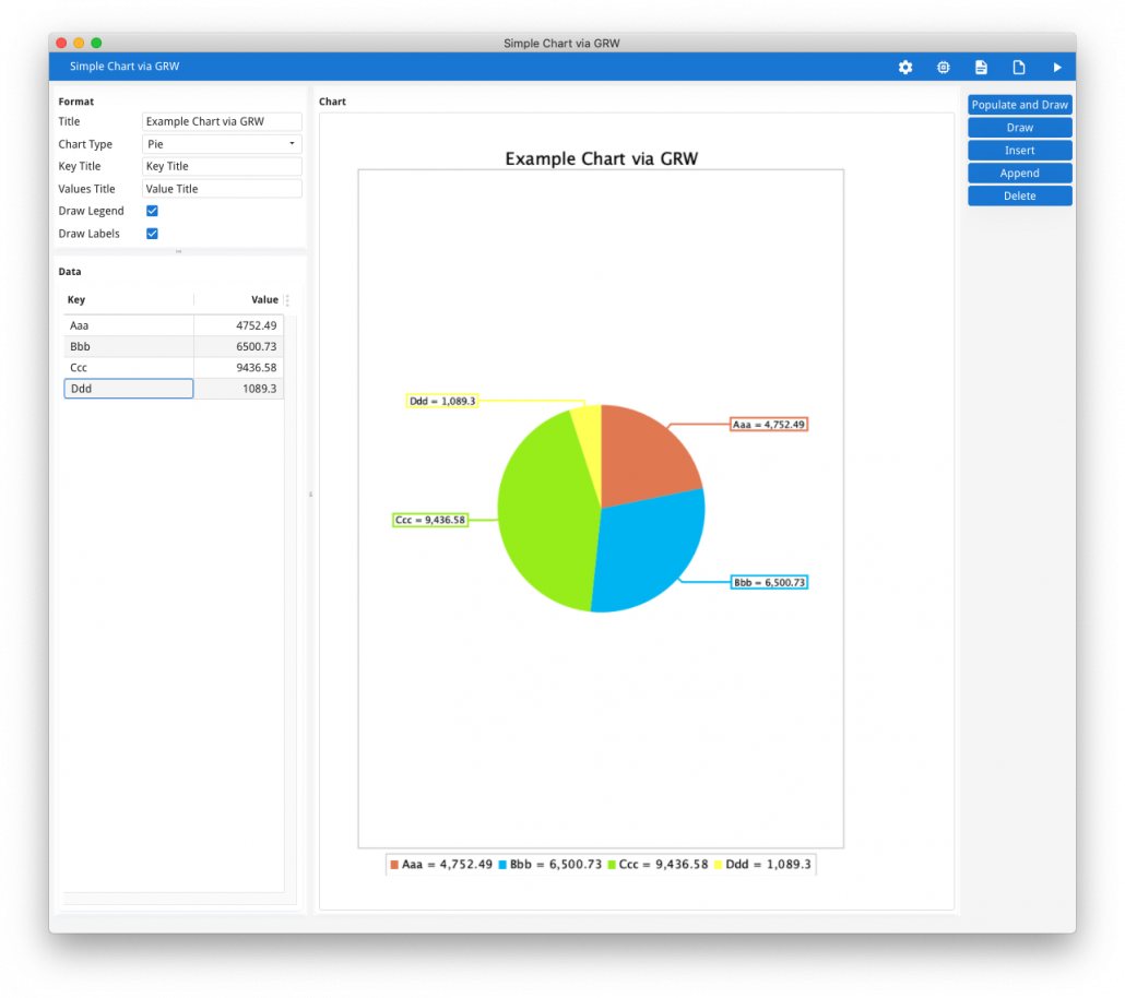
Genero Report Writer has the ability to create what it calls Business Graphs. What you can do with Genero Report Writer is set the output type to Image, generate an image, and thus display the generated image within your Genero application.
The key code is to have …
CALL fgl_report_selectPreview(FALSE)
CALL fgl_report_selectDevice("Image")
CALL fgl_report_configureImageDevice(NULL, NULL, NULL, 1, 1, extension, dirname, filename, NULL)
… to generate your report to 1 page which equates to 1 Image file which you can then DISPLAY to an IMAGE field.
I have a code example in GitHub that illustrates this technique.
The advantages of this technique are …
- does not required any additional plugin or component from outside Four Js
- the same chart/graph can be displayed in your Genero application and a Genero Report Writer report.
Disadvantages of this technique are …
- as GRW is initialised for each chart, it can take 1-3 seconds per report as this initialisation occurs. This can be overcome by using Genero Report Writer in a distributed mode.
- you are limited to the chart types and report options that are exposed by Genero Report Writer and the 3rd party library it is in turn using.
Using a 3rd party Web Component
The next technique is to use a Web Component from a 3rd party.
There are many 3rd party components out there. These include C3, D3, Any Chart, Google Charts. They all have their good points, and bad points. Things to take into consideration would include
- cost
- licensing
- offline vs online
- functionality
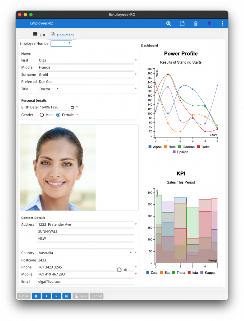
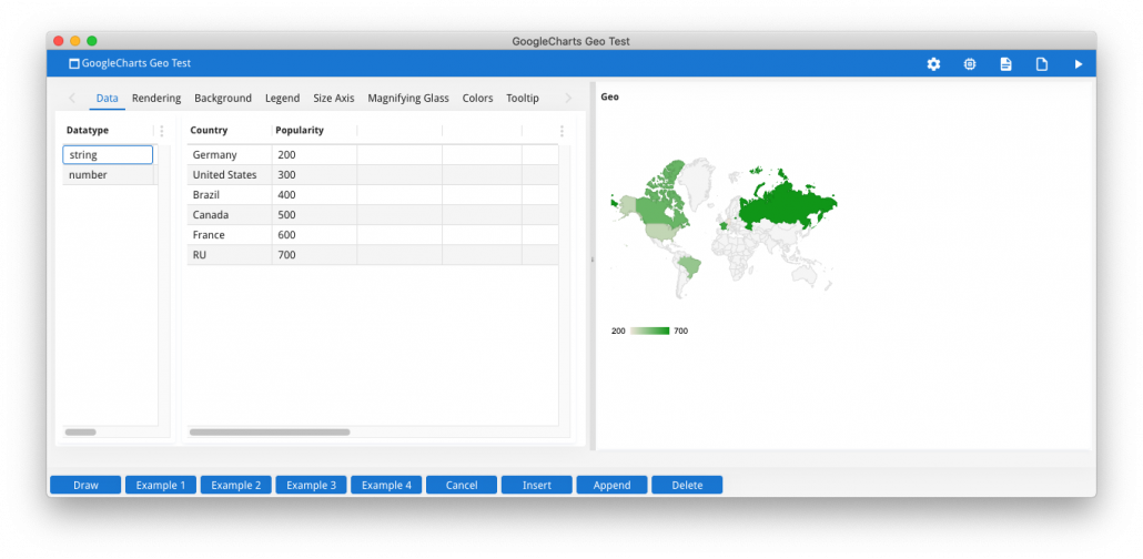
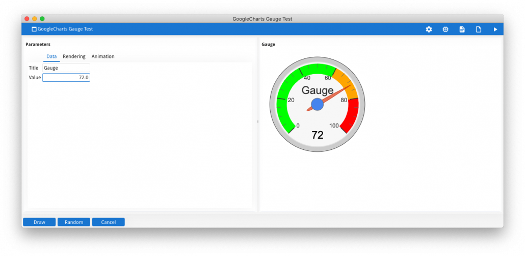
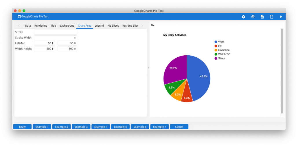
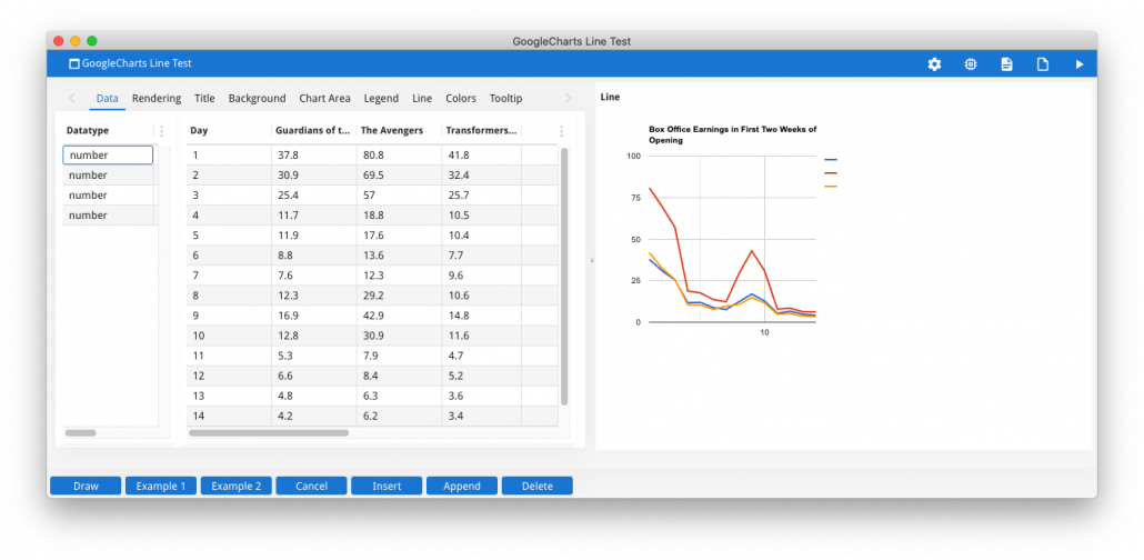
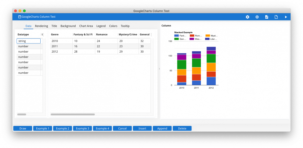
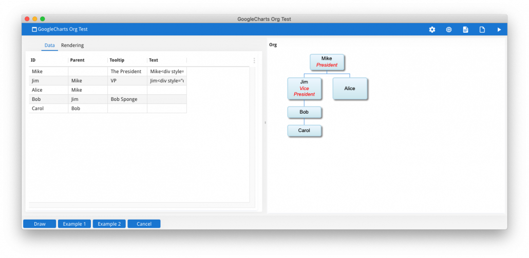
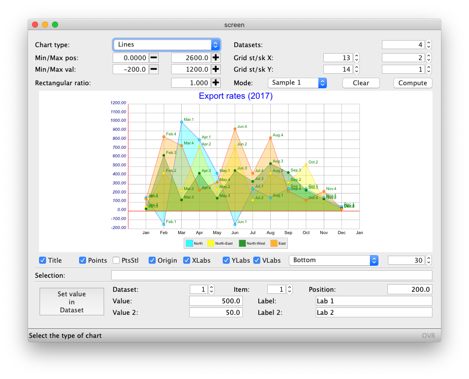
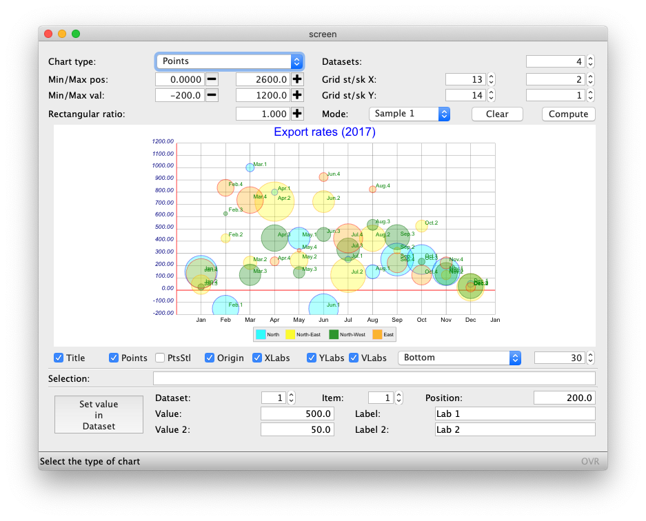
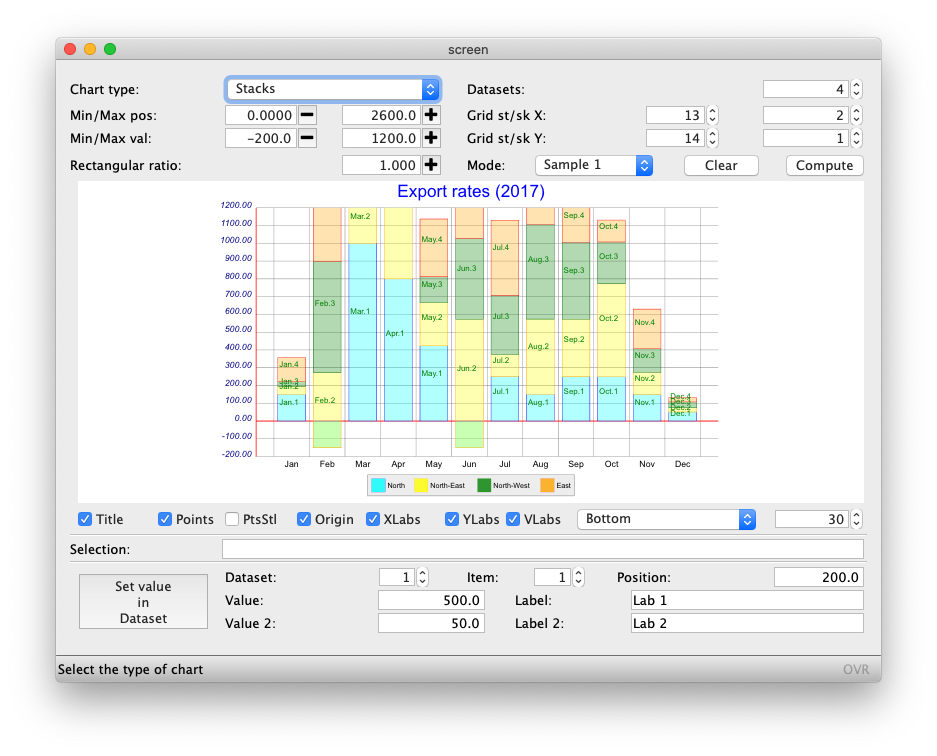
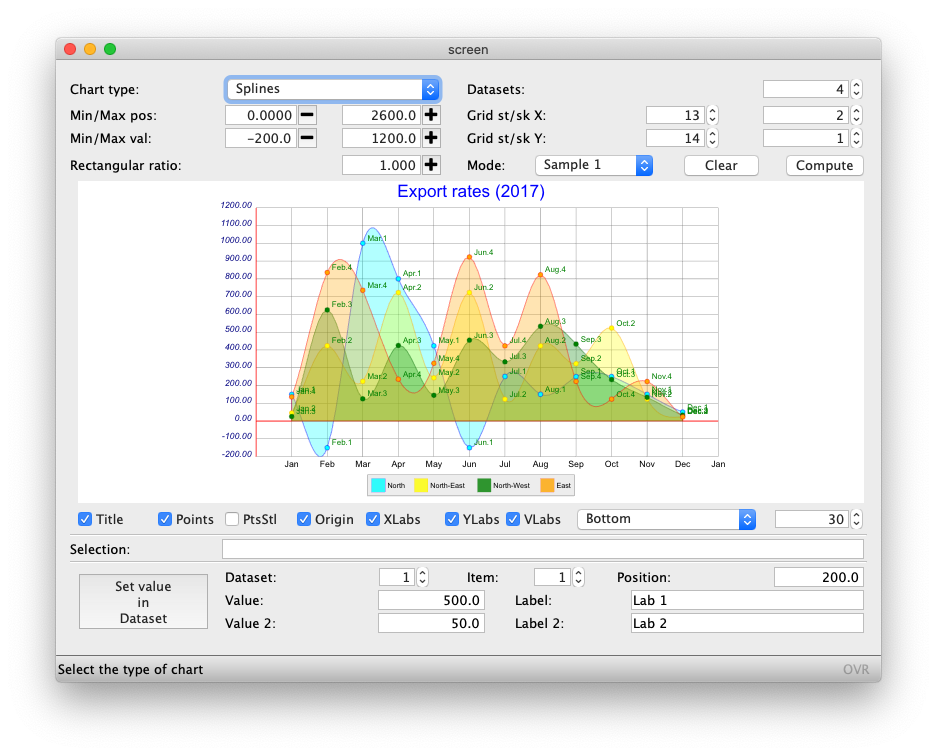
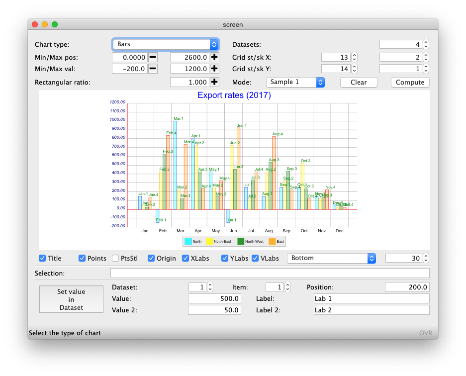
Morgans ex_hr example incorporates use of C3 and D3. This is the first two charts shown here. The remaining charts are from the wc_googlecharts example which uses as the name suggests Google Charts. Typically you would have .html and .js in your web component and you would write a 4gl library to act as a wrapper to the Web Component. This is where you have to do some heavy lifting as you would likely get a senior developer (or talented junior developer) to write this library so that your junior developers can create a chart/graph/infographic with a handful of lines of code.
The advantage of this technique is
- most of the work has been done for you
- there are interesting components out there e.g. maps that would take you a long time to do if you drew them by hand.
The disadvantages of this technique is
- you are at the mercy of the 3rd party as to what functionality is exposed.
- there maybe a cost to using the 3rd party code.
Using built-in fglsvgcanvas Web Component
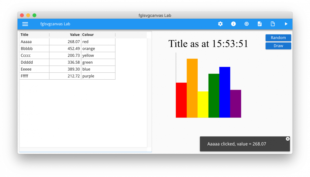
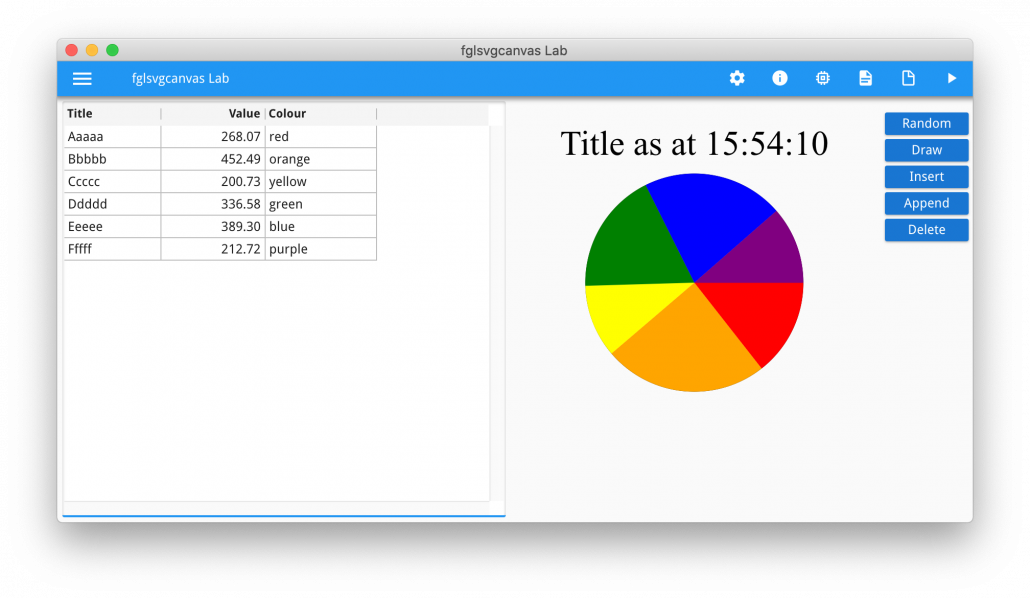
The final technique I will mention is to use the fglsvgcanvas Web Component. I have covered this in an earlier Ask-Reuben article. There is also a course in our Self-paced Training Portal that covers the use of fglsvgcanvas.
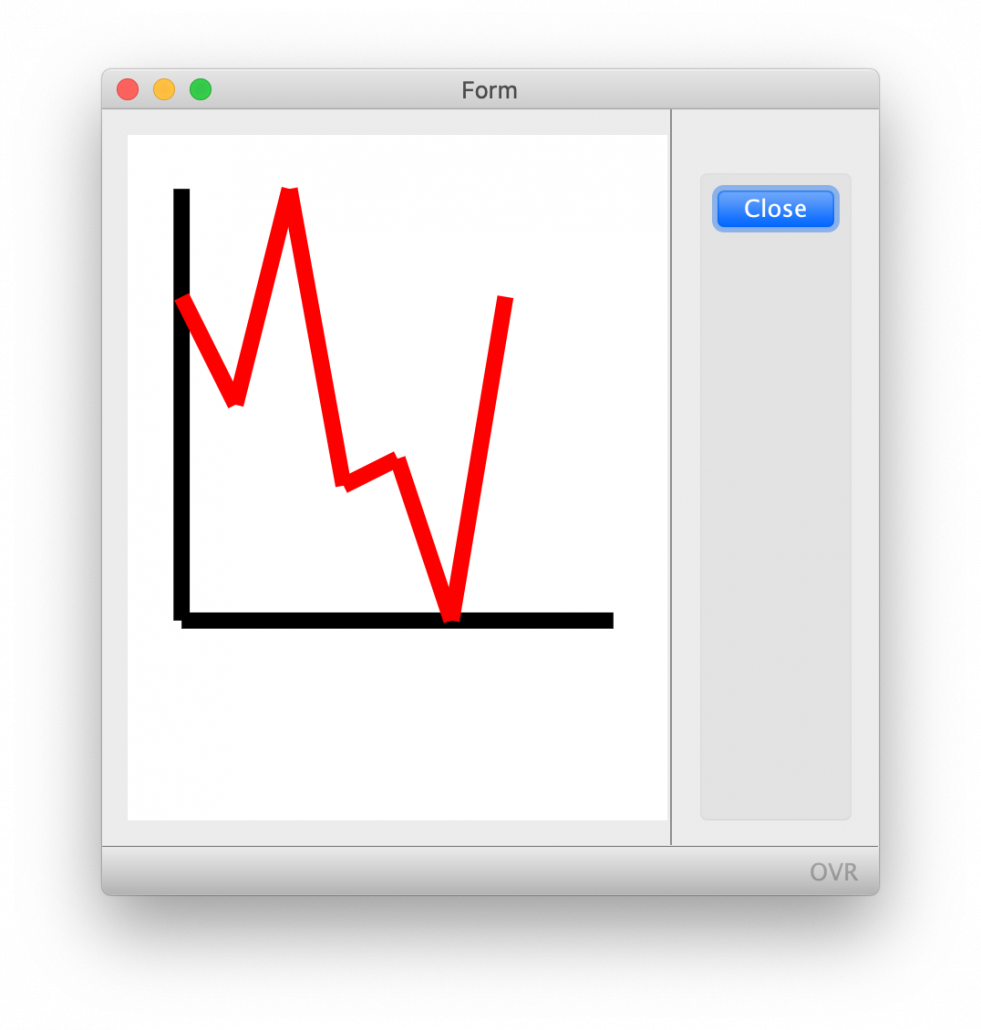
This technique uses a Web Component widget and the fglsvgcanvas library allows you to draw lines, text, shapes within this widget.
The advantage of this technique is that …
- you have complete control over what you draw within this widget. You are not dependent on a 3rd party.
- included in the complete control is being able to handle user actions within this web component. That is respond to clicks and mouse over events.
- as you have complete control, you can do some interesting custom renderings, for example the floor of a warehouse.
The disadvantage of this technique is that …
- you have to do all this coding yourself.
- to include in a report is a case of saving your rendered web component as an image and including in a report.
They say in life that nothing is free. If you want complete control over what you draw then the cost is you have to do the work to draw it.
One thing to be aware of in rendering is not too include too many Web Components on a single form, each Web Component is like a mini browser. It maybe that your form is one web component and that you draw in certain areas to show multiple bits of information.
Summary
What technique you use is upto you. Looking at the screens above, it is not discernible unless you know the component really well to discern what technique was used.
If you are a small developer then using fglsvgcanvas is probably not for you, but for an ISV or large Enterprise customer then you may decide that it is worth having this complete control and not being beholden to a 3rd party. If this is the case then you would probably get one of your talented junior developers and give them a project to build a library utilising the fglsvgcanvas Web Component that you can then use to draw charts/graphics/infographics.
Alternatively you may decide, why reinvent the wheel and instead spend time analysing these 3rd party components and picking one that best meets your needs.
From experience, coding these you will be a little slow to start but once you have done one you will very quickly be able to code many more. Don’t be afraid to ask your Genero support contact to help you get started.
Whichever one you choose, making use of charts, graphs, infographics is a must to have an application that looks fresh and modern, rather than just letters and numbers on a screen.

