Ask Reuben – October 28, 2020
Center GBC
Why is there so much space to the right of my web application?
How can I put my web application in the centre of the browser rather than on the left?
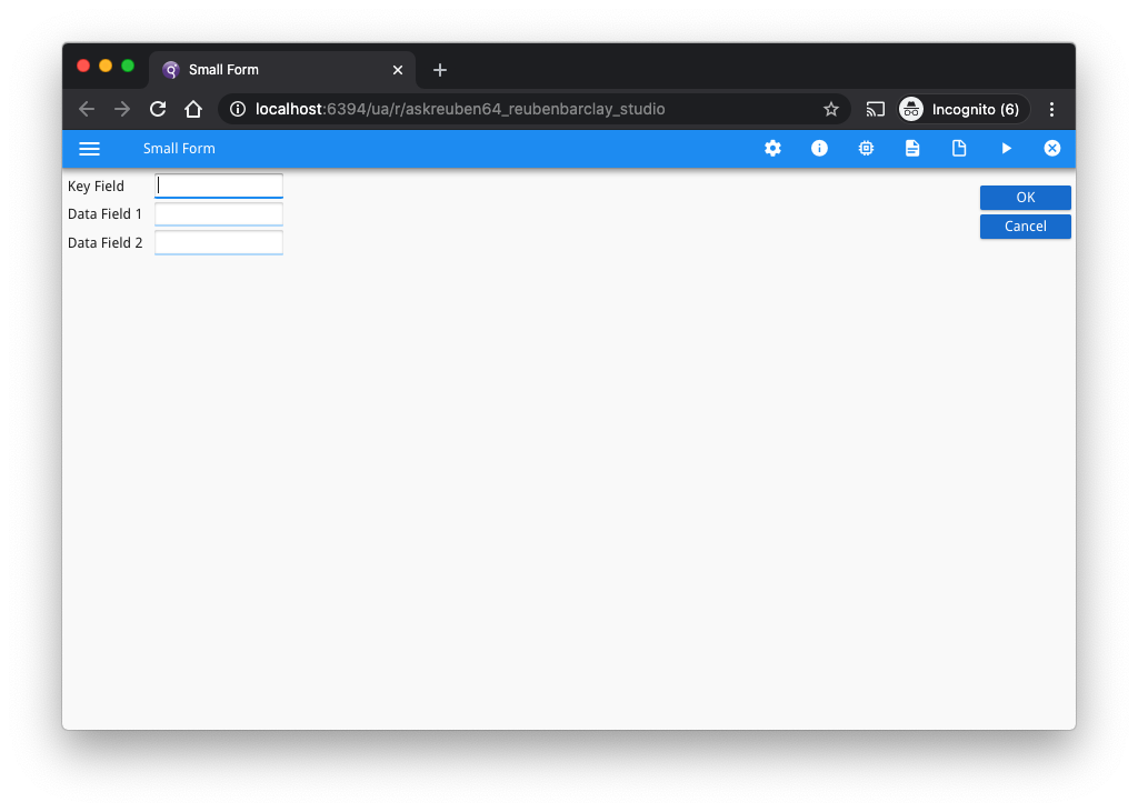
These are questions that gets asked that when you get the answer and understand why it is you might decide to leave the User Interface as is. It is magnified when looking at a small form that does not have any stretchable elements, a case maybe a screen that only has a login and password fields, or the form for the maintenance of a small table that consists of a few LABEL/EDIT widgets. The question gets asked to centre the content because when run in browser it looks odd with the fields to the left and the space on the right …
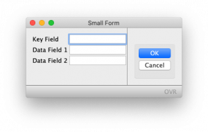
… when on the GDC this extra space does not appear….
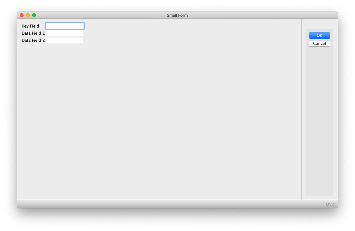
… why this is is if you look closely is you care comparing two windows of different sizes. If you make the desktop window bigger …
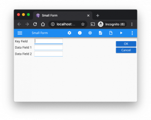
… or the browser window smaller …
… you will see that the browser rendering is an accurate reproduction of what you get with the GDC.
In fact one statement that is not far off the truth is to run your GDC application with the screen maximised and this is what your GBC application may look like.
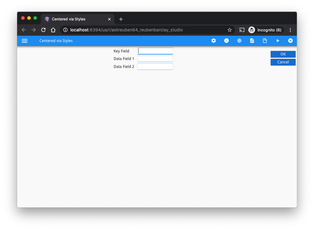
There is a solution involving a presentation style that will allow your application to be centred. To do this add …
<StyleAttribute name="sizable" value="no"/>
<StyleAttribute name="position" value="center"/>
… to the Window node in your .4st. This will make the Window content appear in the centre of the browser as pictured …
… there is another technique you can use. If you have read https://4js.com/ask-reuben/ig-5/ or https://4js.com/ask-reuben/ig-59/ you can probably guess what that is. The technique is to wrap the GRID in an HBOX and add stretchable elements either side of this GRID. These will stretch equally and keep the content in the centre grid in the middle. So something similar to …
LAYOUT
HBOX
GRID
{
[d1]
}
END
GRID
{
... existing content ...
}
END
GRID
{
[d2]
}
END
END #HBOX
END #LAYOUT
ATTRIBUTES
f01 = formonly.field1;
f02 = formonly.field2;
f03 = formonly.field3;

IMAGE d1 = formonly.dummyleft, STYLE="noborder", STRETCH=X;
IMAGE d2 = formonly.dummyright, STYLE="noborder", STRETCH=X;
The two empty image widgets stretch in the X direction to take up space. As they are either side of the content in the middle child of the HBOX, they act to push that content to the centre.
This concept of widgets stretching is why you don’t typically see this issue in busy forms. Chances are there is a TABLE or some other widget that is stretching the content to take up most of the available horizontal space, or there is a LABEL description widget to the right of a field that is consuming space.
This section of the documentation explains a little about the approach taken to rendering .
If you do decide to change something first choice should be the presentation style option but the HBOX solution is also there if necessary, however with this explanation you may choose to leave it as is or find an excuse to place a field on the right hand side.


