Ask Reuben – October 21, 2019
Add an Invisible Stretchable Element
When I stretch a window, my form content spreads across the window rather than being packed in the top-left corner OR When I move from GDC to GBC my form content spreads across the window rather than being packed in the top-left corner. How do I prevent that?
UPDATE 31 July 2023
With the release of GBC 4.01.14, a new presentation style that was added that can also be used to move content to the top and the left.
Instead of adding a dummy stretchable Image widget as discussed in this article, consider using the new packed presentation style attribute available for VBox and Hbox.
This is a question that gets asked one of two ways and has the following characteristics. A form contains a VBOX (or HBOX) with two or more children.
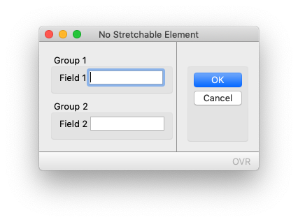
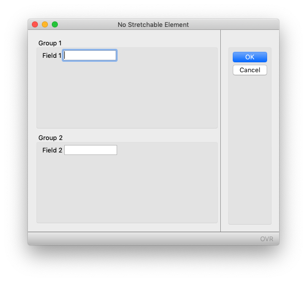
In the GDC when the user increases the size of the window, the content gets spread across the form.
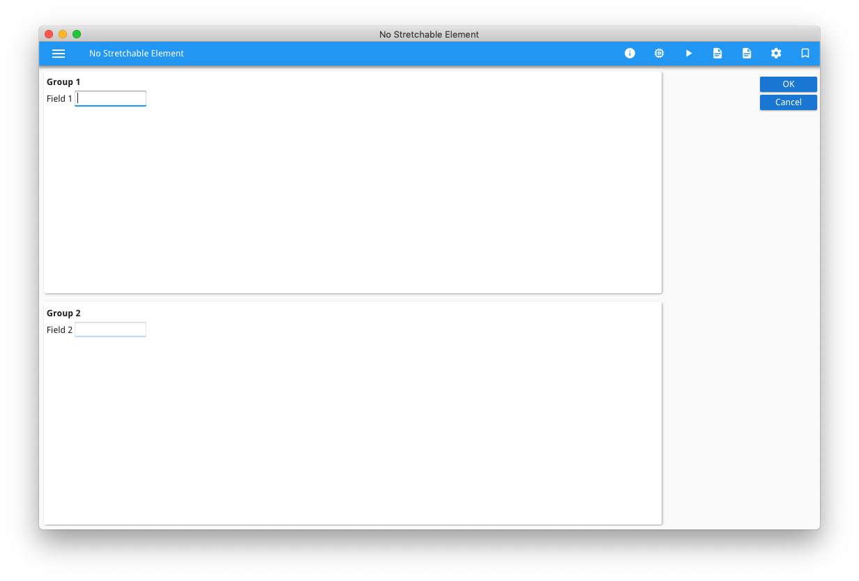
When moving from GDC to GBC / Universal Rendering, the content also gets spread across the form
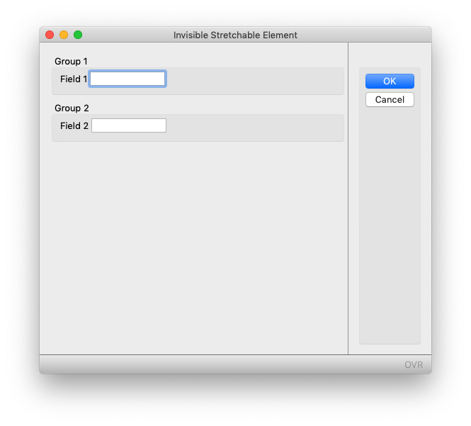
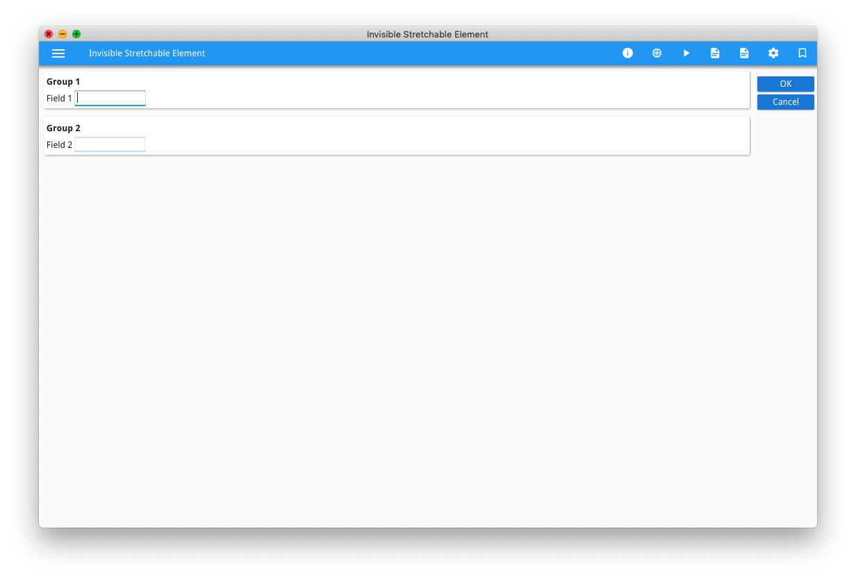
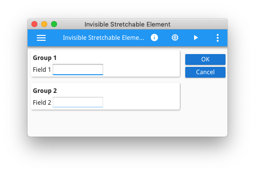
In both cases, the desired result is for the content to be packed to the top like so …
The underlying reason this happens for both scenarios is the same, and the solution is the same.
The underlying reason is tied to the STRETCH property of a container/widget. If there is a container/widget with STRETCH=X or Y or BOTH then it will expand to fill the space available. When there isn’t a container/widget with STRETCH=X or Y or BOTH then you get the undesired spreading behaviour. Not all container/widget have a STRETCH property , for example the GRID container, nor do the EDIT and LABEL widgets have a STRETCH property (Note: 29-Sep-2021 Genero Enterprise 4.00 added the STRETCH property to most widgets, the default value is NONE). So we typically see this issue with forms that have a small number of LABEL + EDIT fields and not much else.
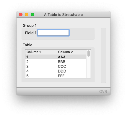
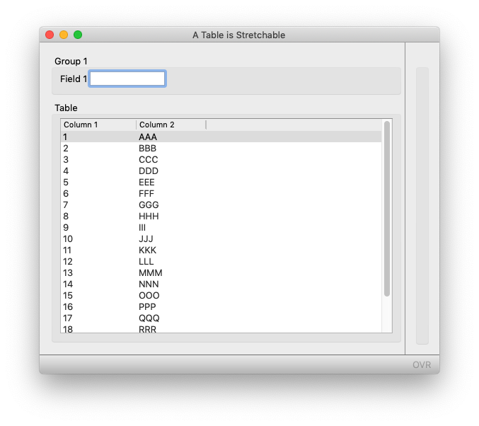
A TABLE by default has STRETCH=BOTH and if we create a similar small example, we can see how when the GDC form is resized, the TABLE container stretches to fill the space available…
So why does the undesirable spreading behaviour occur with the move from GDC to GBC / Universal Rendering? The reason is that with GBC/Universal Rendering you are viewing the content in a browser tab which is influencing the size of the window. With the original GDC, resize the GDC window bigger so that it is the same size as the browser tab, and you will see the spreading behaviour. Similarly with the GBC browser tab, resize the browser tab smaller so that it is the same size as the GDC window, and you will get the desired result
So having explained the problem and the cause, what is the solution? How can I keep the content packed top-left and not have the content spread across the window / browser tab. The solution is to add a stretchable element that you can’t see !!!. The solution I use is to add an IMAGE, don’t give the image a value (or set the value to empty). In some front-end clients, an IMAGE is also rendered with a border so I typically add a presentation style to indicate no border. Set STRETCH=BOTH so that the IMAGE will stretch as the parent container is resized. As seen in the screenshots above, the content is packed to the top. This same technique can also be used to pack content to the bottom – add the dummy stretchable image element as the first child of the VBOX to push everything down, or to pack content to the centre – add two dummy stretchable image elements as the first and last child of the VBOX to push everything to the middle. Similarly within an HBOX, you can add the dummy stretchable image as the first and/or last child of the HBOX to push content to the left, centre, or right. This isn’t a technique you need to apply everywhere. Normally you will find that your forms have a stretchable container or widget. However with small forms with not much content, you may come across this and need to add the empty image element to stretch and push the content to the top of the form. Whilst you might not have noticed it with GDC as users don’t tend to resize windows, you will notice it when moving to GBC / Universal Rendering as your windows are now the size of browser tabs, and not the minimum size to display the content.
# in .per, add as last child of VBOX, a GRID containing an IMAGE
VBOX
...  contents of VBOX ...
GRID  # add as last child of VBOX
{
[z]
}
END #GRID
END #VBOX
...
IMAGE z: IMAGE="empty", STRETCH=BOTH, STYLE="noborder";

# add to .4st
  <Style name="Image.noborder">
     <StyleAttribute name="border" value="no" ></StyleAttribute>
   </Style>


