Ask Reuben – March 25, 2020
MINWIDTH / MINHEIGHT
My form is too narrow and I can’t see all the toolbar , how can I make it wider?
My form is too short and I can’t see all the action panel, how can I make it taller?
The initial size of a Genero Desktop Client window is the minimum size necessary to display the content. With forms that only have a small number of fields, that means the form can be too narrow to see the whole of the statusBar, toolBar, topMenu, action panel or ringMenu panel, or in the other dimension be too short to see the whole of the toolBar, action or ringMenu panel. (Note: by using presentation styles, toolBars, action panels, and ringMenu panels can be displayed in both horizontal and vertical directions.)
There are a few ways this can be alleviated. If the statusBar was a concern, you could change the statusBarType to an entry that begins lines*. You can add a blank line between rows of a GRID as in ask-reuben-11 . You don’t really want to be getting into scenarios where you are making fields wider, or restructuring toolBar, topmenu, actions, simply because you have a small window.
The often overlooked solution is to use the MINHEIGHT, and MINWIDTH properties of a form. Experiment to come up with suitable values to suit your situation, I typically use MINHEIGHT=25, MINWIDTH=80, the rationale being that was the size of the TUI green screen form of the past, and so most of my normal windows will be close to that size anyway.
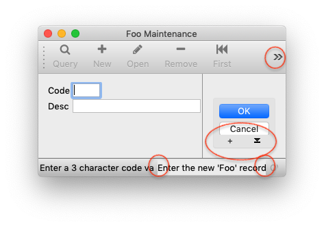
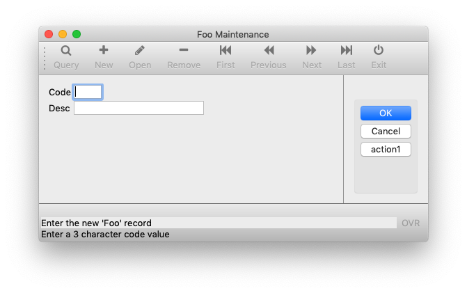
In the two screenshots below, I have simply added attributes to the LAYOUT node
LAYOUT (MINHEIGHT=10, MINWIDTH=50)
and as you can hopefully see in the second screenshot, the window is wider and taller so that as a result the toolBar and action panel are completely visible and there is no overflow.
I also changed the statusBarType presentation style entry so that the statusBar is displayed over multiple lines and this means that a Comment, Message, or Error has the entire window width to be displayed within, as opposed to 1/2 or 1/3 of the window width in the case where 2 or 3 of Comment, Message, or Error are displayed on the same line.
By having a coding standard that enforces use of MINHEIGHT, MINWIDTH throughout your application then you can reduce the likelihood that overflow of statusBar, toolBar, topMenu, action panel or ringMenu panel will occur.


