Ask Reuben – June 28, 2022
Not All Widgets Are Equal
Why do rows in side by side arrays not align?
Why do widgets have different widths and heights?
The children of VBOX and HBOX containers are rendered independently of one another. A common misconception is that elements in adjacent children of these containers should align, particularly if elements have been given the same number of columns and rows in the .per or .4fd. Each widget has its own calculation for determining its height and width which is then factored into the width of columns and the height of rows in the parent container. This is best illustrated by way of example. The code is given at the end of the article.
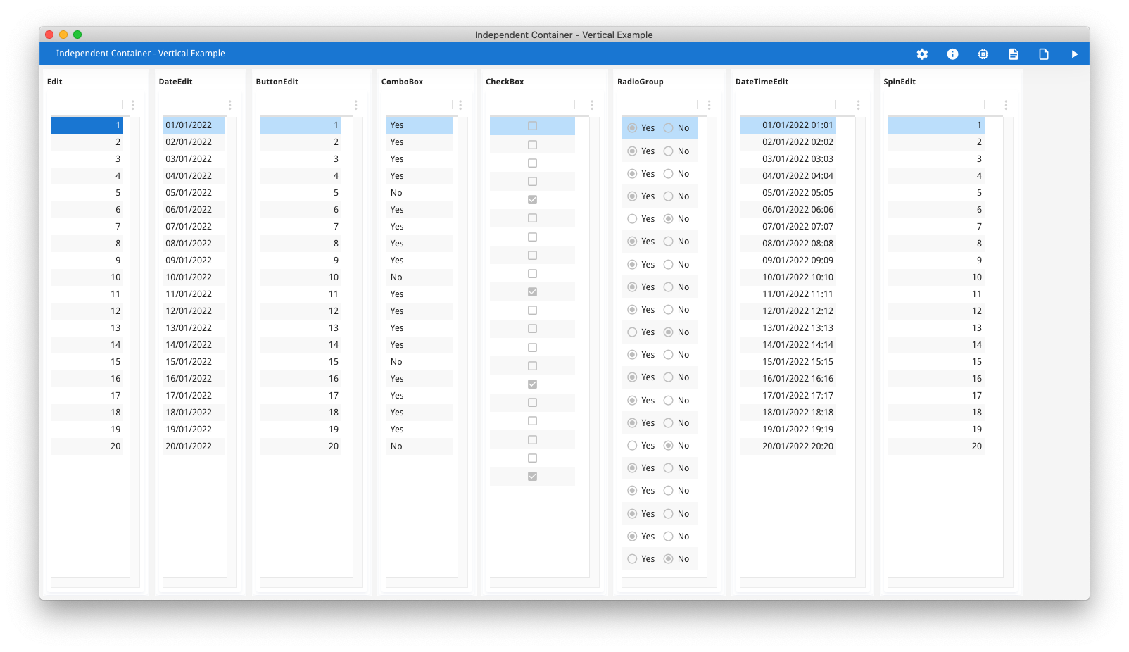
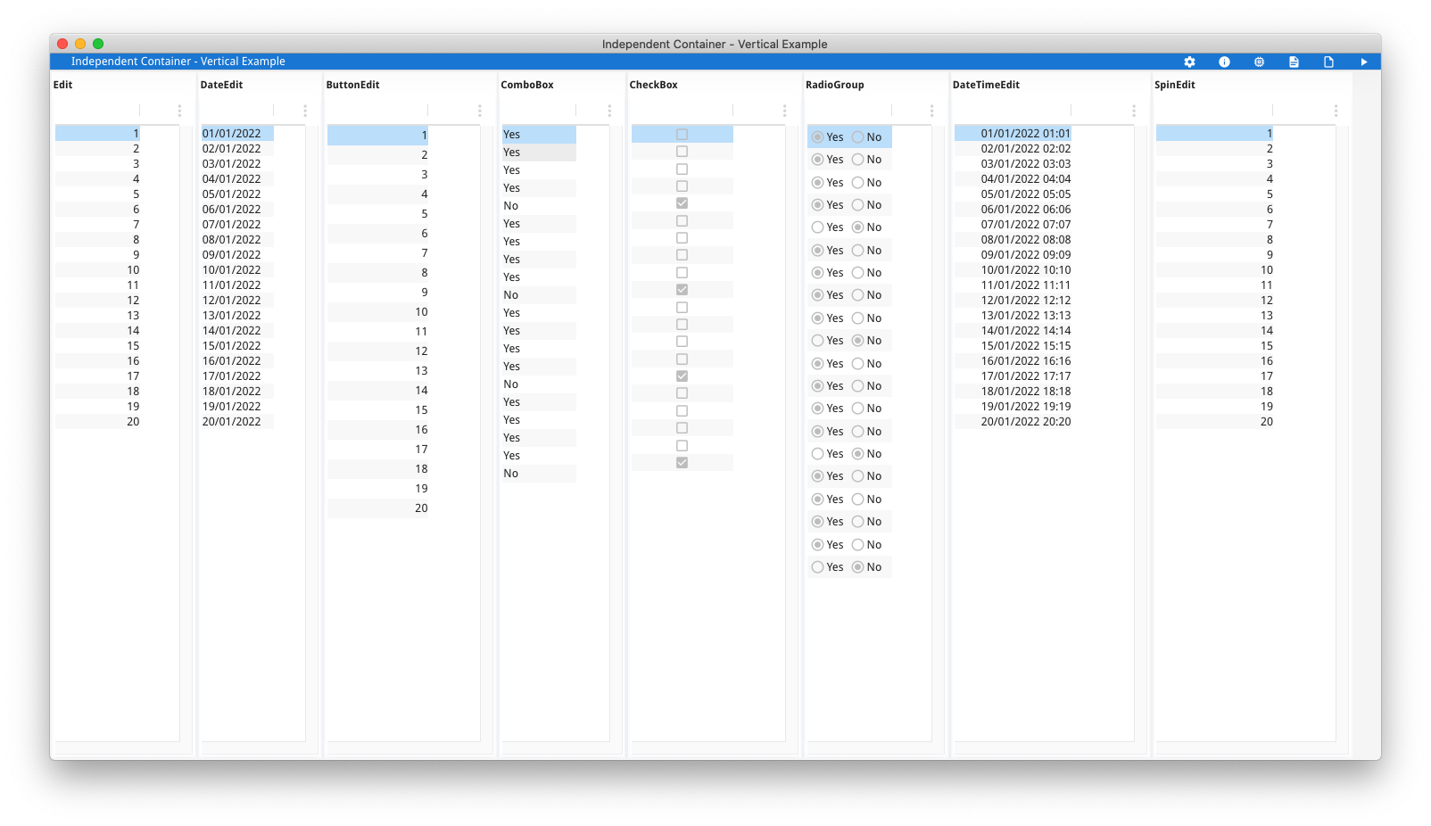
This first example (askreuben150_vertical) shows that different widgets have different heights. There are two screenshots, the first for the default theme, and the second with the new compact theme. The form consists of an HBOX with 8 occurrences of GROUP+TABLE, where each occurrence has 20 rows of a different widget.
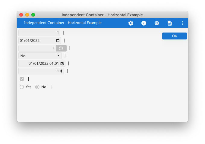
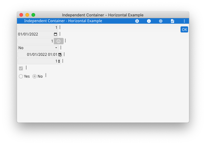
What you should observe is that to display 20 rows takes a different amount of space depending upon the widget used. Where there is a GUI element associated with the widget such as with CHECKBOX and RADIOGROUP, this can lead to the widget taking a larger amount of vertical space. This then has a flow on effect on the parent container, in this case with the TABLE container and the height of each row. In a GRID container, this has an impact on the height of grid rows containing that widget. Typically I will see this in a support case where there are two children of an HBOX and the developer is expecting the rows in the left hand child to align with the rows in the right hand child. Upon investigation I will find that there is a widget such as a CHECKBOX being used on 1 side that sees the height of 1 row being bigger than the same row on the other side. With GBC customisation there is always the option of customising the widget to have the same height as an EDIT widget, but that may mean a smaller clickable area. The second example askreuben150_horizontal shows that different widgets have different widths. In this example … … I have used HBox tags (the : in the GRID) so that each line is effectively its own one line HBOX child rendered independently of the line above. The wrong expectation is that the “|” labels should all align like they do in the .per. The two screenshots, again the first with default theme and second with compact theme show that the “|” is not in alignment, some widgets are wider and push it out …
GRID
{
[f01 :"|": ]
[f02 :"|": ]
[f03 :"|": ]
[f04 :"|": ]
[f05 :"|": ]
[f06 :"|": ]
[f07 :"|": ]
[f08 :"|": ]
}
END
The widgets with a button on the right such as BUTTONEDIT, DATETIMEEDIT can take a larger amount of horizontal space than the same sized widget without the button such as the EDIT. This characteristic has a flow on effect on the width of grid columns containing that widget. This is something normally encountered quite early in a developers introduction to Genero, typically with a COMBOBOX stretching the grid as illustrated in this earlier Ask Reuben article.
Each widget has a number of properties that can control the size. Take note of the SIZEPOLICY attribute as that can have a large impact on the size of the widget, particularly SIZEPOLICY=DYNAMIC for a COMBOBOX. With a Grid based layout as used in GRID and SCROLLGRID, the size of a widget is used to calculate the minimum size of the rows and columns that the widget occupies and this is what leads to stretching of widgets that occupy the same rows or columns. Responsiveness and the use of STRETCH=X for horizontal stretching means that the widget size can be determined by the parent container rather than the widget itself.
The important concept is to note that just because you have given a form element a certain size in terms of grid columns and grid rows, it does not mean that other form elements with the same number of grid columns and grid rows will be rendered the same size. Different widgets can have different height and width calculations before you get into the business of how the rendered height and width is also impacted by the choice of container and other form elements.
#! askreuben150_vertical.4gl
MAIN
    DEFINE arr_ed DYNAMIC ARRAY OF INTEGER
    DEFINE arr_de DYNAMIC ARRAY OF DATE
    DEFINE arr_be DYNAMIC ARRAY OF INTEGER
    DEFINE arr_cb DYNAMIC ARRAY OF INTEGER
    DEFINE arr_ch DYNAMIC ARRAY OF BOOLEAN
    DEFINE arr_rg DYNAMIC ARRAY OF INTEGER
    DEFINE arr_dt DYNAMIC ARRAY OF DATETIME YEAR TO MINUTE
    DEFINE arr_sp DYNAMIC ARRAY OF INTEGER

    DEFINE i INTEGER

    FOR i = 1 TO 20
        LET arr_ed[i] = i
        LET arr_de[i] = MDY(1, i, 2022)
        LET arr_be[i] = i
        LET arr_cb[i] = ((i MOD 5) = 0)
        LET arr_ch[i] = ((i MOD 5) = 0)
        LET arr_rg[i] = ((i MOD 5) = 0)
        LET arr_dt[i] = SFMT("2022-01-%1 %1:%1", i USING "&&")
        LET arr_sp[i] = i
    END FOR

    OPEN FORM f1 FROM "askreuben150_vertical"
    DISPLAY FORM f1
    DIALOG ATTRIBUTES(UNBUFFERED)
        DISPLAY ARRAY arr_ed TO scr_ed.*
        END DISPLAY

        DISPLAY ARRAY arr_de TO scr_de.*
        END DISPLAY

        DISPLAY ARRAY arr_be TO scr_be.*
        END DISPLAY

        DISPLAY ARRAY arr_cb TO scr_cb.*
        END DISPLAY

        DISPLAY ARRAY arr_ch TO scr_ch.*
        END DISPLAY

        DISPLAY ARRAY arr_rg TO scr_rg.*
        END DISPLAY

        DISPLAY ARRAY arr_dt TO scr_dt.*
        END DISPLAY

        DISPLAY ARRAY arr_sp TO scr_sp.*
        END DISPLAY

        ON ACTION close
            EXIT DIALOG
    END DIALOG
END MAIN
#! askreuben150_vertical.per
LAYOUT (TEXT="Independent Container - Vertical Example")
HBOX
GROUP (TEXT="Edit")
TABLE
{
[f01 ]
}
END
END
GROUP (TEXT="DateEdit")
TABLE
{
[f02 ]
}
END
END
GROUP (TEXT="ButtonEdit")
TABLE
{
[f03 ]
}
END
END
GROUP (TEXT="ComboBox")
TABLE
{
[f04 ]
}
END
END
GROUP (TEXT="CheckBox")
TABLE
{
[f05 ]
}
END
END
GROUP (TEXT="RadioGroup")
TABLE
{
[f06 ]
}
END
END
GROUP (TEXT="DateTimeEdit")
TABLE
{
[f07 ]
}
END
END
GROUP (TEXT="SpinEdit")
TABLE
{
[f08 ]
}
END
END
END # HBOX
END #LAYOUT
ATTRIBUTES
EDIT f01 = formonly.ed;
DATEEDIT f02 = formonly.de;
BUTTONEDIT f03 = formonly.be, ACTION=zoom, IMAGE="smiley";
COMBOBOX f04 = formonly.cb, ITEMS=((0,"Yes"),(1,"No"));
CHECKBOX f05 = formonly.ch;
RADIOGROUP f06 = formonly.rg, ITEMS=((0,"Yes"),(1,"No")), ORIENTATION=HORIZONTAL;
DATETIMEEDIT f07 = formonly.dt;
SPINEDIT f08 = formonly.sp;
INSTRUCTIONS
SCREEN RECORD scr_ed(ed);
SCREEN RECORD scr_de(de);
SCREEN RECORD scr_be(be);
SCREEN RECORD scr_cb(cb);
SCREEN RECORD scr_ch(ch);
SCREEN RECORD scr_rg(rg);
SCREEN RECORD scr_dt(dt);
SCREEN RECORD scr_sp(sp);#! askreuben150_horizontal.4gl
MAIN
DEFINE rec RECORD
ed INTEGER,
de DATE,
be INTEGER,
cb INTEGER,
dt DATETIME YEAR TO MINUTE,
sp INTEGER,
ch BOOLEAN,
rg INTEGER
END RECORD
LET rec.ed = 1
LET rec.de = MDY(1, 1, 2022)
LET rec.be = 1
LET rec.cb = 1
LET rec.ch = 1
LET rec.rg = 1
LET rec.dt = "2022-01-01 01:01"
LET rec.sp = 1
OPEN FORM f1 FROM "askreuben150_horizontal"
DISPLAY FORM f1
DISPLAY BY NAME rec.*
MENU ""
ON ACTION accept
EXIT MENU
END MENU
END MAIN#! askreuben_150_horizontal.per
LAYOUT (TEXT="Independent Container - Horizontal Example")
GRID
{
[f01 :"|": ]
[f02 :"|": ]
[f03 :"|": ]
[f04 :"|": ]
[f05 :"|": ]
[f06 :"|": ]
[f07 :"|": ]
[f08 :"|": ]
}
END
END
ATTRIBUTES
EDIT f01 = formonly.ed;
DATEEDIT f02 = formonly.de;
BUTTONEDIT f03 = formonly.be, ACTION=zoom, IMAGE="smiley";
COMBOBOX f04 = formonly.cb, ITEMS=((0,"Yes"),(1,"No"));
DATETIMEEDIT f05 = formonly.dt;
SPINEDIT f06 = formonly.sp;
CHECKBOX f07 = formonly.ch;
RADIOGROUP f08 = formonly.rg, ITEMS=((0,"Yes"),(1,"No")), ORIENTATION=HORIZONTAL;


