Ask Reuben – June 28, 2022
Color Icons
How can I render FontAwesome icons a different color?
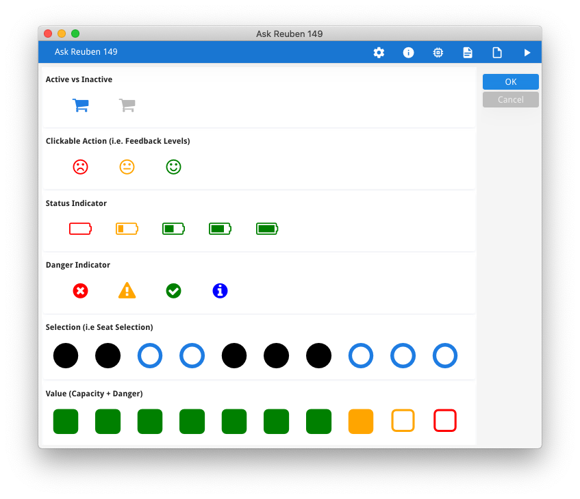
When TTF Icons were introduced to Genero in 3.00 , they required an additional configuration file that provided an image-to-font glyph mapping. This is the image2font.txt that is found in $FGLDIR/lib that will be referenced by FGLIMAGEPATH. To render TTF Icons in different colors required adding additional lines to this configuration file. An example could be found in this program in the Github repository. Its modified image2font.txt file had additional entries to render the circle icon in three different colors. This is achieved by additional an optional third argument for each entry to indicate the color used, and having multiple entries for the same image with the different colors. This technique was not popular. In an ideal world you would not have to touch this configuration file as you then have to update your copy of it every release or update of the font file. Alternatively go down the path of having multiple configuration files and thus multiple entries in FGLIMAGEPATH. With the recent GBC 4.01.06 maintenance release, an issue was resolved surrounding the use of the defaultTTFColor presentation style. You can now consistently use Presentation Styles to control the color of TTF Icons just as you would other widgets. This means that your form can simply reference a Style .. and your 4st can be responsible for the actual color … The advantage of this technique is that you will be defining the entry in your presentation style (.4st) file which you already have, rather than the image-to-font glyph mapping (image2font.txt) file. The presentation style also has the same inheritance rules so you can define a style against a Window and have all icons in that window inherit the same style attributes. It also allows you to change the color used at runtime by using the ui.Form.setElementStyle method rather than displaying another image. This has a positive effect in that with m images and n potential colors, instead of m*n entries in the image-to-font glyph mapping file, you have m entries in the mapping file and n entries in the .4st. Applying color to icons allows you to give these icons more meaning. This could be levels of danger, red being the color associated with danger. This could be used with clickable images to indicate if the image is active or not. This allows a single image or series of images to convey more than just a value but to give an indication of when that value is dangerous. Applying color to icons adds richness to your screens as illustrated below.circle-red=FontAwesome.ttf:f111:red
circle-orange=FontAwesome.ttf:f111:orange
circle-green=FontAwesome.ttf:f111:#00FF00
IMAGE i01 : red, IMAGE="fa-circle", STYLE="red", ...
IMAGE i02 : orange, IMAGE="fa-circle", STYLE="orange", ...
IMAGE i03 : green, IMAGE="fa-circle", STYLE="green", ...
<Style name=".red">
    <StyleAttribute name="defaultTTFColor" value="red"/>
</Style>
<Style name=".orange">
    <StyleAttribute name="defaultTTFColor" value="orange"/>
</Style>
 <Style name=".green">
    <StyleAttribute name="defaultTTFColor" value="#00FF00"/>
</Style>


