Application page for GBC
The application interface consists of a main container, sidebars, and a chromebar.
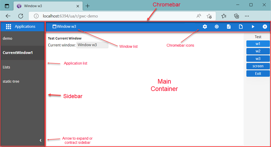
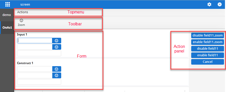
Main container
The main container displays the application. It may contain topmenus, toolbars, forms, and action panels.
SideBar
-
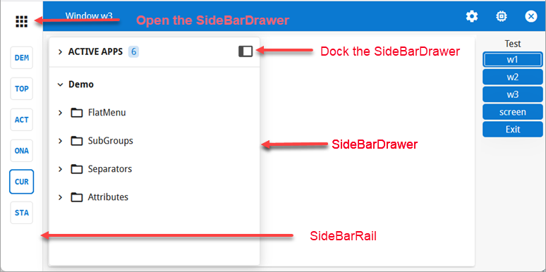
SideBarRail: This is a permanent, thin sidebar that provides quick access to the application list, featuring either application icons or abbreviations of application names. If an icon is provided for the application, it is displayed. If no icon is provided, the GBC shows an abbreviation based on the application name. If the title contains three or more words, the abbreviation uses the first letter of the first three words. Otherwise, it uses the first three letters of the first word.
The application icon is taken from the
imageattribute of theUserInterfacenode. The application title is determined by thetextattribute, or by thenameattribute iftextis not provided. Icons always take priority over the generated abbreviation when displayed in the SideBarRail. Whenmt-sidebar-show-child-nameis enabled and aRUN CHILDinstruction is executed with waiting, the SideBarRail displays the child application's title and icon instead of the parent title. You can override the default behavior usingui.Interface.setImage()to set an icon orui.Interface.setText()to define specific text.You can control the visibility of the SideBarRail using the
applicationListVisiblevariable. For more information, refer to the UserInterface style attributes page in the Genero Business Development Language User Guide. -
SideBarDrawer: This sidebar is designed primarily for the Start Menu but also lists all open and active applications, providing their full names by default. It can be activated via the App Grid Icon (the "nine-squares" icon) at the top left of the interface. If an application has a StartMenu, the start menu list of applications remains visible across all applications and is not limited to just the application that requires it. If the application that created the StartMenu is deleted, it disappears everywhere. The SideBarDrawer floats and can be pinned for easier access. If set, the application entry shown in the SideBarDrawer (or in the ChromeBar when the application is on top) displays both the image and the title.
The APPLICATION and STARTMENU categories can be collapsed or expanded, with APPLICATION collapsed by default when there is a STARTMENU.
If only one application is active, the sidebars do not display. The sidebars list all
applications that are open and active. For example, if an application is launched using a
"RUN WITHOUT WAITING" instruction, both the calling and called applications are
simultaneously active, and both appear in the sidebars. You can switch between active applications
by selecting from the application list, and the selected application will display in the main
container.
Within your GBC customization, you can set the mt-sidebar-show-child-name theme variable to display the window name instead of the
application name. Programmatically, you can change the text and image used for the application with
the ui.Interface.setText and ui.Interface.setImage methods. For
more information on the ui.Interface class, go to the Genero Business
Development Language User Guide.
You can close any application item in both the SideBarRail and the SideBarDrawer by hovering over it to reveal a small close button. This allows you to execute the close action for the current dialog, just like the close icon in the ChromeBar.
On mobile devices, the sidebar is not visible by default. It can be accessed from the icon located next to the window name in the title bar.
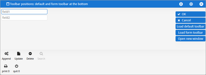
Toolbars
GBC supports the position Genero presentation style (.4st)
at the toolbar level. This attribute can be used to display toolbars individually at the top or
bottom of the window, in the chromebar, or to hide a toolbar completely. The current support is for
two toolbars (a default or global toolbar and a form toolbar) in a Genero application.
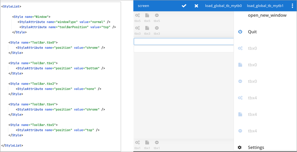
toolBarPosition attribute and
styles for toolbars using the position attribute. The position
attribute has priority and overrides the toolBarPosition attribute set at Window
level if both are set. 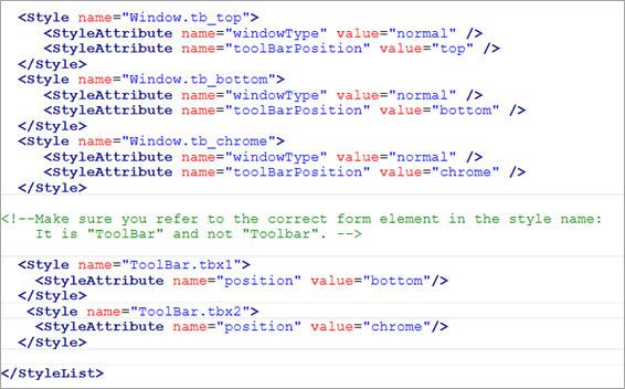
For details about toolbar styles, refer to the ToolBar style attributes page in the Genero Business Development Language User Guide.
Window list
When an application opens multiple windows, the window title transforms into a combobox. Clicking the title reveals a hierarchical list of all open windows. Each entry includes a custom icon that distinguishes normal windows from modal ones. The combobox highlights the active window and adds a green Current label beside it.
When the parent application launches multiple child applications and waits for them to complete, the combobox also lists windows from those child applications.
Window switching via the combobox is not supported at this time.
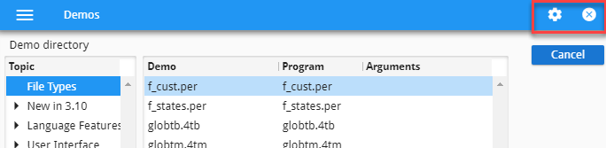
Chromebar
The chromebar displays icons for selecting windows, changing settings, viewing status, debugging the application, and closing the application.
For applications using GDC-UR, the chromebar does not contain the settings and debug icons, as settings and debugging are solely controlled by the GDC monitor. Please refer to the Genero Desktop Client User Guide for details about settings and debugging with the Genero Desktop Client.
The chromebar overflow panel appears when there are more icons or actions than can fit in the visible chromebar area. Instead of displaying all icons, GBC places the extra ones into a overflow panel.
The icons you see on the chromebar will depend on your current mode and customization. By default:
- In normal mode, the chromebar displays the Settings and Close icons.
- If a file is being uploaded, the chromebar also displays the Upload status icon.
- If the GBC is waiting for a response from the server, a progress bar displays above the chromebar, indicating the Runtime status.
- In debug mode, the chromebar also displays the [Debug] AUI Tree icon. For more information, see Debugging.
You can modify these defaults by customizing the chromebar.
Hovering your mouse over the icons shows text that describe their function.
- Settings
- Opens the GBC Settings dialog. For more information on the Settings dialog, go to GBC Settings.
- Upload status
- Indicates that a file is being uploaded into your application. This displays first as an icon and then as a percentage. When all files are uploaded, the upload status disappears from the chromebar. If the upload is fast, you may never see the upload status. To change the icon, see Change file loading icon. To center the icon and percentage on the screen, see Center file loading icon.
- Runtime status
- Displays a progress bar that indicates the GBC is waiting for a response
from the server. Tip:
You can see this progress bar in the GWC demo directory. Navigate to and doubleclick the ProgressBar application.
- Close window
- Closes the selected application. Upon closing, you are taken to the next
open application in the sidebar. If there are no more applications in the sidebar, the GBC displays
the application ended page.Note:
The Close window icon may not be shown while an application is expecting user input or other action.
Tip: Closing application DVMsWe recommend that you always use the Close window action to exit applications. Avoid closing the browser tab to stop applications as application DVMs may stay running on your server until sessions time out. The close action ensures that application DVMs are properly stopped on the server side.