Controlling table rendering
Table rendering can be controlled by the use of presentation styles and table attributes.
Table width
By default, the width of a TABLE container is defined by the number of visible
columns in its layout.
Table column fields defined as HIDDEN will not contribute to computing the default table width.
In this example, the table is defined with three visible columns, which in turn define individual field widths. The sum of the field widths defines the default table width.
GRID
{
<TABLE t1           >
[c1  |c2       |c3  ]
...WIDTH
attribute:TABLE t1 : table1, WIDTH = 5 COLUMNS, ... ;The COLUMNS unit means a number of fields/columns in the TABLE,
not grid-columns.
The size of a TABLE (or TREE)
element has an impact on the size of a modal
window where the form of the table is displayed. However, regular windows will be sized from
the window container, and the form
content will adapt to it.
Table height
TABLE container is by default defined by the number of rows in
its layout. In the example, the default table height will be three
rows:GRID
{
<TABLE t1 >
[c1 |c2 |c3 ]
[c1 |c2 |c3 ]
[c1 |c2 |c3 ]
< >
...HEIGHT attribute:
TABLE t1 : table1, HEIGHT = 10 LINES, ... ;The LINES unit means a number of lines in the TABLE, not
grid-lines.
The size of a TABLE (or TREE)
element has an impact on the size of a modal
window where the form of the table is displayed. However, regular windows will be sized from
the window container, and the form
content will adapt to it.
Showing table grid lines
By default, the grid lines of TABLE container are shown, when the table is
controlled by an INPUT ARRAY. The table grid lines are hidden when using a
DISPLAY ARRAY.
showGrid style attribute, to indicate if the table widget must show
horizontal and/or vertical grid lines:<Style name="Table.custom_style">
<StyleAttribute name="showGrid" value="vertical"/>
</Style>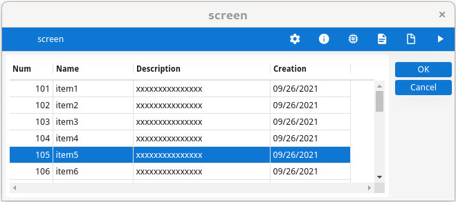
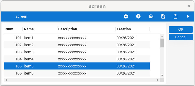
Alternate background color of odd/even rows
TABLE container can automatically display odd/even rows with a different
background color. This is the default rendering, and it can be disabled with the alternateRows
style attribute:<Style name="Table.custom_style">
<StyleAttribute name="alternateRows" value="no"/>
</Style>Consider using alternateRows instead of :odd/:even pseudo
selectors.
Distinguish row on mouse hover
rowHover style
attribute:<Style name="Table.custom_style">
<StyleAttribute name="rowHover" value="no"/>
</Style>Current row / current cell rendering
In a TABLE container, the highlighting of the current row (or current cell, when
focus granularity is at the cell level) can be controlled with style attributes.
The current row / current cell style attributes apply also to stretchable
SCROLLGRID containers.
For more details, see Row and cell highlighting in TABLE.
Frozen columns
tableType is set to frozenTable,
you can define a number of fixed columns on the left and right, respectively with the
leftFrozenColumns and rightFrozenColumns style
attributes:<Style name="Table.custom_style">
<StyleAttribute name="tableType" value="frozenTable"/>
<StyleAttribute name="leftFrozenColumns" value="2"/>
<StyleAttribute name="rightFrozenColumns" value="1"/>
</Style>Frozen columns can also be used in Treeviews.
See the reference topics Table style attributes, Tree style attributes.
Stretchable columns
The form items defining columns in a TABLE or TREE container can use a STRETCH=X attribute, to have the column stretch when the container width
changes.
To make all columns stretchable, define the TABLE/TREE form item with the STRETCHCOLUMNS attribute.
Some columns can then be made non-stretchable individually with STRETCH=NONE.
For stretchable columns, a minimum and maximum stretch width can be defined with the STRETCHMIN and STRETCHMAX attributes. The value
for these attributes represents a number of item-tag cells. By default, the width of a column is
defined by the number of cells used in the column item-tag.
STRETCH, STRETCHCOLUMNS, STRETCHMIN and
STRETCHMAX can be combined with a @screen-size
modifier, to enable these stretching attributes for specific screen sizes.
TABLE definition example using stretchable columns:LAYOUT
...
TABLE ...
{
[c1 |c2 |c3 ]
}
END
...
ATTRIBUTES
EDIT c1 = customer.cust_num;
EDIT c2 = customer.cust_name, STRETCH=X,
STRETCHMIN@SMALL=5, STRETCHMAX@LARGE=30 ;
EDIT c3 = customer.cust_zipcode;
...In the above example, only the c2 (cust_name) column will stretch, when the
table width increases. For small screens, the minimum stretch width will be 5 grid cells, and for
large screens the maximum stretch width will be 30 cells.
See also Horizontal stretching.
Flip columns into rows
TABLE containers can define the FLIPPED attribute, to render the table in a way that all cells of a given
row get packed vertically. In this rendering mode, the table is thinner and can be displayed on
small screens.
To pack row cells vertically, some form item widgets may not keep the same size (especially the
height) as in classical table display. For example, the height of RADIOGROUP, IMAGE and TEXTEDIT form items will be
smaller. Consider using these item types with care, in a table where the FLIPPED
attribute applies.
FLIPPED attribute can be combined with a
@screen-size modifier, to get this rendering for specific screen
sizes (typically with small
screens):TABLE table1 ( FLIPPED@SMALL )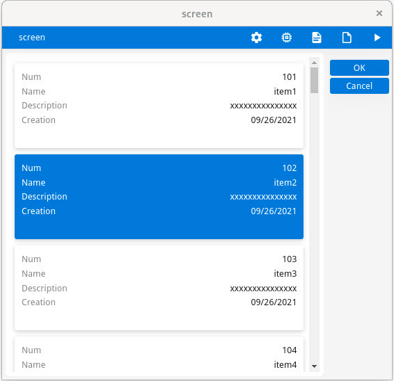
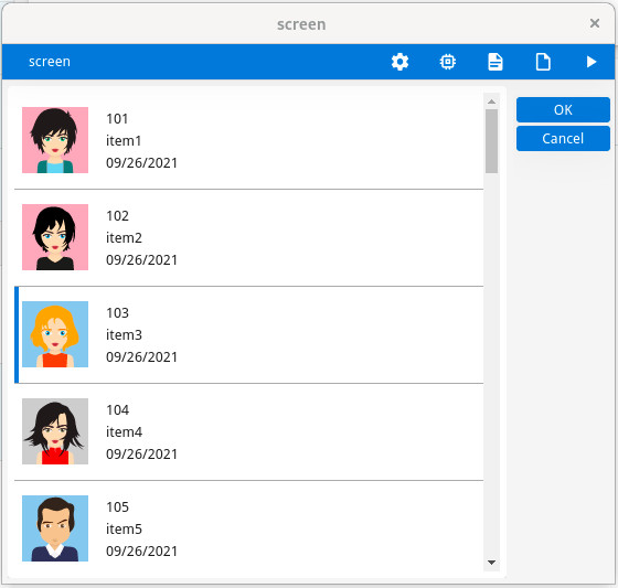
Row aspect control
TABLE with FLIPPED mode in action, use the rowAspect style attribute to get a Material Design list rendering of the
rows:<Style name="Table.list" >
<StyleAttribute name="rowAspect" value="list" />
</Style>When this style attribute is used, the flipped table looks like this:
With the rowAspect set to list, if the table row has the
IMAGECOLUMN attribute
specified on the first column, the image is displayed as a thumbnail in front of all column values
rather than in the same table cell as the column on which it is defined.
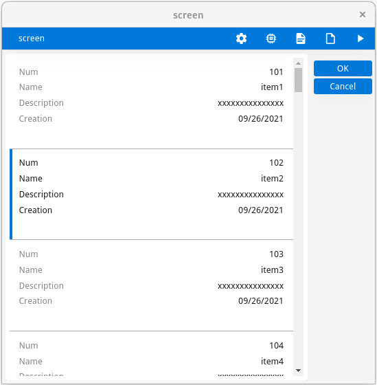
Column title rendering
TABLE uses the FLIPPED attribute, you can control the
visibility, position and alignment of the column titles respectively with the headerHidden, headerPosition and headerAlignment style
attributes:<Style name="Table.list" >
<StyleAttribute name="rowAspect" value="list" />
<!-- default: StyleAttribute name="headerHidden" value="no" /-->
<StyleAttribute name="headerPosition" value="top" />
<StyleAttribute name="headerAlignment" value="center" />
</Style>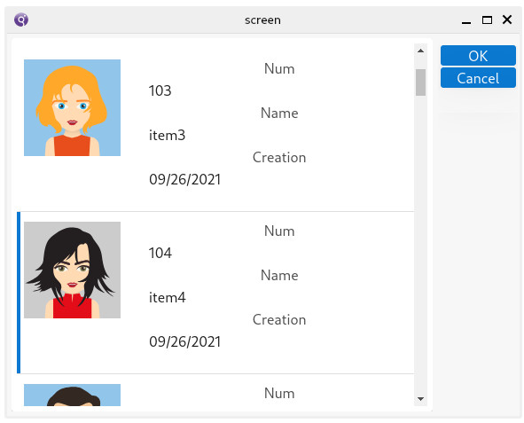
Current row visibility after dialog execution
When the dialog controlling the table has finished, the current row may be deselected, depending
on the KEEP CURRENT ROW dialog
attribute.