Themes and colors
A common use of theme variables is to change the color scheme.
Material color constants
Material color constants are generated palettes which are based on Material Design guidelines (external link). These constants use the naming
pattern $mt-colorname. For example, $mt-red
looks like Figure 1.

Colors within the palette can be referenced as
$mt-colorname[-intensity], where:
- colorname is the name of the color as defined in the material color palette.
- intensity is the number for the gradient.
For example, $mt-red-100 defines a light pink.
Material color constants cannot be changed. However, they form the basis of the color variables, which can be edited to suit your customization needs.
Color variables
Color variables in GBC follow these naming patterns:
palette-*: general color palettes for the default customization.theme-*-color: colors used across the theme.gbc-*Widget-*-color: colors for a specific widget or widget family.*-primary-*-color: aimed at featured elements like buttons and highlighted table lines.*-secondary-*-color: aimed at standard elements like containers and labels.*-field-*-color: aimed at field elements.
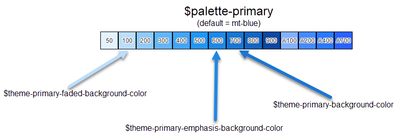
The default values of color variables are ultimately based on the material color constants. See, for example, Figure 2:
palette-primarydefines the theme color base. Its default value is$mt-blue.theme-primary-faded-background-colorhas a default value ofpalette-primary-100(which is the same as$mt-blue-100if the defaults are kept).theme-primary-emphasis-background-colorhas default value ofpalette-primary-600.theme-primary-background-colorhas default value ofpalette-primary-700.

Other variables may inherit these default values. For example, gbc-CheckBoxWidget-checked-color has a default value of
theme-primary-background-color. See Theme variable inheritance for further
details.
The easiest way to change the look-and-feel of your interface is to change the palette. For example, to change the primary palette to green, add the following line to theme.scss.json:
"palette-primary": "$mt-green",To reference a color variable in an .scss file, preface the color variable
name with $. For example:
// in scss file
{
  color: $theme-primary-emphasis-background-color;
}
...