Elements arrangement in forms
When resizing a window, the content will either stretch with the window, be evenly distributed, or be packed in the top left position.
Stretchable elements
If elements in the window can stretch, they will follow the window container and resize accordingly. Some elements can stretch vertically, some can stretch horizontally, and some can stretch in both directions.
The way resizable form items can grow is controlled by the STRETCH attribute.
The window content is packed horizontally, vertically or in both directions if none of the elements can grow in that direction (horizontally, vertically or in both directions.)
The following form item types can stretch horizontally:
TABLE/TREEcontainers (horizontally stretchable by design)SCROLLGRIDcontainers with tile-list view renderingIMAGE,TEXTEDIT, andWEBCOMPONENTitems withSTRETCH=BOTHorSTRETCH=X- "Flat" items like
EDIT,BUTTON, andCOMBOBOXwithSTRETCH=X(see Form item types)
The following form item types can stretch vertically:
TABLE/TREEcontainers whenWANTFIXEDPAGESIZEis not usedSCROLLGRIDcontainers whenWANTFIXEDPAGESIZE=NOIMAGE,TEXTEDIT, andWEBCOMPONENTitems withSTRETCH=BOTHorSTRETCH=X
Packing elements in HBOX/VBOX
By default, fixed-sized elements of a VBOX container are evenly distributed in the vertical direction and packed
to the left horizontally, and fixed-sized elements of an HBOX container are
distributed evenly in the horizontal direction and centered vertically.
If you want to pack the fixed-sized elements to the top of a VBOX or to the left
of an HBOX, use the packed style attribute for the box element.
Keep in mind HBOX and VBOX can change their orientation with
the ORIENTATION@media attribute. When the
packed style attribute is used for a box element that gets oriented in the opposite
direction, packed is applied as defined for the alignment direction selected for
the box.
For example, with the following form definition:
LAYOUT
VBOX vbox1 (STYLE="packme")
GRID grid1
{
Field11: [f11    ] Field12: [f12                ]
}
END
GRID grid2
{
Field21: [f21    ] Field22: [f22                ]
}
END
GRID grid3
{
Field31: [f31    ] Field32: [f32                ]
}
END
END
END
ATTRIBUTES
EDIT f11 = FORMONLY.field11;
EDIT f12 = FORMONLY.field12;
EDIT f21 = FORMONLY.field21;
EDIT f22 = FORMONLY.field22;
EDIT f31 = FORMONLY.field31;
EDIT f32 = FORMONLY.field32;
END
The form elements will be dispatched evenly in the vertical direction:
packed style attribute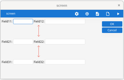
To pack the elements to the top of the vertical box, use the "packed" style attribute:
<Style name="VBox.packme">
    <StyleAttribute name="packed" value="yes" />
</Style>packed style attribute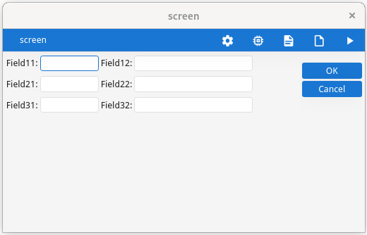
Placing group elements in parent GRID
In general, a GRID
container can grow if any object inside the GRID can grow; however, there is an
exception to this rule. If there is a single GROUP container defined without the GRIDCHILDRENINPARENT
attribute inside a GRID – and only the GROUP container in the
GRID – the grid can grow even if the objects inside the grid cannot grow.
This exception allows better rendering of a grouped grid.
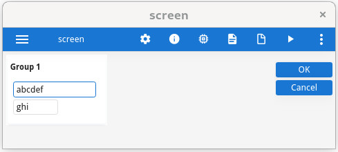
Note the white background of the group element.
GRIDCHILDRENINPARENT attribute to view the difference.LAYOUT
GRID
{
<GROUP g1 >
[f1 ]
[f2 ]
< >
}
END
END
ATTRIBUTES
GROUP g1: group1, TEXT="Group 1"
, GRIDCHILDRENINPARENT -- Comment to see the difference
;
EDIT f1 = FORMONLY.field1;
EDIT f2 = FORMONLY.field2;
END