Widget overrides

This example demonstrates how to override the ButtonWidget by modifying its methods for tooltip display, while the original widget remains intact as a base for the new version.

Before you begin

For more specific information on overriding widgets in the GBC, refer to the section provided in the following link Overriding and extending widgets

The modifications include changing the class definition to extend from ButtonWidget instead of TextWidgetBase, which allows for overriding existing methods. For instance, the setText method is updated to store the text in a new property, _text, while the setTitle method is overridden to customize how the title is set based on the _text property.

Additionally, this customization addresses the tooltip text that appears when hovering over a button. In the BDL code, when an ON ACTION statement includes both a lot of text and a comment to create a button, the information may be truncated, preventing the user from seeing the full content. (Line breaks have been added to improve readability.)
ON ACTION name ATTRIBUTES(TEXT="full text name that will display with dots", 
 COMMENT="comment")

By overriding the setTitle method, this customization ensures that the complete text and comment are displayed as a tooltip when the user hovers their mouse over the button.

Steps

  1. Copy the gbc-project-dir/src/js/base/widget/widgets/formfields/ButtonWidget.js to your customization-project-dir/js directory.
  2. Make the changes to the ButtonWidget.js at the line numbers indicated.

    In the code sample, the output is from a diff. The lines that begin with a "+" sign indicate new lines that you should add to the file, while lines that start with a "-" sign represent lines that you must remove. As this is a system output, the line numbers outputted may vary from system to system.

    -modulum('ButtonWidget', ['TextWidgetBase', 'WidgetFactory'],
    +modulum('ButtonWidget', ['ButtonWidget', 'WidgetFactory'],
       function(context, cls) {
     
         /**
    @@ -20,7 +20,7 @@ modulum('ButtonWidget', ['TextWidgetBase', 'WidgetFactory'],
          * @extends classes.TextWidgetBase
          * @publicdoc Widgets
          */
    -    cls.ButtonWidget = context.oo.Class(cls.TextWidgetBase, function($super) {
    +    cls.ButtonWidget = context.oo.Class(cls.ButtonWidget, function($super) {
           return /** @lends classes.ButtonWidget.prototype */ {
             __name: "ButtonWidget",
     
    @@ -61,6 +61,9 @@ modulum('ButtonWidget', ['TextWidgetBase', 'WidgetFactory'],
             /** @function */
             _afterLayoutHandler: null,
     
    +        /** @type {String} */
    +        _text: "",
    +
             /** @type {boolean} */
             _isTextAlign4STApplied: false,
     
    @@ -146,6 +149,8 @@ modulum('ButtonWidget', ['TextWidgetBase', 'WidgetFactory'],
              * @publicdoc
              */
             setText: function(text) {
    +          this._text = text;
    +
               this.domAttributesMutator(function() {
                 this.getElement().toggleClass('hasText', text.length !== 0);
                 this._textElement.textContent = text;
    @@ -354,6 +359,17 @@ modulum('ButtonWidget', ['TextWidgetBase', 'WidgetFactory'],
              * @inheritDoc
              */
             setTitle: function(title) {
    +          switch( true ) {
    +            case this._text.length>0 && title.length==0:
    +              title = this._text;
    +              break;
    +            case this._text.length==0 && title.length>0:
    +              title = title;
    +              break;
    +            default:
    +              title = this._text + " (" + title + ")";
    +            }
    +
               $super.setTitle.call(this, title);
               if (this._image) {
                 this._image.setTitle(title);
  3. Save your changes and rebuild your customization:
    $ gbc build --customization customization-project-dir
    All new instances of the ButtonWidget will use the customized widget. The effect of this customization is shown in Figure 1.
    Figure: Customized ButtonWidget tooltip

    Image shows tooltip text displayed when hovering over a button
Important: Patch with latest GBC release

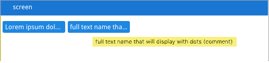
Be aware that each time a new GBC version is released, you must check your customized widget against the new released ButtonWidget version, to not miss changes introduced in releases.