The Genero Browser Client (GBC) comes with light, dark, high contrast, and compact
themes.
At installation, the GBC provides themes that are available for the various front-end clients:
Browser on desktop – using the GBC
Browser on mobile – using the GBC
Universal Rendering on desktop – used by the GDC
Universal Rendering on mobile – used by GMI and GMA
These themes can be grouped as light themes, dark themes, high contrast themes, and compact
themes. Some themes fall into multiple groups, as they contain aspects of both groups.
For users who have not explicitly chosen a dark theme or a light theme, the GBC will default to
the browser preference.
Light themes
Figure: GBC desktop light theme The light themes use a color scheme that uses dark-colored text, icons, and
graphical user interface elements on a light background. They include variations for:
Browser on desktop (Desktop Light)
Browser on desktop that includes the colors/compact theme part (Desktop
Compact Light)
Browser on mobile (Mobile Light)
Universal Rendering on desktop (UR Light)
Universal Rendering on desktop that includes the colors/compact theme part
(UR Compact Light)
Universal Rendering on mobile (UR Mobile Light)
The color scheme of the light themes is the default for all themes; however, a theme can
override this default by including a theme part that overrides the color scheme, as shown by the
default set of dark themes.
Dark themes
Figure: GBC desktop dark theme The dark themes use a color scheme that uses light-colored text, icons, and
graphical user interface elements on a dark background as specified by the colors/dark
theme part. They include variations for:
Browser on desktop (Desktop Dark)
Browser on mobile (Mobile Dark)
Browser on desktop that includes the colors/compact theme part (Desktop
Compact Dark)
Universal Rendering on desktop (UR Dark)
Universal Rendering on desktop that includes the colors/compact theme part
(UR Compact Dark)
Universal Rendering on mobile (UR Mobile Dark)
High Constrast themes
The high contrast themes use larger fonts and spacing for accessibility as
specified by the colors/highcontrast theme part. They include variations for:
Browser on desktop (High Contrast)
Browser on mobile (High Contrast)
Universal Rendering on desktop (High Contrast)
Universal Rendering on mobile (High Contrast)
Regardless of the Genero front-end client, the title of the theme remains High
Contrast.
Compact themes
The compact themes minimize the use of space as specified by the
colors/compact theme part.. They include variations for:
Browser on desktop that uses the default light color scheme (Desktop Compact
Light)
Browser on desktop that includes the colors/dark theme part (Desktop Compact
Dark)
Universal Rendering on desktop that uses the default light color scheme (UR Compact
Light)
Universal Rendering on desktop that includes the colors/dark theme part (UR
Compact Dark)
Compact themes can assist in migration efforts for customers moving to the GDC with Universal
Rendering, as the spacing of the compact theme more closely resembles the spacing that was used by
the GDC when it used native rendering.
The compact themes are not suitable for mobile devices.
Where themes are defined
The gbc-project-dir/custom.json file
defines these default themes. Open this file to learn which theme parts are used by each theme.
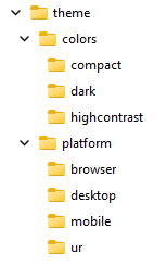
The gbc-project-dir/theme directory holds the theme part definitions; see Figure 3. The color
subdirectory contains the theme parts that define the compact, dark, light, and high contrast
characteristics of a theme. The platform subdirectory contains the
platform-specific and front-end specific theme parts, to include the theme conditions that restrict
where a theme can be used.
Figure: Directory structure for default theme parts