MENU style specification
MENU instruction can be controlled with the
STYLE dialog
attribute:MENU "Test" ATTRIBUTES ( STYLE = "style-name" )
...
END MENU-
"dialog": To get modal window with option buttons arranged horizontally, on top of the current window/form. -
"popup": To get a popup option list arranged vertically, on top of the current window/form, at the position of the mouse.When using this type of menu, the dialog will terminate automatically without the need to perform anEXIT MENU. A hidden "close" action is created automatically, to terminate theMENUdialog, when clicking outside the frame. -
other: To define your own style attributes, with default action views displayed in the action frame.
STYLE attribute can reference presentation style definition in a
.4st file, for example to define the size of the button icons, and the
background color of the widget frame: <Style name="Menu.dialog">
<StyleAttribute name="scaleIcon" value="20px" />
<StyleAttribute name="backgroundColor" value="cyan" />
<StyleAttribute name="textColor" value="green" />
<StyleAttribute name="fontWeight" value="bold" />
</Style>Default MENU rendering
By default, when no STYLE attribute is used in the MENU
instruction, each menu option will be displayed as default action views in a dedicated area
of the current window called the action frame.
Note that when an explicit action view (for example, a BUTTON in form layout) is associated
with a menu option, the default action
views will not appear.
The default rendering of a MENU, including the position of the default action
views in the window, can be controlled with window
presentation style attributes.
For example:
MAIN
  MENU "File"
    COMMAND "New"
      DISPLAY "New"
    COMMAND "Open"
      DISPLAY "Open"
    COMMAND "Save"
      DISPLAY "Save"
    COMMAND "Import"
      DISPLAY "Import"
    COMMAND "Quit"
      EXIT MENU
  END MENU
END MAIN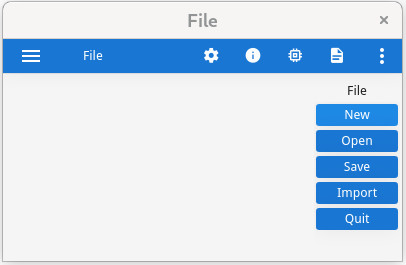
Dialog-style MENU rendering
Menus can be rendered in a modal dialog window where options are displayed horizontally, by
specifying the STYLE="dialog" attribute in the MENU
instruction.
For example:
MAIN
  MENU "Example of dialog menu"
    ATTRIBUTES ( STYLE="dialog", COMMENT="Delete the file?" )
    COMMAND "Yes"
      DISPLAY "Yes"
    COMMAND "No"
      DISPLAY "No"
    COMMAND "Cancel"
      DISPLAY "Cancel"
  END MENU
END MAIN
When the user clicks on an option, the MENU instruction automatically exits
and the modal dialog window closes. There is no need for an EXIT MENU command.
STYLE="dialog", when the user clicks on an option, the
MENU instruction automatically exits and the pop-up menu closes. There is no need
for an EXIT MENU command. 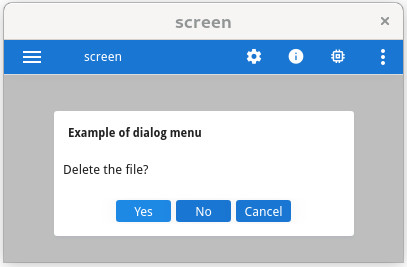
Popup-style MENU rendering
Menus can also be displayed as pop-up choice lists where options are displayed vertically, when
the STYLE="popup" attribute is used in the MENU instruction.
For example:
MAIN
   DEFINE r INTEGER
   MENU "test"
     COMMAND "popup"
        DISPLAY popup()
     COMMAND "quit"
        EXIT MENU
   END MENU
END MAIN

FUNCTION popup()
   DEFINE r INTEGER
   LET r = -1
   MENU "unused" ATTRIBUTES ( STYLE="popup" )
     COMMAND "Copy all"
        LET r = 1
     COMMAND "Copy current"
        LET r = 2
     COMMAND "Paste all"
        LET r = 3
     COMMAND "Paste current"
        LET r = 4
   END MENU
   RETURN r
END FUNCTION
With STYLE="popup", when the user clicks on an option, the MENU
instruction automatically exits and the pop-up menu closes. There is no need for an EXIT
MENU command.
STYLE="popup", the runtime system creates automatically a hidden "close"
action that will terminate the MENU dialog, and allow the front-end close the popup
window when the user clicks outside the options frame. 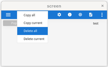
MENU rendering on mobile platforms
MENU dialog can be customize by using
Window style attributes, to display the menu options in the chromebar,
with:<Style name="Window">
<StyleAttribute name="ringMenuPosition" value="chrome" />
</Style>For more details, see Action views in chromebar.