The PROGRESSBAR item type defines a horizontal bar with a progress indicator.
Rendering
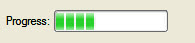
Figure 1. PROGRESSBAR item type
Syntax
PROGRESSBAR item-tag = field-name [ , attribute-list ] ;
- item-tag is an identifier that defines the name of the item tag in the layout section.
- field-name identifies the name of the screen record field.
- attribute-list defines the aspect and behavior of the form item.
Attributes
COLOR, COLOR WHERE, COMMENT, FONTPITCH, HIDDEN, JUSTIFY, VALUEMIN, VALUEMAX, SAMPLE, SIZEPOLICY, STYLE, TAG.
Table column only: UNSORTABLE, UNSIZABLE, UNHIDABLE, UNMOVABLE, TITLE.
Usage
The PROGRESSBAR form item type can be used to show progress information.
This sort of form item has to be used with a SMALLINT or INTEGER variable, larger types like BIGINT or DECIMAL are not supported.
The position of the progress bar is defined by the value of the corresponding form field. The value can be changed from the program by using the DISPLAY TO instruction to set the value of the field. This kind of Form Item does not allow data entry; it is only used to display integer values.
The VALUEMIN and VALUEMAX attributes define respectively the lower and upper integer limit of the progress information. Any value outside this range will not be displayed. Default values are VALUEMIN=0 and VALUEMAX=100.
Some front-ends support different presentation options which can be controlled by a style attribute. You can for example define of a percentage must be displayed.
PROGRESSBAR f001 = workstate.position,
  VALUEMIN=-100, VALUEMAX=+100;