The DATEEDIT item type defines a line-edit with a button that opens a calendar.
Rendering
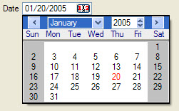
Figure 1. DATEEDIT item type
Syntax
DATEEDIT item-tag = field-name [ , attribute-list ] ;
- item-tag is an identifier that defines the name of the item tag in the layout section.
- field-name identifies the name of the screen record field.
- attribute-list defines the aspect and behavior of the form item.
Attributes
AUTONEXT, CENTURY, COLOR, COLOR WHERE, COMMENT, DEFAULT, FONTPITCH, FORMAT, HIDDEN, INCLUDE, JUSTIFY, KEY, NOT NULL, NOENTRY, REQUIRED, SAMPLE, SIZEPOLICY, STYLE, TAG, TABINDEX, VALIDATE LIKE.
Table column only: UNSORTABLE, UNSIZABLE, UNHIDABLE, UNMOVABLE, TITLE.
Usage
The DATEDIT form item type defines a line-edit with a button on the right that opens a calendar, dedicated to DATE input.
When the SAMPLE attribute is not specified, the default width for a DATEEDIT is dependent upon DBDATE , and FORMAT when this attribute is used in the field.
Some front-ends support different presentation options which can be controlled by a style attribute. You can for example change the first day of the week, or the icon of the button.
The real widget size of a DATEEDIT is computed according to a specific layout rule described in Widget size within hbox tags.
DATEEDIT f001 = order.shipdate;