Layout structure for responsive
Use the LAYOUT structure to define forms that adapt to screen
sizes.
Understanding the layout structure for responsive
HBOX/VBOX
elements:VBOX
|-- HBOX
| |-- TABLE
| +-- GRID
+-- GRIDIn GRID containers, define fields as stretchable, to allow fields to resize
depending on the screen size. Containers such as TABLE are by essence
stretchable.
HBOX/VBOX and leaf containers can be defined with
HIDDEN@screen-size and/or
ORIENTATION@screen-size attributes, to describe how these should
behave depending on the size of the screen.
GRID as stretchable leaf container
In a responsive layout form, define GRID containers with basic form items such
as labels and fields, without using container
layout tags such as <GROUP g1 >.
Inside the GRID containers, elements can be organized by position. Right-most
elements can be made horizontally
stretchable, to occupy all the screen width.
Screen-size dependant attributes
Responsive layout introduces a new syntax to indicate for what screen or window width an attribute must take effect.
HIDDEN attribute can get the
@screen-size
specifier:HIDDEN@screen-sizeThe @screen-size specifier can be one of
@SMALL, @MEDIUM, @LARGE.
The interpretation of these abtract size qualifiers is done dynamically, depending on the device type and display area size/width.
The exact screen size/width corresponding to SMALL/MEDIUM/LARGE can be
configured in the front-end, but it is not recommended to change the defaults. The predefined sizes
correspond typically to a given device type: SMALL and MEDIUM for
smartphones and tablets, LARGE for desktop computer screens. This abstract size can
also reflect the screen orientation on any device type.
For the complete syntax, see HIDDEN attribute.
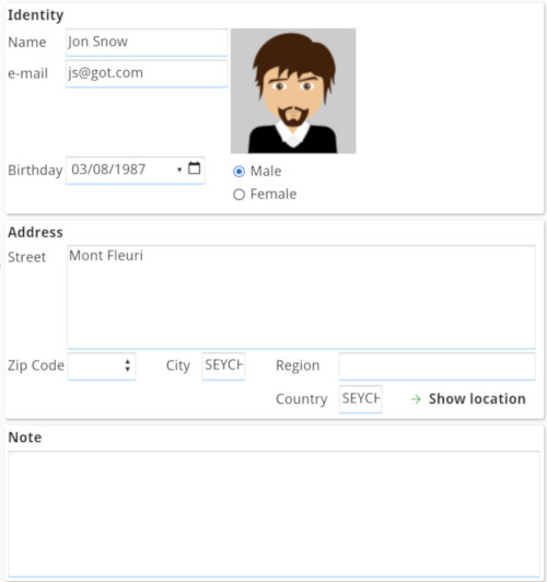
Responsive form layout definition example
LAYOUT
VBOX vb1
  HBOX hb1 ( ORIENTATION@SMALL = VERTICAL )
    TABLE tb1
       ...
    END
    GRID gd1 ( HIDDEN@SMALL )
       ...
    END
  END
  GRID gd2 ( HIDDEN@SMALL, HIDDEN@MEDIUM )
     ...
  END
END
ENDvb1organizeshb1andgd2vertically, no matter the screen size or orientation.hb1organizestb1andgd1horizontally by default, but vertically on small screens.gd1will be hidden on small screens.gd2will be hidden on small and medium screens.