Coloring a map chart
Genero Studio provides default colors for the items in a map chart. These colors are suitable for most purposes but can be changed if required.
For example, you might want to change the color if:
- You want to keep consistency of color across several charts with similar data.
- The content of the field is associated with a particular color. For example, your chart shows political parties and you want to display the Green Party in green.
The color of the items is determined by the Color property of the Map Chart Item.
Example 1: Pick a base color
You want to display your chart in shades of blue. Select the Map Chart Item and set the Color property as follows:
Color.BLUEThe map chart displays as in Figure 1.
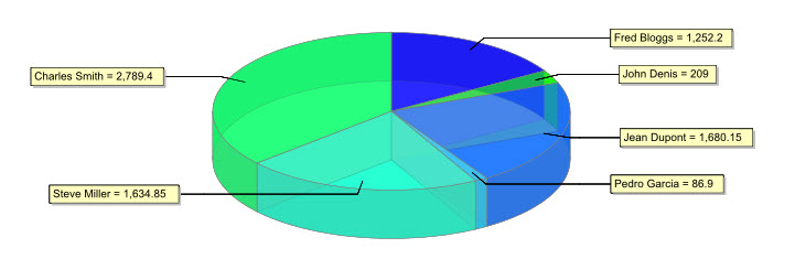
The first item, Fred Bloggs, is displayed in blue (RGB 0,0,255). The other items are colored in compatible shades.
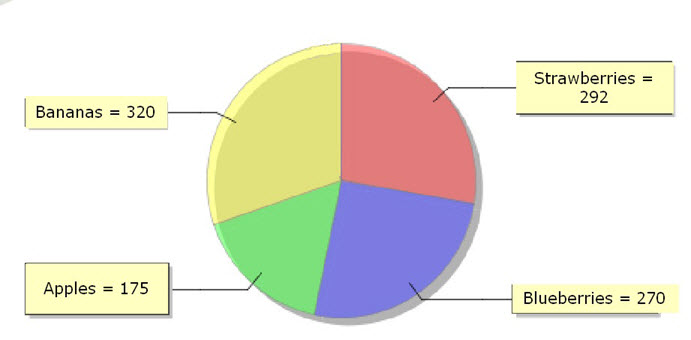
Example 2: Pick specific colors
- Bananas: Yellow
- Apples: Green
- Strawberries: Red
- Blueberries: Blue
Select the Map Chart Item and open the Expression Editor for the Color property.
You could set the color within the RTL code:
item.fruitname.trim()=="Bananas"?Color.YELLOW:item.fruitname.trim()=="Apples"?Color.GREEN:
item.fruitname.trim()=="Strawberries"?Color.RED:item.fruit.trim()=="Blueberries"?Color.BLUE:null
However, it's more likely that you'd set the RGB values within the database and define the Color property using those values:
Color.fromRGBA(item.color.redValue, item.color.greenValue, item.color.blueValue)The map chart displays as in Figure 2.