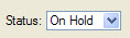
ComboBox
A ComboBox is a data handling widget that defines a drop-down list of values, allowing the user to select a value.
Defining the underlying formField
When you drop a ComboBox form item onto your form, it sets the fieldType property to NON_DATABASE as the default. To associate the ComboBox underlying formField with a database column, change the fieldType property to TABLE_COLUMN, and specifying the tableName and colName properties.
Usage
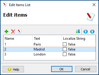
In this example, the entries represent a key-value pair for three cities. The end-user sees proper names such as "Paris", "Madrid", or "London". The underlying formField will hold the key equivalent, in our case either a "1", "2", or "3".
As an alternative, your application may include a function whose role is to populate the combobox. The initializer property specifies the name of that function.
If neither items nor initializer properties are specified, the form compiler automatically fills the list of items with the values of the include property, when specified.
The queryEditable property can be used to force the ComboBox to be editable during a CONSTRUCT instruction.
Some front-ends support different presentation options which can be controlled by a style property. You can for example enable the first item to be selected when pressing keys.
For more information about programming for a ComboBox, see the Genero Business Development Language User Guide.
Context Menu
The values in the list of items can be managed (add, delete) by right-clicking on the ComboBox on the form in Form Designer and selecting Edit Items. Edit the values in the columns of the dialog:
- Name - the value to be stored in the underlying formField represented by the ComboBox, for example, "W".
- Text - the value in the list to be displayed to the user, for example "West Region".
- Localize string - Specify whether the text is a localized string (true/false).