CheckBox
The CheckBox widget defines a boolean entry with a box and a text label.
Usage
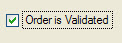
The text attribute defines the label to be displayed near the check box.
The box shows a checkmark when the form field contains the value defined in the valueChecked attribute (for example:
"Y"), and shows no checkmark if the field value is equal to the value defined by
the valueUnchecked attribute
(for example: "N"). If you do not specify the valueChecked or valueUnchecked attributes, they
respectively default to TRUE (integer 1) and FALSE(integer 0).
By default, during an INPUT, a CheckBox field can have three states:
- Grayed (NULL value)
- Checked (valueChecked value)
- Unchecked (valueUnchecked value)
If the field is declared as notNull, the initial state can be grayed if the default value is NULL; once the user has changed the state of the CheckBox field, it switches only between checked and unchecked states.
During an CONSTRUCT, a CheckBox field always has three possible states (even if the field is notNull), to let the user clear the search condition:
- Grayed (No search condition)
- Checked (Condition column = valueChecked value)
- Unchecked (Condition column = valueUnchecked value)