Grafana visualization
Grafana is an open-source analytics and interactive visualization web application. It provides charts, graphs, and alerts for the web when connected to supported data sources such as Prometheus.
To learn more about Grafana, please refer to Technical documentation | Grafana Labs. Grafana requires a commercial license in some instances. If you do not use Grafana, you can still access metrics directly through Prometheus queries or other visualization tools.
Connecting Grafana to Prometheus
- Install Grafana and Prometheus on your system (refer to their official documentation).
- Start Prometheus and ensure it is scraping metrics from your Genero services.
- Log in to Grafana and add Prometheus as a data source (Configuration > Data Sources > Add data source > Prometheus).
- Enter the Prometheus server URL and save the configuration.
Grafana dashboard overview
Example creating categories of user names and reports
Categories can be defined using PromQL aggregation functions to group users or reports into meaningful sets. For example, to track the number of reports started by user_2 and user_3 (from a sample set including user_1 to user_4), use the following expression:
sum by (category) (
  delta(fourjs_gre_nb_of_reports_per_user_total{user=~"user_2|user_3"}[$__range])
) * on() group_left() (
  label_replace(vector(1), "category", "Sales", "", "")
)
This query aggregates report counts for selected users and assigns them to the
Sales category. Grafana then displays the result as a labeled segment in a pie
chart. This is especially effective when the volume of individual users exceeds the practical limits
of pie charts or similar visual formats.
Graphs
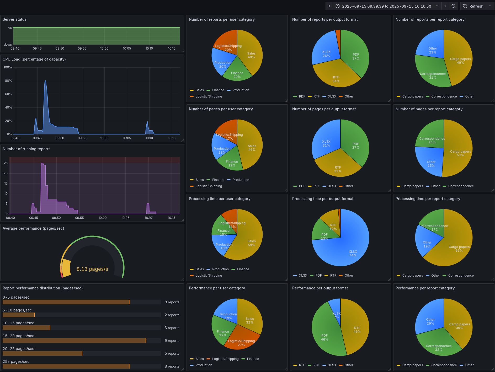
- Server status - The Server status is a simple time series that shows whether the Genero Report Engine (GRE) is currently running and ready to receive new jobs.
- CPU Load (percentage of capacity) - The CPU Load (percentage of capacity) time series shows the overall CPU usage of the GRE as a percentage of the total available processing power.
- Number of running reports - The Number of running reports time series shows how many reports the server is actively processing at any given moment. By default, the server allows up to 25 reports to run in parallel; any additional requests wait in a queue until capacity becomes available.
- Average performance (pages/sec) - The Average performance (pages/sec) gauge shows the mean number of pages rendered per second across the server. This visualization includes red, yellow, and green thresholds to indicate whether current performance is below, near, or within acceptable levels.
- Report performance distribution (pages/sec) - This visualization shows a histogram of completed reports, grouped into performance buckets based on throughput (pages per second). Grafana renders these buckets as gauge bars. Each report is assigned exclusively to the bucket that corresponds to its measured performance (e.g., 5–10 pages/sec), preventing duplication across multiple ranges.
- Number of reports - The Number of reports per … graphs show the distribution of executed reports as pie charts. You can break these down by specific labels such as user, output format, or source report file name, or by aggregated categories such as user category or report category.
- Number of pages - The Number of pages per … graphs show the distribution of rendered pages as pie charts. You can break these down by specific labels such as user, output format, or source report file name, or by aggregated categories such as user category or report category.
- Processing time - The Processing time per report graphs show the distribution of report execution times. You can display these by specific labels such as user, output format, or source report file name, or by aggregated categories such as user category or report category.
- Performance - The Report performance (pages/sec) per … graphs show the distribution of completed report performance as pie charts. You can break these down by specific labels such as user, output format, or source report file name, or by aggregated categories such as user category or report category.