XY charts have two data values. For example, you could map quantity sold against discount
percentage.
-
Open a new or existing report in Report Designer.
-
If you are creating a new report, specify the data schema to be used
for the report.
-
From the Tool Box view, drag and drop the XY Chart into
a container on the report design.
The Design Window contains a Chart object and its related Item object
(shown as a price tag).
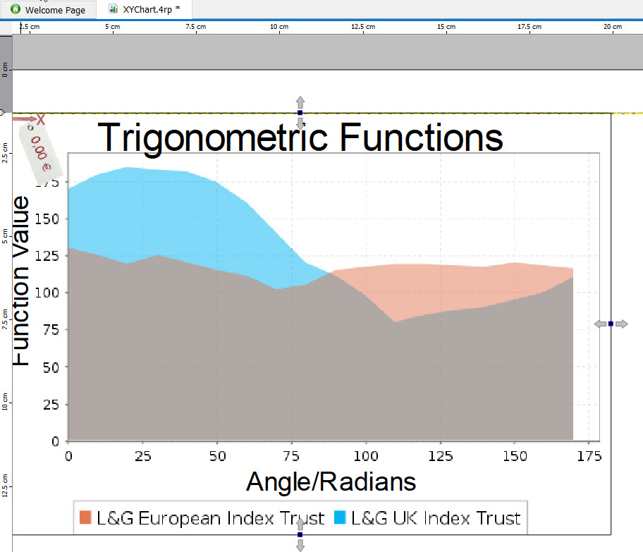
Figure: XY chart object in the work area
-
Select the chart object and enter the values for its properties in the
Properties View:
- Title - caption at the
top of the graph
- X Axis Title -
caption for the X axis
- Y Axis Title -
caption for the Y axis
- Draw As - the type of
chart, for example, Scatter or TimeSeries. The default is a line chart.
-
Select the chart's price tag, which represents the item object, and
enter the following properties:
- Series Title
- Determines the color and legend entry for the data point. The series title must be a String.
- X - What to plot on the X-axis. X
must be Numeric.
- Y - What to plot on the Y-axis .
Y must be Numeric.
What to do next: You must modify the
report structure to ensure the chart displays as required.