Create a map chart

Map charts have one key value and one data value. For example, you could map the revenue distribution by customer.

  1. Open a new or existing report in Report Designer.
  2. If you are creating a new report, specify the data schema to be used for the report.
  3. From the Tool Box view, drag and drop the Map Chart into a container on the report design.
    The Design Window contains a Chart object and its related Item object (shown as a price tag).
    Figure: Map chart object in the work area

    This figure is a screenshot of a map chart object in the work area.
  4. Select the chart object and enter the values for its properties in the Properties View:
    • Title - caption at the top of the graph
    • Keys Title - caption for the keys
    • Values Title - caption for the values
    • Draw As - the type of chart, for example, Pie or Ring. The default is a pie chart.
    • Sort By - sort alphabetically, numerically, or by input order.
    • Sort Ascending - sort in ascending or descending order.
    • DrawLegend - include or exclude the chart legend.
      Tip: When several similar charts are drawn next to each other, set DrawLegend to False on all charts except one. The charts now appear to be sharing the same legend.
    • DrawLabels - include or exclude the chart labels.
  5. Select the chart's price tag, which represents the item object, and enter the following properties:
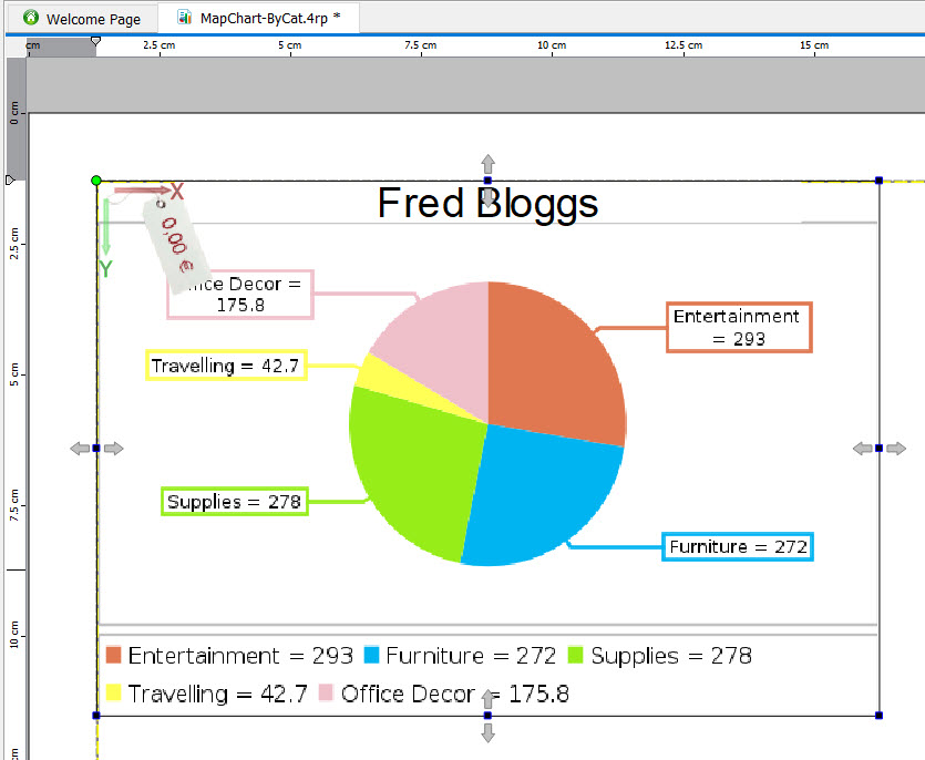
    • Key - The data item that summarizes the data. For example, in Figure 1, the key is the category name. The key must be a String. To use a non-string value, define a custom string for the key, using the data item in a expression.
    • Value - The data item that contains the numbers to be charted. For example, in Figure 1, the value is the unit price. The value must be Numeric.
    • Color - The color of each item in the map chart. If not specified, the items display using the Genero default colors. See Coloring a map chart.

You must modify the report structure to ensure the chart displays as required.