Application page for GDC
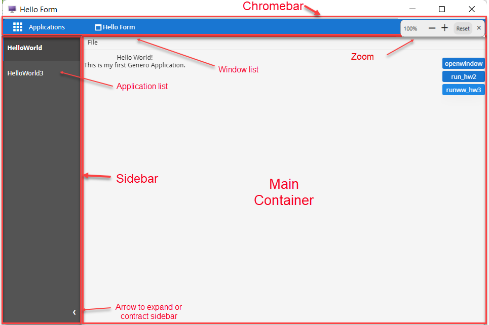
The application interface consists of a main container, sidebars, and a chromebar.

Main container
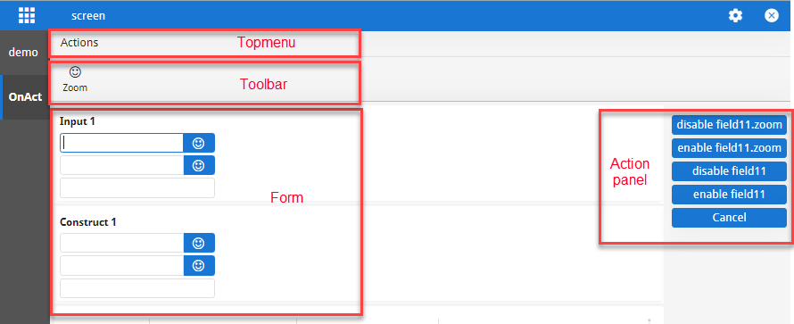
The main container displays the application. It may contain topmenus, toolbars, forms, and action panels.

Sidebar
-
SideBarRail: This sidebar is a permanent, thin sidebar that provides quick access to the application list, featuring either application icons or abbreviations of application names. You can control the visibility of the SideBarRail using the 4st
applicationListVisiblevariable. For more information, refer to the User Interface style attributes page in the Genero Business Development Language User Guide. -
SideBarDrawer: This sidebar is designed primarily for the Start Menu but also lists all open and active applications, providing their full names by default. It can be activated via the App Grid Icon (the "nine-squares" icon) at the top left of the interface. If an application has a StartMenu, the start menu list of applications remains visible across all applications and is not limited to just the application that requires it. If the application that created the StartMenu is deleted, it disappears everywhere. The SideBarDrawer floats and can be pinned for easier access.
The APPLICATION and STARTMENU categories can be collapsed or expanded, with APPLICATION collapsed by default when there is a STARTMENU.
If only one application is active, the sidebars do not display. The sidebars list all
applications that are open and active. For example, if an application is launched using a
"RUN WITHOUT WAITING" instruction, both the calling and called applications are
simultaneously active, and both appear in the sidebars. You can switch between active applications
by selecting from the application list, and the selected application will display in the main
container. When you close an application, it is removed from the application list.
On mobile devices, the sidebar is not visible by default. It can be accessed from the icon located next to the window name in the title bar.
Window list
When an application opens multiple windows, the window title transforms into a combobox. Clicking the title reveals a hierarchical list of all open windows. Each entry includes a custom icon that distinguishes normal windows from modal ones. The combobox highlights the active window and adds a green Current label beside it.
When the parent application launches multiple child applications and waits for them to complete, the combobox also lists windows from those child applications.
Window switching via the combobox is not supported at this time.
Chromebar
You can customize the chromebar by customizing the Genero Browser Client. For further details, go to the Genero Browser Client User Guide.
Zoom
You can make elements on an application using Universal Rendering larger or smaller using the zoom widget. To display the widget, change the zoom percentage from 100% by pressing Ctrl and +/- or Ctrl and using the mouse wheel. The - and + buttons can be used to zoom in and out of the form. Click X to hide the widget. To reset the zoom to 100%, click Reset or press Ctrl and 0. The zoom widget disappears after short time regardless of zoom percentage.