Styles can now be applied to MESSAGE and ERROR statements.
Support for message styling has been added in 2.30. When using the MESSAGE or ERROR statement, you can customize how the information is displayed. The AUI Tree defines ERROR and MESSAGE as the same node Message, so GDC 2.30 introduced new pseudo-selectors Message:error and Message:message. Now it is possible to:
- Apply a style to all Messages and/or Errors
- Apply a style to a specific Message or Error using ERROR "error" ATTRIBUTES(STYLE="myStyle")
Supported Style Attributes are:
- Font style attributes (textColor, fontWeight, and so on)
- position, which is used to override the Window style property for the current message (statusbar, popup, statustip, both)
- textFormat, which is used to define whether a value should be interpreted as plain text or as html.
Example: 4st file:
<Style name="Message:error">
  <StyleAttribute name="textColor" value="red" />
  <StyleAttribute name="fontWeight" value="bold" />
</Style>
<Style name="Message:message">
  <StyleAttribute name="textColor" value="blue" />
</Style>
<Style name="Message.yellow">
  <StyleAttribute name="textColor" value="yellow" />
</Style>
| Statement | Result |
|---|---|
| MESSAGE "This is a message" | 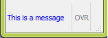 |
| ERROR "This is an error" | 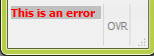 |
| MESSAGE "This is a message" ATTRIBUTES( STYLE="yellow" ) |  |
| ERROR "This is an error" ATTRIBUTES( STYLE="yellow" ) |  |
Note: Similar to simple fields, tty attributes have a
higher priority than styles. By default, ERROR has the tty attribute
REVERSE, which explains why ERROR messages have a REVERSE background
even when using styles.