Add a custom color picker widget
This procedure shows you how to add a custom color picker widget to your customization.
This custom widget will allow users to select colors visually in an EDIT widget
defined with a colorpicker style.
What is the custom color picker widget?
Starting with GBC 5.00.10, a customization example extends the class
FieldWidgetBase to create a custom color picker widget. The color picker
customization example can be found in the gbc-project-dir/customization/colorpicker directory.
- Interactive mode (
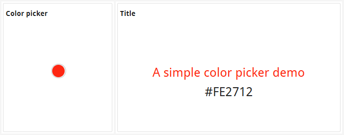
EDITwidget in anINPUT ARRAYor CONSTRUCT ARRAY):- The widget displays a circular color preview that represents the current color.
Figure: Color picker with selected color 
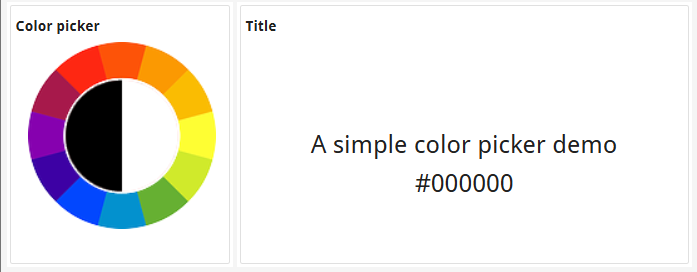
- When the user clicks on the circle, a color wheel is displayed, allowing the user to select a
new color by clicking on any color on the wheel.
Figure: Color picker with color wheel 
- The widget displays a circular color preview that represents the current color.
- Read-only mode (
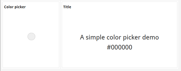
NOENTRYattribute is set on an edit field or when the color picker is used in aDISPLAY ARRAY):- The widget displays only the circular color preview without any interaction.
Figure: Color picker widget in read-only mode 
- The widget displays only the circular color preview without any interaction.
To use the color picker widget, set the "colorpicker" style attribute on an EDIT
form item type field in your form file. In your Genero application, you retrieve the value from the
color picker in the same way you would from any edit widget.
Examine the provided examples
Locate the customization directory gbc-project-dir/customization/colorpicker.
In this directory, you will find the following files:
- In /customization/colorpicker/js:
- ColorPickerWidget.tpl.html (color picker widget template file)
- ColorPickerWidget.tpl.js (color picker widget JavaScript file)
- In /customization/colorpicker/sass:
- ColorPickerWidget.scss (color picker widget style sheet)
- customization.scss ( includes the import statement for ColorPickerWidget)
- In /customization/colorpicker/resources/img:
- text-color.png (color picker image file)
- In /customization/colorpicker/resources/lib:
- tinycolorpicker.js (called from ColorPickerWidget.tpl.js)
- In /customization/colorpicker:
- config.json (includes compilation instructions for tinycolorpicker.js)
You can read through each of these files to see how the class FieldWidgetBase
was extended to create a custom color picker widget.
Add this color picker widget to an existing customizaton
If you want to include this custom color picker widget in an existing customization, follow these steps.
The customization now includes the color picker widget. To test, you must have an application
where a form includes an EDIT form item with its style set to
"colorpicker". For an example of such an application, go to Test the custom color picker widget.