GBC 5.01.06 new features and upgrade notes
A summary of new features and changes in functionality introduced with Genero Browser Client (GBC) 5.01.06. Note the changes you may need to make when moving to this version of the GBC.
This page covers only those new features introduced with the Genero Browser Client version specified in the page title. Check prior new features pages if you migrate from an earlier version.
For a detailed list of GBC 5.01.06 changes, please refer to the list of fixes on our issue tracker.
Previous new features page: GBC 5.01.05 new features and upgrade notes.
Support for the phoneEdit style attribute value
EDIT
text input fields that have the customWidget style attribute set to
"phoneEdit". This style activates input helpers and visual decorations for
international phone numbers, including country flags.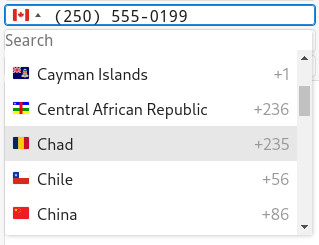
PhoneEdit widget. Both can be achieved by extending or overriding the widget. For
more information, go to Customizing your application using widgets.You should never modify files directly in the src directory, as these changes
may be lost during updates.
One common customization is setting the flag displayed when the form loads. By default, when the
field is empty, the PhoneEdit widget displays a flag based on the user's IP
address. To override this behavior, extend the widget and set the _initialCountry
property to a specific country code (e.g., "fr" for France or "us"
for the United States) in PhoneEditWidget.js. This ensures a consistent default
flag, regardless of the user's location.
Another common customization is controlling which countries appear in the dropdown list. By
default, the PhoneEdit widget uses an external phone library that includes all
supported countries. To restrict the list to specific countries, configure the library using the
onlyCountries option. This accepts an array of country codes and can be set when
initializing the widget in your custom implementation.
this._iti = tel(input, {
  initialCountry: this._initialCountry,
  separateDialCode: true,
  autoPlaceHolder: "aggressive",
  dropdownContainer: document.body,
  onlyCountries: ["fr", "de", "us", "mex", "gb"]
});
A demo application of the phoneEdit widget is provided within the
tests/genero_samples directory of the GBC project package.
For more details on this presentation style, go to Phone number fields in the Genero Business Development Language User Guide.
Support for the tagEdit style attribute value
GBC supports multi-value input for EDIT and BUTTONEDIT input
fields that have the customWidget style attribute to
"tagEdit".
tagEdit widget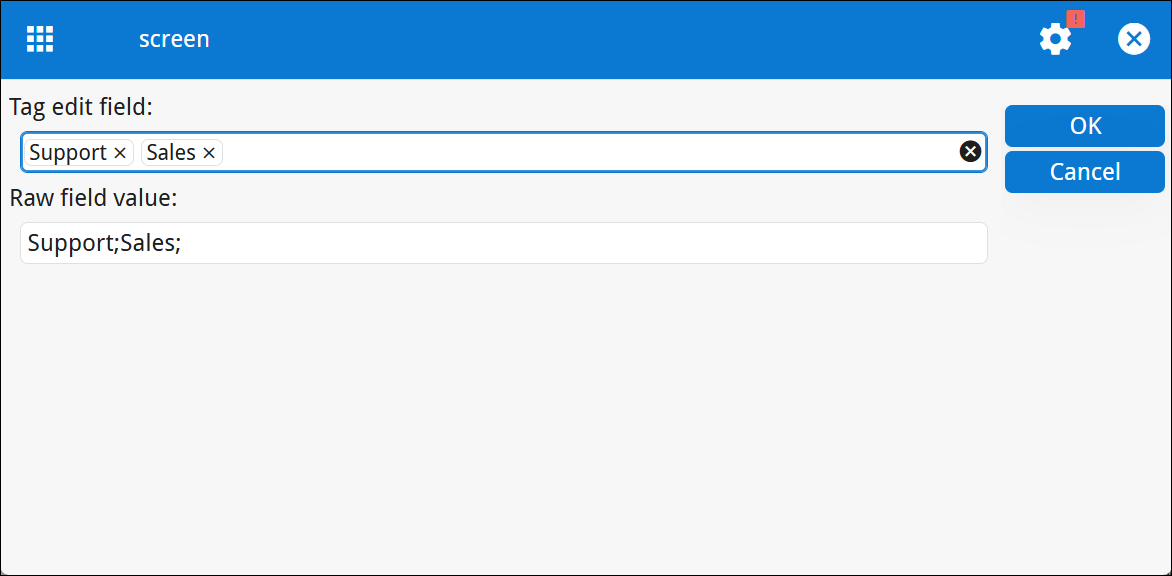
Tags are rendered as chips inside the edit field. The left and right arrow keys shift focus
across tags. A single tag can be removed via the close icon (X) displayed on each
chip. The Remove all icon clears all tags and appears only in
tagEdit (not in ButtonTagEdit). In disabled state, the
Remove all icon is hidden.
The Delete key removes the focused tag. The Backspace key
removes the last tag in the input field.
{
  "gwc": {
    "main": {
      "tagedit": {
        "newTag": "(+)"
      }
    }
  }
}A demo application of the tagEdit widget is provided within the
tests directory of the GBC package.
For more details on this presentation style, go to Edit style attributes in the Genero Business Development Language User Guide.
New mt-* variables
The following variables are renamed to be consistent with naming use in ui-*
variables:
Removed mt-* variables
mt-card-font-size-ratiomt-sidebar-always-visible-min-widthmt-sidebar-max-widthmt-sidebar-title-colormt-sidebar-item-colormt-sidebar-settings-colormt-tabs-margin-ratio
Update to mt-toolbar-item-height variable
The $mt-toolbar-item-height variable is computed based on the $ui-field-height-ratio. Previously it was based on the $ui-margin-ratio.
New tests directory
The GBC project package includes a tests directory containing two
subdirectories:
- automated_tests
- genero_samples
The genero_samples directory includes working examples of the
phoneEdit and tagEdit widgets.