GBC 4.01.21 new features and upgrade notes
A summary of new features and changes in functionality introduced with Genero Browser Client (GBC) 4.01.21. Note the changes you may need to make when moving to this version of the GBC.
This version of GBC is desupported, use a more recent version of the product.
This page covers only those new features introduced with the Genero Browser Client version specified in the page title. Check prior new features pages if you migrate from an earlier version.
For a detailed list of GBC 4.01.21 changes, please refer to the list of fixes on our issue tracker.
Previous new features page: GBC 4.01.20 new features and upgrade notes.
Changes to the GBC Home page
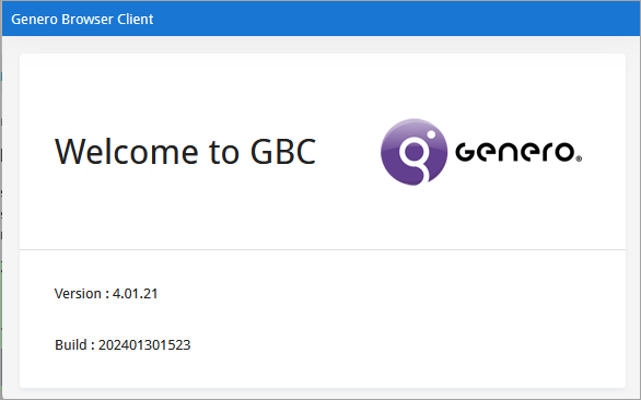
- a welcome message
- the GBC logo
- the GBC version
- the GBC build number

- History management
- Bookmark management
- UA URL launcher
- Log player launcher
The log player is still accessible directly using the
logplayerURL query string parameter. For details, go to Replay a GBC log.
For more information, see Home page.
Application launcher variables removed
Changes to the Home page have resulted in the removal of theme variables it used.
| Variable | Comment |
|---|---|
gbc-ApplicationLauncher-item-title-color |
Variable removed |
gbc-ApplicationLauncher-item-title-background-color |
Variable removed |
gbc-ApplicationLauncher-item-title-hover-background-color |
Variable removed |
gbc-ApplicationLauncher-item-title-hover-link-color |
Variable removed |
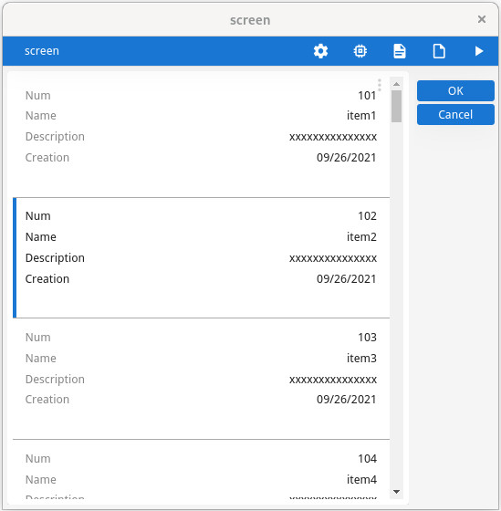
Table and scrollgrid have card views
TABLE with FLIPPED attribute, or in a
SCROLLGRID with WANTFIXEDPAGESIZE=NO can be rendered as cards when
the rowAspect style attribute is set to "card". This feature
applies also when customWidget style attribute is set to
"pagedScrollGrid".
For more information, refer to the Controlling table rendering and Controlling scrollgrid rendering pages in the Genero Business Development Language User Guide.
toolBar position style attribute support added
GBC now supports the "position" presentation style attribute at the toolbar level. It can be used to display toolbars individually at the top or bottom of the window, in the chromebar, or to hide the toolbar completely.
For details, go to the ToolBar style attributes page in the Genero Business Development Language User Guide.
toolBar CSS class names modified for naming consistency
For clarity and to be consistent with the naming convention chosen for toolBar (instead of toolbar), some CSS classes have been modified.
<div class="gbc_bottomBarsContainer">
 <div class="gbc_toolBarContainer"></div>
</div><div class="gbc_bottomBarsContainer">
<div class="gbc_bottomToolBarContainer"></div>
</div><div class="gbc_WindowToolbarContainer"></div><div class="gbc_WindowToolBarContainer"></div><div class="gbc_WindowBottomToolbarContainer"></div><div class="gbc_WindowBottomToolBarContainer"></div>