Form items render as widgets in the window, at a given position and with a given
size.
To render form items, grid-based rendering follows the layout rules described below:
The position of the widgets in the virtual grid is defined by the
posX and posY AUI tree attributes.
The number of virtual grid cells occupied by a widget is defined by the
gridWidth and gridHeight AUI tree attributes.
The real size of a widget is defined by the width and height
AUI tree attributes. Some form items allow to specify their size with the WIDTH and HEIGHT attributes.
Empty lines and empty columns in the form layout definition take a size of 0 pixels.
The size of a cell in the virtual grid depends on the real size of the widgets
inside the grid.
A widget's minimum size is computed via its real size and the SAMPLE attribute. The minimum width
can be forced by setting the STRETCHMIN attribute.
The preferred size of the widget is computed following the SIZEPOLICY attribute.
The final widget size is computed depending on the minimum and preferred size, to fill the cells
in the grid.
A small spacing is applied in non-empty cells.
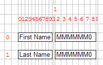
Take this form file:
LAYOUT
GRID
{
First Name  [fn     ]
Last Name   [ln     ]
}
END
END
ATTRIBUTES
EDIT fn = FORMONLY.fname;
EDIT ln = FORMONLY.lname;
END
It will produce the virtual grid as follows:
Figure: Two labels and two fields placed in a grid: Grid view
By default, empty grid rows and empty grid columns get no size when rendered on the front-end.
For example, in the above grid sample, the grid columns #10 and #11 are empty.
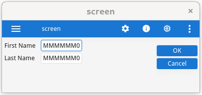
Visual result: Figure: Two labels and two fields placed in a grid: Form view