Widget position and size in grid
Form items render as widgets in the window, at a given position and with a given size.
To render form items, grid-based rendering follows the layout rules described below:
- The position of the widgets in the virtual grid is defined by the
posXandposYAUI tree attributes. - The number of virtual grid cells occupied by a widget is defined by the
gridWidthandgridHeightAUI tree attributes. - The real size of a widget is defined by the
widthandheightAUI tree attributes. Some form items allow to specify their size with theWIDTHandHEIGHTattributes. - Empty lines and empty columns in the form layout definition take a size of 0 pixels.
- The size of a cell in the virtual grid depends on the real size of the widgets inside the grid.
- A widget's minimum size is computed via its real size and the
SAMPLEattribute. The minimum width can be forced by setting theSTRETCHMINattribute. - The preferred size of the widget is computed following the
SIZEPOLICYattribute. - The final widget size is computed depending on the minimum and preferred size, to fill the cells in the grid.
- A small spacing is applied in non-empty cells.
Take this form file:
LAYOUT
GRID
{
First Name  [fn     ]
Last Name   [ln     ]
}
END
END
ATTRIBUTES
EDIT fn = FORMONLY.fname;
EDIT ln = FORMONLY.lname;
END
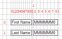
It will produce the virtual grid as follows:

By default, empty grid rows and empty grid columns get no size when rendered on the front-end. For example, in the above grid sample, the grid columns #10 and #11 are empty.
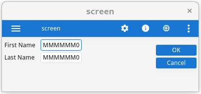
Visual result:
