Form item dependencies in grids
Form items interact with each other in terms of width, depending on the front-end widget size.
GRID
{
  [a      ]
  [b      ]
}
END
This .per implies that form items a and b
start at the same position and have the same size, whatever a and
b are.
This rule leads to very different results, especially when a large widget is assigned into a small number of cells.
LAYOUT
GRID
{
[a|b   ][f     ]
[c|d]   [e     ]
}
END
END
ATTRIBUTES
CHECKBOX a = FORMONLY.a, TEXT="A Checkbox";
EDIT b = FORMONLY.b;
EDIT c = FORMONLY.c;
CHECKBOX d = FORMONLY.d, TEXT="Another Checkbox";
EDIT e = FORMONLY.e;
EDIT f = FORMONLY.f;
END
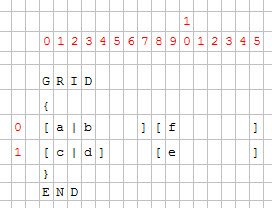
The grid is computed with regard to the character cells in the form definition:
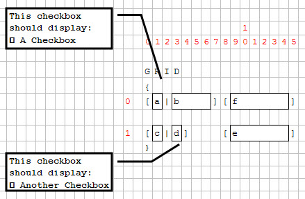
Then the minimum size of each widget and the layout is computed.
Cells (0,1) and (1,3) contain a checkbox; these checkboxes will enlarge columns 1 and 3.
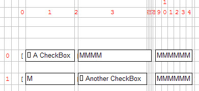
Because the EDIT field "c" is defined to have the same width as
checkbox "a", it will be much larger as expected.
GRID
{
[a       |b   ][f     ]
[c|d          ][e     ]
}
END
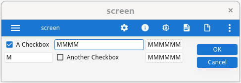
Even if the grid area is wider in the source form file, the real graphical result will be smaller.
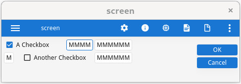
STRETCH=X attribute to the field "f", and make the last
grid column stretch to the size of the parent container. Note that the underlying field
"e" will stretch as well, because it belongs to the same grid column as
"f":EDIT f = formonly.f, STRETCH=X;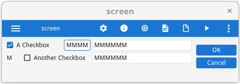
STRETCH=X attribute, add the STRETCHMIN=nn
attribute, to force the minimum width:GRID
{
Customer ID: [cid ] <-- width is 8 cells
...
}
END
...
EDIT cid: customer.cust_id, STRETCH=X, STRETCHMIN=3;
...