Understanding Responsive Layout
Forms can be designed to adapt to the front-end screen possibilities.
Screens of mobile devices (smart phones and tablets), as well as web browsers on a desktop computer, can have various display area sizes.
Modern applications should adapt automatically to the device type, display area size and screen orientation.
On a small screen or browser window, only the main information should be visible, and when a larger display area is available, more detailed information should be visible. On small screens, the end user must have options to access the detailed information, typically through touchscreen gestures.
In responsive layout, the concept of screen size refers to the available width of the screen or window, that can be used to render application forms. The height of the screen/window is secondary.
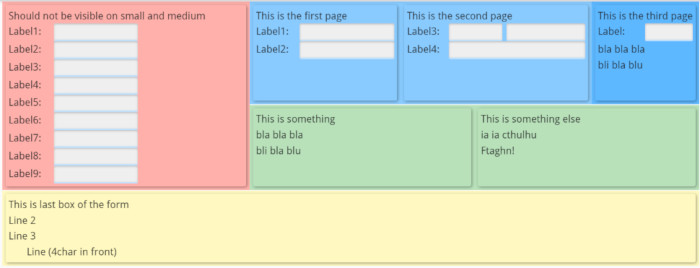
For example, a given form can be rendered on a large screen as follows, showing all sub-groupd of fields since there is enough room:


In Genero BDL, elements of form files can use special attributes that will define the rendering
of the elements, depending on the type of device and the size of its screen. The possible screen
sizes are referenced by abstract names: SMALL and MEDIUM for
smartphones and tablets, LARGE for desktop computer screens. This abstract size can
also reflect the screen orientation on any device type.